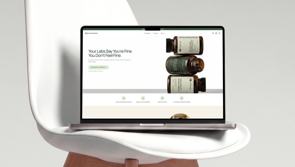
Snack packaging protects food, supports freshness, and helps buyers choose between competing snacks. Whether the contents are chips, cookies, protein bars, or candy, the format must suit the food while making its purpose easy to understand. Effective packs combine reliable protection, convenient use, and clear shelf appeal.
At bemain studio, we develop distinctive visual systems for food brands, connecting packaging with retail and e-commerce. Our approach combines creative design, clear product messaging, and consistent branding to help snacks stand out on shelves and connect with consumers. This guide covers formats, materials, sustainable choices, and three real projects from the snack market.
What Makes Effective Snack Packaging?
Good snack packaging keeps snacks in suitable condition and communicates clearly. Depending on the contents, barriers against moisture, oxygen, or light may help preserve taste and texture. Strong seals matter, while resealable openings add convenience to bags of snacks intended for repeat use. Choosing the right packaging format also helps protect the product during storage, transportation, and everyday handling.
Appearance also influences how consumers compare snacks. Clear labels should identify the product, key benefit, and flavor before decorative details compete for attention. Vibrant graphics and a consistent brand identity build recognition, but text must remain easy to read on shelves and screens. A well-organized design helps customers understand what makes a product different, even when they only see the packaging for a few seconds.
Snack Packaging Examples From bemain studio
These projects illustrate snack food packaging across bar wrappers and candy-inspired pouches. Each responds to a different need rather than repeating one formula. Together, they show how clear nutritional messaging, distinctive flavor cues, and consistent visuals can make products easier to recognize. Each example also highlights how the design approach changes with the product format and its intended audience.
1. Bricks Protein: Clear Benefits on a Small Wrapper
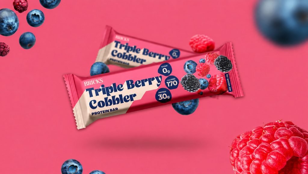
Bricks Protein offers dessert-inspired bars with 30g of protein and 0g added sugar. The challenge was to make functional snacks appetizing and understandable on a small wrapper. In a category filled with performance-focused products, the packaging also needed to communicate flavor and personality immediately, without burying the key nutritional information. Every element had to work within the limited space of an individual bar.
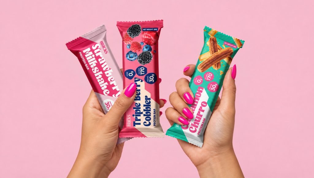
At bemain studio, we designed a colorful system with bold typography, dessert-focused imagery, and prominent nutritional messaging. Each bar remains recognizable, with distinct flavor cues that help shoppers navigate the range. The layout gives the brand name, product benefit, and flavor their own place, so the wrapper feels energetic without becoming difficult to read. The same visual direction carries into e-commerce, giving shoppers a familiar experience across product pages and physical shelves.
2. Zupz: Candy-Inspired Design With a Nutritional Message
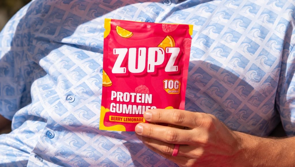
Zupz Candy is a gummy snack brand that grew from the earlier Thrive concept. The refresh needed to emphasize candy enjoyment without obscuring nutrition. Its Berry Lemonade pack combines bright pink and yellow with oversized lettering, fruit illustrations, and a visible 10g protein callout. That contrast gives the product the playful energy shoppers expect from candy while still making its functional benefit part of the first impression.
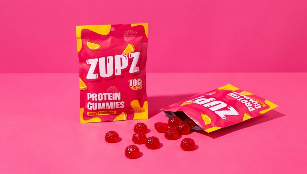
Our visual direction shows how playful snack packaging can prioritize clarity for candy-style snacks. Large lettering and vivid color make the pouch recognizable, while fruit graphics establish a clear connection to the flavor. The nutritional callout remains visible instead of competing with the decorative elements. This balance helps the product appeal to consumers looking for a fun treat and those comparing functional snack options. It also creates a visual language that can be adapted to additional varieties without losing recognition.
3. Primal Sweets: Refreshing a Familiar Treat
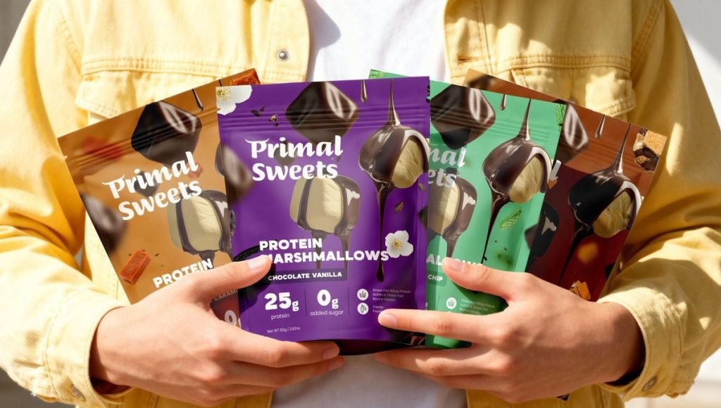
Primal Sweets reimagines marshmallows as a functional treat. Its original presentation did not clearly communicate the food’s appeal and nutritional proposition. The redesign needed clearer variety cues for these snacks without losing their playful character. Because marshmallows are usually associated with indulgence, the packaging had to bring together appetizing product imagery and a straightforward explanation of what makes this range different.
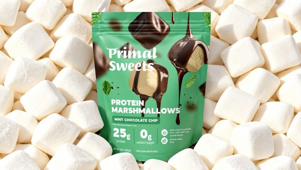
We introduced appetizing imagery, expressive type, and coordinated color cues across the pouches. A repeatable layout connects the range, while visual details distinguish flavors and help customers recognize each option at a glance. Product imagery gives the marshmallows an inviting presence, while the nutritional message remains easy to find. The stand up pouch provides clear product presentation, and the refreshed look extends to the Shopify website. This approach shows how an established snack brand can modernize its packaging while preserving its recognizable personality.
Snack Food Packaging Formats: Bags, Pouches and Wrappers
Different snack types require different shapes, sizes, and opening features. Choosing a format starts with the food’s fragility, portion size, storage requirements, and how people expect to use it. The right structure should provide enough space for branding and product information while supporting everyday convenience and practical storage.
Stand Up Pouch and Pillow Bags
A stand up pouch works well for snacks such as granola, popcorn, nuts, and trail mix because it sits upright and offers a broad print surface. Resealable pouches can be practical for repeated consumption. Pillow bags are common for chips and other loose snacks; they offer a familiar form and can accommodate protective air space where the filling process requires it.
Bar Wraps and Flexible Film
Individual bars and some cookies use flexible film wrappers with compact graphics and space for essential information. Rollstock film can support high-speed form fill seal equipment, which forms the bag, fills it, and creates the final seal. This may improve production efficiency, but designers must account for folds, seal areas, and how the printed artwork appears after filling.
Cartons, Cups and Rigid Containers
Paperboard cartons can help protect delicate food from crushing and provide room for detailed labels. Rigid plastic jars offer shatter resistance and, when transparent, visibility of the contents. Preformed cups suit certain single-serve options, while tin canisters can offer strong barriers against moisture and light for specialty snacks. Each format offers a different customer experience.
Flexible Packaging Materials and Food Protection
Flexible packaging is widely used for snacks because lightweight films can be made into bags and pouches in many sizes. Film structures may combine layers selected for strength, seal performance, and barriers against oxygen or moisture. For suitable snacks, a validated high-barrier film can extend shelf life by limiting exposure to air and moisture. These material considerations are also important in broader food packaging design, where functionality and visual presentation must work together.
Materials also affect print quality and print consistency. A glossy film, matte finish, or paper-based surface changes how colors and printed imagery appear. The design team should check printed artwork at actual size and coordinate print specifications with the packaging supplier. A reliable seal, legible labels, and appropriate material selection matter more than an attractive mockup alone.
Sustainable Snack Packaging and Practical Choices
Sustainable snack packaging should reduce unnecessary waste without compromising the snacks inside. Lighter bags, right-sized cartons, and simpler structures may reduce material consumption and transport weight. Recyclable mono-material films or paper-based options can be worth investigating, but their suitability depends on barrier needs, food-contact requirements, and local recycling facilities.
Recycled-content or compostable options also need verification before a company makes environmental claims. Clear disposal instructions help consumers understand the correct route after use. Using less material is not better if weaker protection causes snacks to spoil. The goal is responsible design supported by evidence, not a green-looking label.
Snack Packaging Design for Retail and E-Commerce
On a shelf, shoppers need to identify snack types and key product benefits at a glance. Online, bags and pouches of snacks appear as small thumbnails where fine details may disappear. Testing artwork in both settings helps ensure that the name, primary message, and recognizable graphics remain visible. This is especially important in protein bar packaging, where limited wrapper space requires clear nutritional information and strong flavor recognition. Digital printing can also offer flexibility for shorter runs or changing artwork.
Compact wrappers require particular discipline because important information must remain readable on a narrow surface. Strong typography, appetizing imagery, and consistent product photography help customers understand the food before reaching checkout. Packaging should maintain the same recognizable appearance across retail displays, product listings, and branded digital content.
Creating a Consistent System Across Snack Varieties
As a snack range grows, new products and sizes should feel connected rather than look like separate brands. Clear design rules for typography, nutrition claims, colors, and product imagery make it easier to create additional pouches and wrappers. For an established product range, a strategic packaging redesign can improve recognition and consistency while preserving familiar visual elements. These shared design decisions help products remain recognizable across retail shelves and e-commerce listings.
Consistency does not require identical designs. Customers should recognize the same brand while being able to distinguish its different products. A flexible visual system allows for new formats, flavor variations, and creative ideas without losing that recognition. This approach supports future product launches without requiring a completely new design for every addition.
Ready to Improve Your Snack Packaging?
Whether you are launching a new snack or refreshing an existing range, good design should make the product easier to understand and more memorable. At bemain studio, we create brand identities and packaging systems for consumer businesses, with attention to the way products look on shelves, in customers’ hands, and in online stores.
Frequently Asked Questions About Snack Packaging
What Are the Main Types of Snack Packaging?
Common options include stand-up pouches, pillow bags, flow wraps, cartons, cups, and jars. The ideal choice depends on the food, quantity, shelf life, and how the pack will be stored, displayed, and opened.
How Does Packaging Help Keep Snacks Fresh?
Suitable films and strong seals help protect food from conditions that affect quality. Barrier structures can limit oxygen, moisture, and light exposure and may extend shelf life when matched to the product and storage conditions. Resealable features add convenience after opening, but the required protection must be verified for the specific contents.
What Are Current Snack Packaging Trends?
Common directions for snacks include bold graphics, clear nutrition claims, convenient closures, and simpler material structures. Successful brands choose features that match their audience, product needs, and budget rather than following every trend.
How Much Does Custom Snack Packaging Design Cost?
Costs depend on the number of formats, artwork variations, brand development needs, and technical specifications. A single wrapper adaptation is generally less involved than a complete visual system across several sizes and pouches. Print production and manufacturing quotes should be evaluated separately from creative design fees.