


Protein bar packaging has to do several jobs at once. It needs to highlight nutrition, communicate flavor, protect the product, and catch attention on a crowded shelf. That explains why so many protein bars use similar visual cues: large protein claims, bold typography, bright wrappers, and tempting images of chocolate, nuts, or caramel. These familiar elements help shoppers identify the category, but they can also make competing products look alike.
For founders building a protein bar brand, the challenge is not to abandon what consumers recognize. It is to turn useful category conventions into a distinctive packaging design that makes protein bars recognizable at first glance. Below, we explore five recurring visual patterns, practical ways to differentiate a product, the packaging formats that influence presentation, and how Bemain Studio approached the branding and packaging of Bricks Protein.
Why Does So Much Protein Bar Packaging Look Alike?
Most protein bar brands compete for attention within a very small display area. Every wrapper has to organize the logo, flavor, nutritional claims, and other important information. As a result, packaging often follows the same visual formula: a prominent protein number, a bold product name, and flavor imagery that tells shoppers what to expect. These choices serve a purpose. They help customers compare options in a retail store without having to read every detail.
Choosing the right protein bar packaging also involves practical considerations. A wrapper must protect the bar from damage and support freshness, while the design still needs to communicate value at a glance. However, when brands rely on the same colors, typography, and message hierarchy, visual appeal can start to feel interchangeable. The goal is to preserve clarity while giving consumers a reason to recognize one brand over another.
5 Common Visual Patterns in Protein Bar Packaging
Looking across the protein bar category reveals recurring packaging ideas. They are not inherently bad design decisions. In fact, many make products easier to understand. The problem appears when the execution becomes so familiar that the packaging communicates the category more clearly than the individual brand.
- Prominent protein claims: Large numbers and benefit statements often receive as much space as the logo. They make protein bars easy to compare, but can leave little room for a distinctive identity.
- Dessert-inspired imagery: Chocolate, caramel, nuts, and other ingredients make a bar look appealing and communicate flavor quickly. Similar photographs can also make different wrappers feel alike.
- Bold typography: Heavy lettering and high contrast suggest energy and performance. Eye-catching designs need more than big type, though. The choice of font, spacing, and hierarchy should feel ownable.
- Color-coded flavors: Different wrapper colors help customers choose between varieties. A coherent system keeps the logo and other brand elements recognizable even as the colors change.
- Repeated layouts: Logos, protein claims, and flavor names often occupy predictable positions. An organized layout is useful, but it should also support a memorable visual signature.
These five patterns show why effective protein bar packaging is a balancing act. Familiar cues make products easy to shop for, while original typography, illustration, and a consistent brand system help the product stand apart from dozens of alternatives on the shelf.
How Packaging Design Helps Protein Brands Stand Out
Distinctive packaging design starts with a decision about what shoppers should notice first. For one brand, that might be a recognizable logo. For another, it could be a unique flavor proposition or a specific protein benefit. High-quality imagery, readable type, and clear information hierarchy should reinforce that priority rather than compete with one another. A thoughtful approach to brand identity design gives the entire range a visual language that customers can recognize across wrappers, boxes, and digital displays.
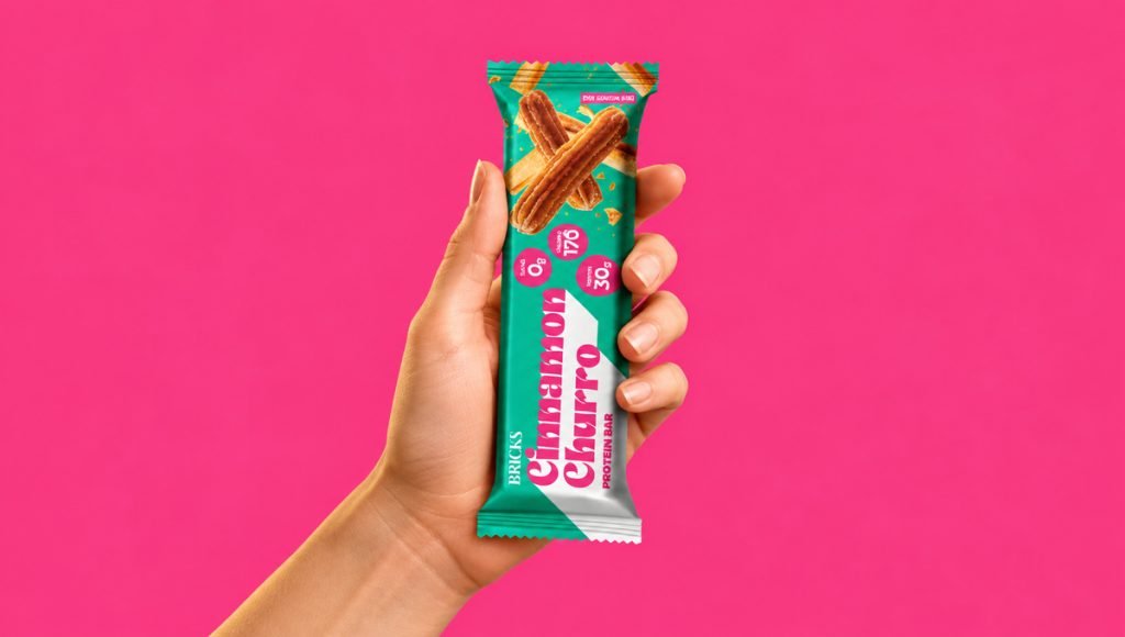
The creative direction should also reflect the audience and the brand’s positioning. A performance-focused protein bar might benefit from a clean, structured design that emphasizes nutritional value, while a dessert-inspired product can use richer imagery and playful typography to communicate indulgence. The key is choosing visual elements that reflect the product’s personality rather than simply copying popular packaging trends.
Next, test the design in the environments where people actually see it. Does the wrapper work at its real size? Can consumers identify the brand on a packed store shelf or in a small online search result? Is the flavor easy to select without changing the entire look of each variety? These checks help create a visually appealing, premium packaging system with a consistent identity that customers can recognize across flavors and shopping environments.
How Packaging Formats Influence Protein Bar Design
A good visual identity must work with the physical format of the package. Individual protein bar wrappers, commonly produced using flow wrap packaging, provide limited space for logos, nutritional claims, and flavor information. This lightweight format supports convenient single-bar sales, but the packaging design must account for seals, folds, and readable printing. A well-organized layout helps maintain visual appeal without overcrowding the wrapper.
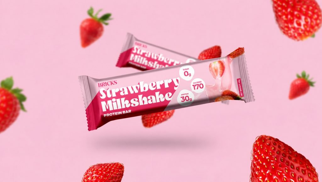
Multi-bar packs may use folding cartons or custom protein bar boxes to improve shelf display, while stand-up pouches provide additional space for branding and product presentation. Corrugated boxes generally serve a protective role during shipping rather than acting as primary retail packaging. Transparent windows can also allow customers to see the product when the selected format supports them. Each packaging option offers different opportunities for creating a recognizable brand experience.
Materials are equally important, although selecting them is a separate technical decision from visual design. Packaging suppliers should verify protection against moisture, air exposure, contamination, and handling damage, along with shelf-life requirements. Laminated films, recyclable materials, and compostable options require careful evaluation based on performance and disposal conditions. Once these requirements are established, high-quality printing, QR codes, and embossing on suitable packaging can enhance presentation while maintaining product protection.
How Bemain Studio Approached Bricks Protein Packaging
At Bemain Studio, we developed the branding, packaging design, and e-commerce website for Bricks Protein, a high-protein snack brand offering 30g of protein, 0g added sugar, and dessert-inspired flavors. The challenge was to create a distinctive visual identity that communicated nutritional performance while making flavor a central part of the experience. The brand needed to feel energetic, modern, and recognizable across retail shelves and digital platforms.
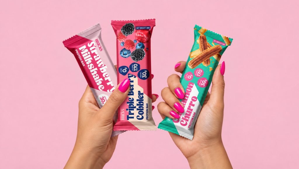
Rather than following a conventional fitness-focused aesthetic, the design combines vibrant colors, expressive typography, and appetizing product imagery to communicate flavor and personality. Four key visual elements define the Bricks Protein packaging system:
- Distinctive Colors: Bold pink boxes reinforce the brand identity, while contrasting wrappers distinguish flavors.
- Flavor-Focused Imagery: Appetizing ingredient visuals highlight each flavor.
- Expressive Typography: An elegant BRICKS wordmark contrasts with playful, oversized flavor names.
- Clear Nutritional Claims: Prominent protein and sugar information communicates key product benefits.
The visual identity extends across individual protein bar wrappers and multi-bar boxes, creating a consistent packaging system that reflects Bricks Protein’s combination of flavor and performance. You can explore the products on the official Bricks Protein website and see how bold colors, expressive typography, and flavor-focused imagery bring the brand’s personality to life.
What Should Protein Brands Consider Before a Packaging Redesign?
Before investing in new packaging, identify what is not working. Perhaps the brand disappears beside competing bars, the flavors are difficult to distinguish, or a nutritional claim takes attention away from the logo. Our guide to the packaging redesign process offers a broader framework for planning an update. A useful redesign brief should define the audience, product positioning, and the specific communication problem to solve. It should also consider whether customers already recognize certain colors or graphics that are worth keeping.
The first step is a clear purpose, not a fashionable design trend. The next step is to review the full product range, including individual protein bars, display boxes, and online images. Check packaging sizes, legibility, print quality, and how the design will translate to future flavors. Confirm that all nutritional information and environmental claims are accurate before production. The result should be a system that looks good, works for customers, and supports long-term recognition.
Ready to Make Your Protein Bar Packaging Stand Out?
Your protein bar packaging should do more than display nutritional information. It should express what makes your product different, create a recognizable identity across flavors, and make the brand easier to identify in retail and online environments. A thoughtfully designed packaging system can strengthen brand recognition and help your products stand out in a competitive market.
For a new protein bar launch, this might mean developing a packaging system that can grow with future flavors and product lines. For an established brand, it could involve improving readability, refining product messaging, or creating a more consistent look across the range. The goal is to make every design decision support the brand’s positioning and long-term growth.
Bemain Studio creates branding, packaging systems, and digital experiences for CPG brands in the supplements and better-for-you space. We combine strategy and design to help founders build a cohesive visual identity that works beyond a single wrapper.
Frequently Asked Questions About Protein Bar Packaging
What makes protein bar packaging stand out?
Clear nutritional messaging, recognizable branding, and a distinct visual system help protein bar packaging stand out. Strong color contrast and readable typography are useful, but the design should also give consumers something specific to associate with the brand.
Should every protein bar flavor have a different packaging design?
No. Changing colors or flavor imagery can help customers choose varieties, but keeping the logo, typography, and overall layout consistent makes the product range easier to recognize.
How important is protein bar packaging for online sales?
Packaging design influences how clearly a product appears in small e-commerce images. A readable brand name, concise benefit claims, and consistent visuals make the bar easier to identify across product pages and digital stores.
