A packaging redesign updates existing packaging to improve clarity, usability, and product presentation while keeping the brand recognizable. It can involve changes to typography, color, hierarchy, imagery, structure, or materials. The goal is to solve problems in the original packaging and make the product easier to understand across retail and digital channels.
This guide is for CPG, food, beverage, wellness, and supplement brands considering a product packaging redesign. It covers the signs that an update may be needed, the difference between a brand refresh and a full redesign, real packaging redesign examples, the redesign process, testing, common mistakes, and what should stay versus change as the packaging evolves.
What Is Packaging Redesign?
Packaging redesign is the process of improving or replacing an existing packaging system rather than creating one from scratch. It can involve changes to typography, imagery, messaging, structure, packaging shape, color scheme, materials, or other design elements, depending on what is no longer working in the original packaging. A successful redesign should make the product easier to understand and use while keeping enough recognizable brand elements to maintain continuity.
Effective packaging redesign combines visual consistency with functional, user-centered improvements. The package still needs to protect the product, support freshness during storage and transit where relevant, present information clearly, and meet applicable labeling and safety requirements. Customers also expect packaging to be practical and information to be easy to find, so the redesign should improve the overall product experience rather than focus only on aesthetics.
The scale of a redesign can vary. Some products only need a focused upgrade to hierarchy, typography, imagery, or messaging, while others require a more complete product packaging redesign that changes the visual system, structure, and way the product is presented across retail, ecommerce, and future SKUs.
Signs Your Packaging Needs a Redesign
A packaging redesign should start with a clear problem rather than a desire to change the design for its own sake. The strongest redesign projects respond to issues with clarity, recognition, product changes, customer needs, retail performance, or the ability of the packaging system to support future growth. Defining the problem early also makes it easier to measure whether the redesign actually improves the way the packaging performs.
The Design Looks Outdated or Unclear
Packaging can begin to feel dated when its typography, imagery, color scheme, or overall style no longer reflects the quality or positioning of the product. Weak hierarchy can create a similar problem when customers struggle to identify the product name, type, flavor, quantity, or main benefit quickly.
That does not mean every new design trend should trigger a redesign. The important question is whether the existing packaging still communicates effectively and remains competitive on the shelf and in digital product listings.
The Product, Positioning or Product Range Has Changed
Changes in formula, flavor, size, format, technology, positioning, or product benefits can make the original packaging less accurate or harder to manage. A broader brand refresh or repositioning can create the same need when the existing package no longer reflects what the product or company has become.
Growth can also expose weaknesses in the original system. If every new flavor, formula, size, or SKU requires a completely different layout or color solution, the packaging may no longer be scalable. A redesign can establish clearer rules for what stays consistent and what changes across the wider range.
The Packaging No Longer Works Across Retail and Ecommerce
Packaging that works at full size may become difficult to recognize in an ecommerce thumbnail, while a design created mainly for digital use may lack enough presence on a physical shelf. Modern product packaging often needs to perform across retailers, product pages, photography, marketplaces, social content, and physical retail at the same time.
A redesign can strengthen product recognition by improving hierarchy, simplifying smaller details, and making important visual cues more consistent across every environment where customers encounter the product.
Real Packaging Redesign Examples
Real before-and-after examples show how a packaging redesign can solve different problems without following the same visual formula. Each project below started with existing product packaging and a specific set of weaknesses, then used hierarchy, color, imagery, typography, and strategic design to create a clearer and more effective system.
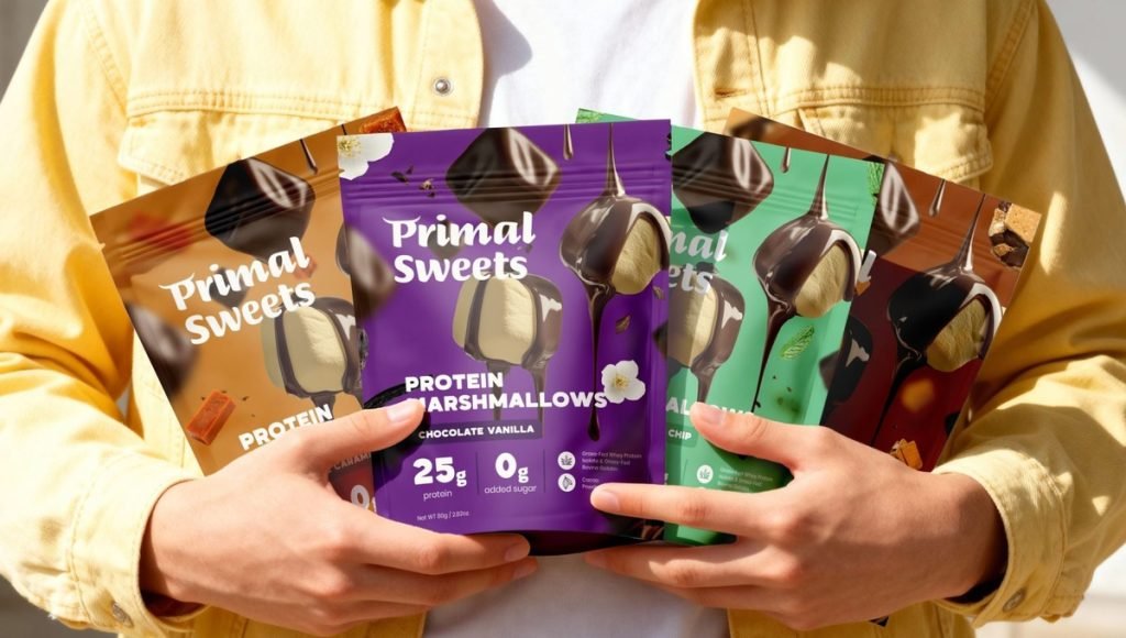
1. Primal Sweets: From Functional to Crave-Worthy Protein Packaging
Primal Sweets already had a strong product concept, but the original packaging did not fully communicate the quality, taste, or nutritional value of its high-protein marshmallows. The darker visual direction and information-heavy front panel made the product feel less distinctive within the growing better-for-you snack category.
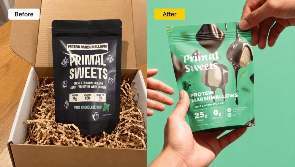
The redesign introduced a brighter, more appetite-focused system built around clear protein communication, stronger flavor cues, and improved hierarchy. Bold colors and product imagery give each flavor its own identity, while the overall product packaging design remains consistent across the range and easier to recognize in both retail and ecommerce.
- Clearer protein communication
- Stronger flavor differentiation
- More scalable SKU system
The Primal Sweets redesign shows how stronger hierarchy and product presentation can give existing packaging new life without losing the core product idea. Instead of changing the design for aesthetics alone, the new system makes the product easier to understand and better prepared to expand across future flavors and formats.
2. Bricks Protein: From Generic Protein Bar to a Bold, Recognizable System
The original Bricks Protein packaging communicated the product category, but the overall presentation felt more conventional and offered less visual distinction between flavors. For a compact format such as a protein bar, that can make it harder for the main product message, flavor, and key information to stand out quickly on shelf or in ecommerce thumbnails.
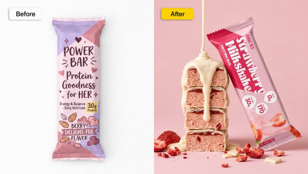
The packaging redesign introduced a stronger visual system built around bold typography, high-impact color, and clearer flavor differentiation. Each SKU feels distinctive while still following the same structure, helping the range appear more consistent and recognizable as one brand.
- Stronger shelf presence
- Clearer flavor differentiation
- More consistent SKU system
Bricks Protein shows how redesign can improve recognition without overcrowding a small package. By simplifying the hierarchy and strengthening the most important brand elements, the new packaging creates a more distinctive presentation while leaving room for the range to expand.
3. LIST/OF: From a Basic Fiber Supplement to a Clear Daily Gut System
The original packaging placed most of the attention on a single fiber-focused message, with a more conventional supplement appearance and limited visual distinction. The redesign created a more focused system around LIST/OF Daily Gut Reset, using restrained color, clearer typography, and a more deliberate information hierarchy to make the product simpler to understand at first glance.
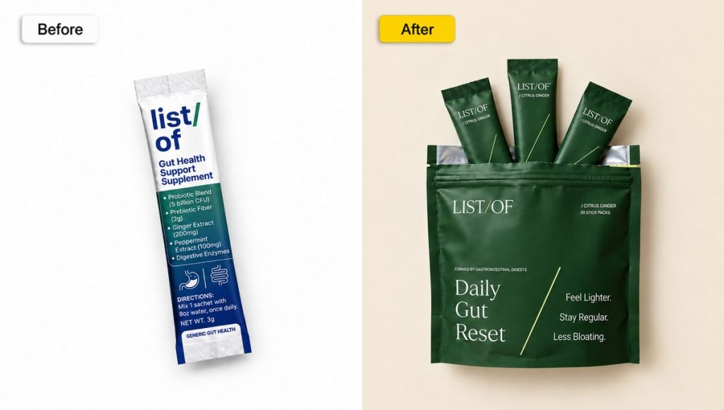
The new packaging also supports the product’s broader positioning as a once-daily gut health routine combining multiple forms of digestive support. The updated system gives that positioning more room to come through without overcrowding the package with competing claims or unnecessary design elements.
- Clearer daily gut positioning
- Stronger visual hierarchy
- More focused presentation
LIST/OF shows how a product packaging redesign can do more than modernize aesthetics. By simplifying the presentation and aligning the packaging with the product’s core proposition, the redesign creates a stronger connection between the product, its daily-use format, and the wider brand identity.
4. Brown Body Reset: Turning a Generic Supplement Look Into a Purpose-Built AM/PM System
Brown Body Reset needed packaging that could communicate a much more specific product story. The range uses a two-part system with AM Recharge for daytime support and PM Restore for nighttime support, so the packaging needed to make that structure immediately clear instead of presenting the products as unrelated wellness supplements.
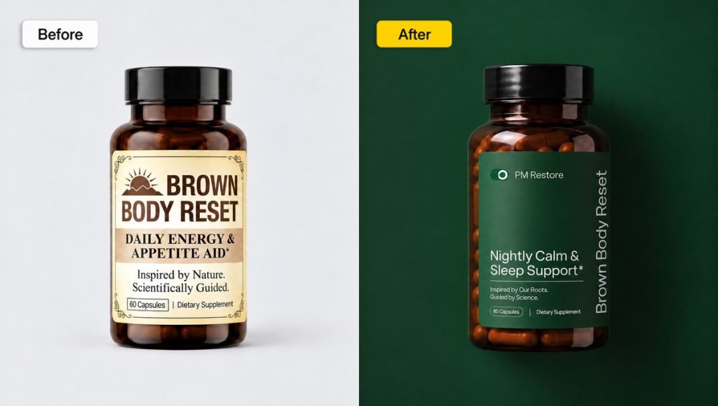
The redesign creates a more distinctive system through stronger typography, clearer hierarchy, and a deliberate visual relationship between the two formulas. Each product has its own role, but the shared structure keeps both products connected within the same packaging system.
- Clearer AM/PM system
- Stronger audience positioning
- More cohesive product family
Brown Body Reset shows how a packaging redesign can make product architecture itself easier to understand. Aligning the visual system with the product routine creates clearer communication without adding unnecessary complexity to the package.
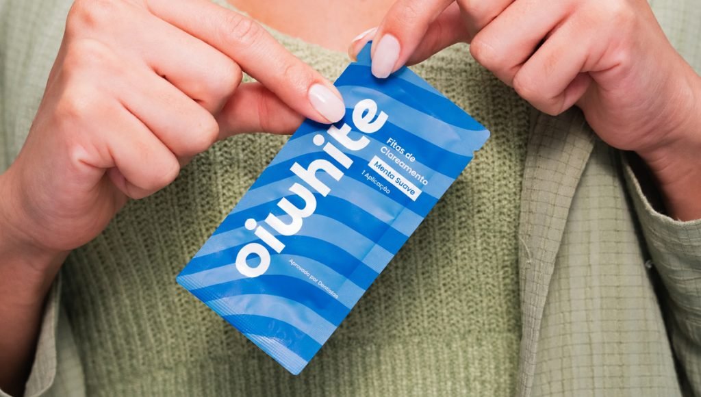
5. Oiwhite: From Clinical Whitening Packaging to a Bold Consumer Brand
Oiwhite needed to move away from the typical clinical aesthetic used across many teeth-whitening products. The original direction did not fully support the younger, digitally native audience the brand wanted to reach, so the redesign needed to feel more modern and distinctive while keeping the product trustworthy and easy to understand.
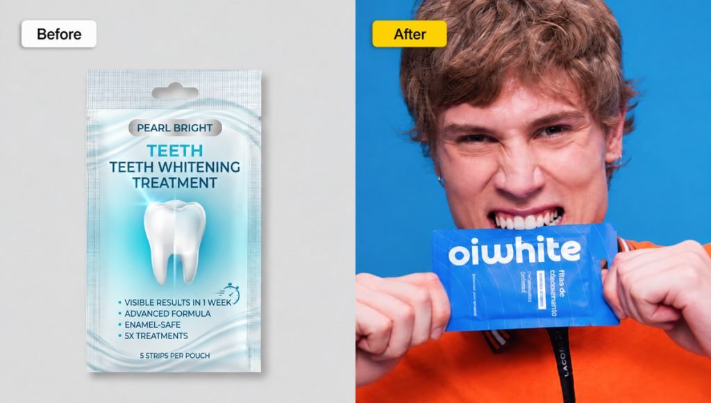
The new packaging uses stronger typography, brighter color, and flexible graphic elements to create a friendlier and more recognizable system. The result is packaging designed to work consistently across retail, ecommerce, social media, and other marketing touchpoints while keeping the main product information clear.
- More distinctive identity
- Stronger digital presence
- Clearer product communication
Oiwhite demonstrates how a packaging redesign can move a product away from category clichés without sacrificing credibility. The redesign combines a professional structure with more expressive design elements, giving the product a clearer place within a crowded oral-care market.
Brand Refresh vs Full Packaging Redesign
Not every product needs a complete redesign. A focused brand refresh may be enough when the main issue is typography, color balance, imagery, spacing, or messaging, while the core structure and recognizable brand elements still work well. This approach can improve the presentation without making the packaging feel unfamiliar to existing customers.
A full packaging redesign makes sense when the original packaging no longer reflects the product, limits future growth, creates confusion, or performs poorly across retail and digital channels. It can also support a larger repositioning when packaging and marketing need to communicate a different direction rather than simply introduce a cosmetic update.
The goal is to determine what deserves to stay and what actually needs to change. Familiar logos, colors, naming cues, or other distinctive elements can preserve recognition, while improvements to structure, hierarchy, typography, imagery, and messaging can give the packaging a stronger new look without disconnecting it from the existing brand identity.
The Packaging Redesign Process
A strong packaging redesign process should move through clear stages rather than jumping directly into visual changes. A practical process usually includes auditing the current packaging, defining the redesign strategy, developing the new system, testing it, and preparing the final design for production and launch.
Each stage should solve a specific problem identified at the beginning of the project. This keeps the redesign focused, helps the team make more consistent decisions, and reduces the risk of making changes that look better visually but do not improve how the packaging performs in real use.
Audit the Existing Packaging
Start by identifying what is and is not working in the original packaging. Review hierarchy, readability, product communication, shelf presence, ecommerce presentation, functionality, production limitations, and how effectively the current system supports different SKUs.
The audit can also include research into customer behavior, category conventions, retailer requirements, and competing products. This gives the team enough context to determine whether the project needs a focused upgrade or a more substantial product packaging redesign.
Define What Should Stay and What Should Change
The next step is to separate recognizable brand elements from the parts of the packaging that are creating problems. Logos, colors, naming systems, typography, or other familiar cues may still have value even when the overall design needs improvement.
Successful redesigns retain the elements that support recognition while modernizing what no longer works. When the packaging update is part of a wider brand identity design change, the same recognizable cues should remain consistent across the wider visual system.
Develop, Test and Prepare the New Packaging
Once the strategy is clear, designers can develop the updated product packaging design. Hierarchy should make the product name, type, flavor, benefits, quantity, and supporting messaging easier to understand, while typography, spacing, imagery, contrast, and other design elements create a clearer reading order. The direction may also include changes to the color scheme, packaging shape, structure, materials, finishes, or the way multiple SKUs are organized.
Before full production, the redesign should be tested at actual size, across multiple SKUs, on physical mockups, and in ecommerce thumbnails. If sustainability is part of the project, material choices should also be reviewed alongside protection, cost, production requirements, and the actual needs of the product. Consumer testing can help identify issues with clarity, recognition, or product communication before the final rollout. The rollout should also account for remaining packaging inventory, production timelines, retailer updates, and the transition from the old design to the new system.
What Makes a Successful Packaging Redesign?
A successful packaging redesign improves how a product is understood, recognized, and used without changing familiar elements simply for the sake of change. The updated system should create a stronger shelf and digital presence, communicate the product more clearly, and remain consistent with the wider brand identity.
Function matters just as much as aesthetics. New packaging should work across production, storage, transport, retail, and everyday use while keeping important information easy to find. It should also remain connected to the wider product branding system so the package, messaging, and other customer touchpoints continue to present the product consistently.
The strongest redesigns balance consumer appeal with practical strategy. If business performance is part of the objective, results should be compared with a pre-redesign baseline rather than simply assuming the new look boosted sales or revenue. Useful indicators can include sales performance, ecommerce conversion, customer feedback, retailer response, and how easily customers recognize the redesigned product.
Common Packaging Redesign Mistakes
A packaging redesign can solve real problems, but it can also create new ones when changes are made without a clear reason. Most mistakes happen when appearance receives more attention than recognition, product communication, scalability, or real-world performance.
- Changing too much at once: Removing every familiar cue can make new packaging feel disconnected from the product customers already recognize.
- Following trends instead of solving problems: A modern style only makes sense when it supports the product, customer needs, and goals of the redesign.
- Ignoring the wider product range: A design that works for one SKU may fail once new flavors, sizes, formats, or products are introduced.
- Skipping real-world testing: Mockups, print tests, ecommerce thumbnails, readability, handling, and production details should all be reviewed before rollout.
A stronger approach is to treat redesign as a strategic project with clear goals, defined priorities, and testing before launch. For consumer products, the packaging should also support the wider CPG branding strategy rather than function as an isolated visual asset.
Packaging Redesign Checklist
Before approving a packaging redesign, review the new system as a complete product experience rather than judging the front panel alone. The design should remain clear, recognizable, scalable, and practical across production, retail, ecommerce, and future product extensions.
| Area | What to Check |
| Brand Recognition | Keep recognizable brand elements where they still add value. |
| Product Hierarchy | Make the product name, type, flavor, and key information easy to scan. |
| SKU System | Ensure future flavors, sizes, and products can fit the same design system. |
| Shelf Presence | Check whether the packaging remains distinctive in a retail environment. |
| Ecommerce | Review thumbnails, product photography, retailer listings, and mobile presentation. |
| Functionality | Confirm the structure, opening, storage, and everyday use still make sense. |
| Production | Test dielines, materials, print quality, foil or other finishes, and technical limitations. |
| Compliance | Make sure required labeling and safety information remain clear and accurate. |
| Testing | Review physical mockups and real-world applications before full rollout. |
A practical checklist keeps the redesign focused on more than aesthetics. When recognition, communication, functionality, testing, and production are reviewed together, the final product packaging has a stronger foundation for a successful launch.
Final Thoughts on Packaging Redesign
A successful packaging redesign should solve clear problems in the existing system rather than simply make the product look newer. Stronger hierarchy, clearer product communication, better SKU organization, and a more distinctive shelf and digital presence can make product packaging easier to understand and more consistent across different channels.
The best redesigns also protect the parts of the brand identity that still have value. Familiar colors, logos, typography, naming systems, or other recognizable elements can maintain continuity while weaker parts of the packaging are improved through more focused design decisions.
When strategy, design, testing, production, and customer needs are considered together, new packaging can give an existing product a stronger foundation for future growth without losing what customers already recognize. The goal is not change for its own sake, but a packaging system that works better for the product, the brand, and the people buying it.
Packaging Redesign FAQs
When Should You Redesign Product Packaging?
A redesign makes sense when existing packaging feels outdated, no longer reflects the product, creates confusion, performs poorly across retail or ecommerce, or cannot support new SKUs effectively. Changes in formula, positioning, technology, business direction, or the wider product range can also make an update necessary.
What Is the Difference Between a Packaging Refresh and Redesign?
A brand refresh usually keeps the main packaging structure and identity while improving selected elements such as typography, color, imagery, spacing, or messaging. A full packaging redesign can go further by changing hierarchy, visual direction, product architecture, packaging shape, structure, or the overall system used across multiple products.
How Much Should You Change in a Packaging Redesign?
Only as much as the product actually needs. Familiar logos, colors, naming cues, or other recognizable brand elements may still have value, while weak hierarchy, unclear messaging, outdated styling, or an inflexible SKU system may require larger changes. The goal is to improve the packaging without unnecessarily sacrificing recognition.
Should a Packaging Redesign Keep the Existing Brand Identity?
In most cases, yes. A successful redesign should preserve the parts of the brand identity that still support recognition while improving the areas that no longer work. The balance depends on the strength of the original identity, the scale of the problems, and the goals of the redesign.