Food packaging design brings structure, materials, visual hierarchy, product information, and usability together in one package. The goal is not only to make food look appealing, but to protect the product, support freshness, communicate clearly, and work in the conditions where the package will be produced, transported, displayed, stored, and used.
This guide is for food brands developing new packaging or improving an existing system. It focuses on the decisions that directly shape food packaging, including format, materials, typography, imagery, sustainability, shelf performance, ecommerce presentation, production, and testing.
What Is Food Packaging Design?
Food packaging design is the process of planning the visual and structural presentation of packaging used for food products. It combines the package format, material, typography, color, imagery, required information, and practical features so the final result works as both a protective container and a clear communication surface.
Unlike a purely visual concept, food packaging must account for the product inside. Moisture, oxygen, light, temperature, grease, transport, storage, opening, resealing, and shelf life can all affect the choice of structure and material. Good design works within those technical requirements instead of treating them as an afterthought.
Clarity and hierarchy are equally important. Consumers should be able to understand what the product is, which variety or flavor they are looking at, and where to find essential information without reading through a crowded layout.
What Makes Food Packaging Design Effective?
Effective food packaging design balances protection, clarity, functionality, and visual impact. A package can look attractive, but if it is difficult to read, inconvenient to use, unsuitable for the food, or difficult to reproduce in production, the design is incomplete.
- Protection: The structure and material should protect the food from physical damage and relevant environmental factors.
- Clarity: Product name, flavor, quantity, key details, and required information should follow a clear visual hierarchy.
- Functionality: Closures, openings, storage, portioning, and handling should make sense for the product and its use.
- Presentation: Typography, color, photography, illustration, and layout should make the package easy to identify without creating visual noise.
Functional features such as easy-open formats, resealable closures, and practical storage can make food packaging easier and more intuitive to use. A simple design can also work well when it removes unnecessary competition between elements. The objective is not to make every package minimal, but to make the most important information easy to understand.
Key Elements of Food Packaging Design
The main elements of a package should work as one system. Structure determines the available space, typography organizes information, imagery helps communicate the food, and color can distinguish flavors, product types, or variants. Each decision should support the package rather than compete with other elements.
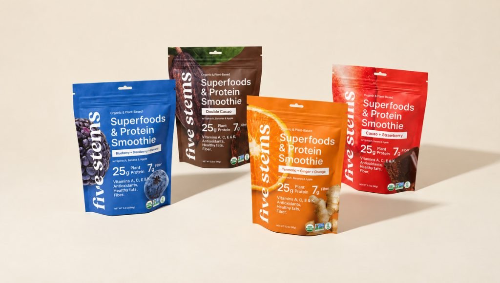
A clear hierarchy also helps the package communicate quickly in real-world conditions. When structure, type, imagery, and supporting information are planned together, the design becomes easier to scan, more consistent across different formats, and better suited to both retail shelves and digital product images.
- Structure and format: Boxes, cartons, wrappers, pouches, jars, bottles, trays, and cans create different opportunities for layout, storage, and use.
- Typography and hierarchy: Type size, spacing, contrast, weight, and placement guide consumers from the main product message to supporting information.
- Color and imagery: Color, photography, and illustration can communicate flavor, ingredients, product type, and quality before the package is opened.
- Product information: Important and required details need enough space to remain readable at the final printed size.
Color can influence immediate perceptions of flavor, freshness, intensity, and product type, so it should support the information hierarchy rather than work as decoration alone. High-quality imagery can also communicate product quality before opening, while illustration can help explain ingredients, preparation, or product characteristics.
Food packaging has also evolved into a storytelling medium. Copy, imagery, material, texture, and information can add context to the product, but creative packaging should never make the contents harder to understand.
Food Packaging Types and Materials
The right packaging type depends on the food, shelf-life needs, storage conditions, filling method, transport, and intended use. Material choice also affects weight, print quality, barrier performance, finishes, recyclability, and how the finished package feels and performs.
Paperboard and cartons are commonly used for cereals, bars, frozen foods, dry goods, and products that need a structured outer package. Flexible films and stand-up pouches are popular for snack foods, powders, dried foods, and other products that benefit from low weight, compact storage, or resealable closures.
Glass works well for many sauces, spreads, beverages, and preserved foods, while plastic can be formed into bottles, tubs, trays, films, and closures. Metal cans and tins provide strong protection for products that require durable storage. Each type creates different possibilities for printing, labeling, handling, and product presentation.
Barrier properties matter as much as appearance. Some foods need greater protection from oxygen, moisture, light, grease, or aroma transfer. Multi-layer structures, coatings, seals, and closures can help maintain freshness, but they can also affect production and recyclability. Material compatibility should therefore be considered before the visual concept is pushed too far.
Sustainable and Innovative Food Packaging
Sustainable packaging aims to reduce environmental impact without compromising product protection, usability, or food safety. Reducing unnecessary material, using lighter structures, and choosing recyclable or renewable options where suitable can all support a more efficient packaging system.
Reusable, refillable, compostable, and second-life packaging can also be useful when the format suits the food and the available recovery system. Mono-material structures may simplify recycling in some applications, while clear disposal or reuse instructions can help consumers understand how the package should be handled after use.
Innovative food packaging is also expanding through active, intelligent, edible, and soluble materials. Smart packaging can connect the physical package with digital content through QR codes, giving consumers access to preparation instructions, sourcing details, recipes, or additional product information without overcrowding the printed design.
Modified atmosphere packaging is another method used to support freshness and shelf life for suitable foods by changing the gases inside a sealed package. These technologies should always be selected according to the food, storage conditions, packaging material, and production process rather than added simply because they are new.
Food Packaging Design for Retail and Ecommerce
Food packaging needs to communicate quickly in both physical and digital environments. On shelves, the product may be surrounded by similar colors, formats, and claims. Online, the same package may first appear as a small thumbnail. In both situations, the product name, type, flavor, and most important front-panel information should remain easy to identify.
Shelf impact comes from hierarchy rather than from adding more elements. Strong contrast, clear typography, distinctive color use, and high-quality imagery can help a package stand out while keeping the food easy to understand. Color can also help consumers distinguish flavors or product varieties, but it should support navigation rather than replace clear information.
For ecommerce, packaging should be tested at small sizes. Details that look clear on a large artboard can disappear when reduced to a product card. A consistent packaging system helps multiple SKUs stay connected while giving each flavor, size, or variation enough distinction to avoid confusion.
Food Packaging Design and Production
A food packaging design needs to survive the transition from screen to finished package. Dielines define folds, cuts, glue areas, seals, safe zones, and printable surfaces, so important text and graphics need to be positioned with the physical structure in mind. Even small placement errors can become much more noticeable once the packaging is printed, folded, sealed, and assembled.
Testing is an important part of the wider packaging design process, helping identify issues with scale, structure, materials, and print before full production. Materials and print methods also affect the final result. Color, fine typography, photography, coatings, metallic surfaces, embossing, foil, matte finishes, and other treatments can reproduce differently depending on the substrate and production method.
Tactile finishes can improve the physical experience of the package, but they should have a clear purpose and remain practical to manufacture. Before a full production run, prototypes and proofs can reveal problems with scale, readability, color, opening, closing, product fit, and usability. Testing the package in realistic conditions helps identify issues before they become expensive production mistakes.
Food Packaging Design Examples
Real examples show how the same packaging principles change depending on format, available space, product type, and the information that needs to be communicated. These examples focus specifically on food packaging decisions. Looking at different applications also shows how hierarchy, imagery, color, and layout need to adapt to the practical limits of each package.
1. Primal Sweets: Protein Marshmallow Packaging
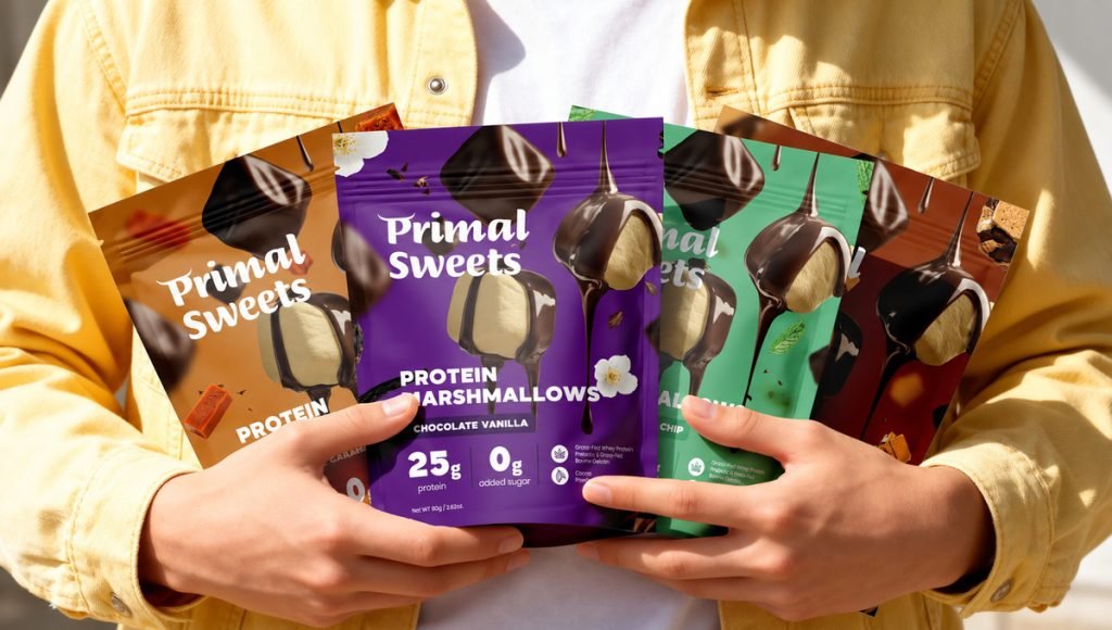
Primal Sweets uses packaging to make an unusual food concept easy to understand at first glance. Protein marshmallows combine a familiar confectionery format with a nutrition-focused benefit, so the front panel needs to communicate both without becoming crowded. This requires the design to establish a clear reading order so the product type, key benefit, and flavor can be understood within seconds.
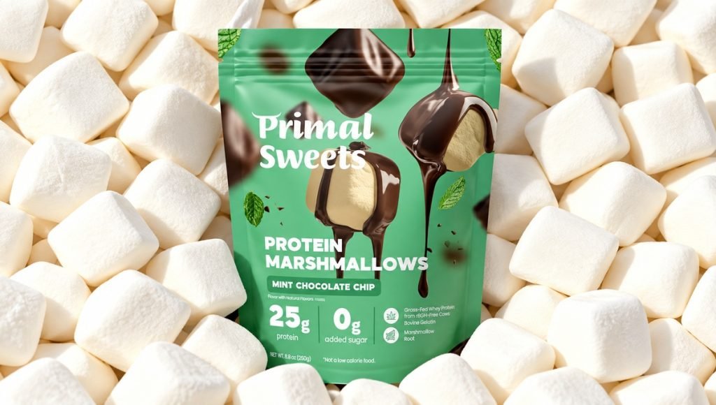
Bold color, prominent product naming, and clear separation between varieties help the package remain easy to scan. The design also provides enough flexibility for different flavors while keeping a consistent structure across the range.
- Product clarity: makes the marshmallow format easy to understand
- Visual hierarchy: gives the product name and key benefit clear priority
- Flavor differentiation: separates variants through distinct visual cues
- Shelf presence: creates impact without excessive information
This example shows how food packaging design can make a less familiar product concept feel clear, appealing, and easy to navigate. The packaging also uses imagery and hierarchy to explain the product quickly without overcrowding the front panel.
2. Five Stems: Superfood Protein Smoothie Packaging
Five Stems needs to communicate the smoothie format, flavor, ingredients, and nutrition-focused proposition within a limited package area. Clear organization prevents those messages from competing with one another. This makes hierarchy especially important, allowing the flavor, key ingredients, and nutrition-focused details to stay clear within the same front-panel layout.
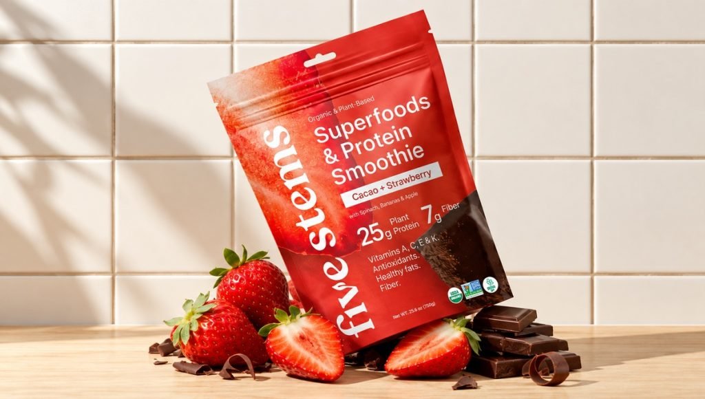
Ingredient and flavor imagery helps explain what consumers can expect from the product, while the shared layout creates consistency across varieties without making every package look identical.
- Information hierarchy: separates product name, flavor, and supporting details
- Product imagery: communicates ingredients and flavor quickly
- Variant system: keeps multiple products visually connected
- Package clarity: handles several messages without feeling crowded
Five Stems demonstrates how food packaging can balance product information and visual appeal across multiple SKUs. The design also shows how ingredient imagery and consistent layout can help different flavors remain clear while still belonging to the same packaging system.
3. Bricks Protein: Snack Bar Packaging
Bricks Protein works within a compact wrapper commonly used for snack foods and other grab-and-go products, where every element needs to earn its space. Product name, flavor, nutrition-focused information, and visual cues all need to remain readable on a narrow format. This makes careful spacing and hierarchy essential, helping the wrapper communicate the most important product details without feeling crowded at a small scale.
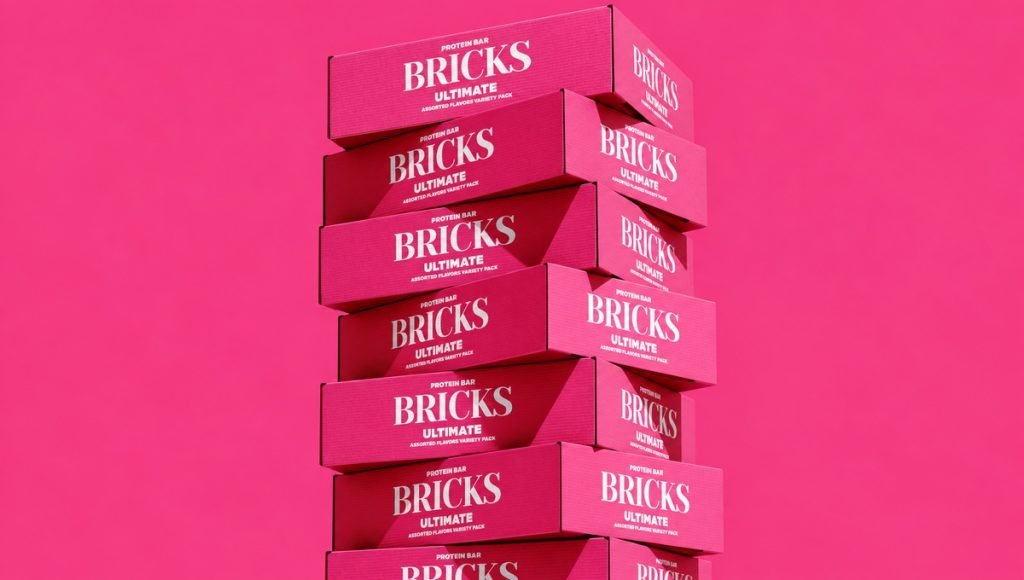
The package also needs to perform as a small ecommerce image and alongside other snack foods on shelves, which makes contrast, typography, and flavor differentiation especially important.
- Compact layout: uses limited packaging space efficiently
- Readable typography: keeps important details visible at small sizes
- Flavor navigation: distinguishes individual products within the range
- Retail and ecommerce use: maintains clarity across physical and digital presentation
Bricks Protein shows why package dimensions and viewing size should influence the design from the beginning. The compact format also shows how strong hierarchy can keep the product easy to scan across both retail shelves and ecommerce thumbnails.
Common Food Packaging Design Mistakes
Many packaging problems come from treating the artwork separately from the product, material, or production process. Reviewing the packaging as a complete system helps catch these issues before they affect usability, print quality, or the final presentation. Common mistakes include:
- Weak hierarchy: Too many messages compete for attention, making the package difficult to read quickly.
- Form over function: An unusual structure may look creative but be awkward to open, store, transport, or use.
- Poor material fit: The chosen substrate or barrier does not suit the food or expected storage conditions.
- Late production planning: Dielines, seals, folds, print limits, and finishes are considered after the concept is already approved.
- Ignoring real size: Typography and details that look clear on screen become difficult to read when printed.
- Poor information planning: Required product details are forced into leftover areas instead of being considered from the start.
Regulatory compliance should be planned into the layout from the beginning so required information can remain clear without overwhelming the design. Exact requirements depend on the food product and the market where it will be sold, so the final package should be reviewed against the applicable regulations before production.
Food Packaging Design Checklist
Before approving a package for production, review it as a complete physical system rather than focusing only on the front panel. Check how the design performs across folds, seals, edges, secondary panels, and the final assembled format. It is also important to review readability, material compatibility, and usability at actual size before the package moves into full production.
- Protection: Does the structure and material suit the food and its storage conditions?
- Hierarchy: Can consumers identify the product, variety, and key information quickly?
- Readability: Does the typography remain clear at the final printed size?
- Format: Is the package practical to fill, transport, store, open, and reseal where needed?
- Materials: Are printing, coatings, barriers, seals, and finishes compatible with the substrate?
- Variants: Are different flavors or SKUs easy to distinguish?
- Retail: Does the package remain clear when viewed among other products on shelves?
- Ecommerce: Is the front panel understandable at thumbnail size?
- Information: Is enough space reserved for applicable product and regulatory details?
- Production: Have dielines, bleed, safe areas, folds, seals, color, proofs, and final artwork been checked?
A physical proof or prototype can reveal issues that are easy to miss on a monitor and helps confirm that the finished food packaging performs as intended.
Final Thoughts on Food Packaging Design
Effective food packaging design brings protection, materials, structure, hierarchy, usability, and visual presentation into one practical system. The best results come from considering the food, package format, production process, shelf environment, and digital presentation before the artwork is finalized. The packaging should also work consistently within the wider food branding system without compromising its structural, functional, or production requirements.
When those decisions support one another, the package becomes easier to understand, more practical to use, and better prepared for real-world production. Creative packaging can still be distinctive, modern, and memorable without sacrificing the clarity and function that food products require.
A strong final package should also remain consistent from the initial concept through printing, filling, transport, display, and everyday use. Reviewing those stages as part of the design process helps ensure the packaging performs as intended after it leaves the screen.
Frequently Asked Questions About Food Packaging Design
What Makes a Good Food Packaging Design?
Good food packaging design balances product protection, clarity, usability, and visual appeal while remaining practical to manufacture. It should suit the food and chosen material, organize information clearly, and remain effective on shelves, in storage, and in ecommerce images.
What Materials Are Used for Food Packaging?
Common food packaging materials include paperboard, flexible films, pouches, plastic, glass, and metal, as well as multi-material structures where additional barrier performance is needed. The right choice depends on the food, shelf life, storage conditions, filling process, transport, print requirements, and sustainability goals.
What Information Should Food Packaging Include?
The required contents depend on the product and market, but packaged foods commonly need space for product identity, quantity, ingredients, nutrition information, allergen declarations, and applicable storage or preparation details. The layout should reserve this space from the beginning so important information remains readable rather than being added at the end.
How Should Food Packaging Be Designed for Ecommerce?
Food packaging for ecommerce should remain recognizable and easy to understand at small image sizes. Clear typography, strong contrast, simple hierarchy, and distinct product or flavor cues help the main package view remain useful, while secondary images can explain details that are difficult to show on the front panel.