Product packaging examples show how thoughtful packaging design can turn everyday products into recognizable brands. For CPG businesses, effective product packaging combines visual appeal, clear product information, and a distinctive brand identity. From wellness supplements to functional snacks, creative packaging design helps products stand out at first glance while making it easier for consumers to understand what makes each brand different.
At Bemain Studio, we create branding and packaging design for food, wellness, supplement, and personal care brands. In this article, we explore eight real projects from our work, including Primal Sweets, Tuned, LIST/OF, Five Stems, Brown Body Reset, Mood Jooce, Thrive, and OiWhite. These packaging design examples highlight the creative decisions behind each project and show how different approaches to color, typography, imagery, and product presentation can strengthen brand recognition.
8 Product Packaging Examples From Our Work
The best product packaging examples demonstrate how creative packaging design responds to different products, audiences, and brand goals. At Bemain Studio, we’ve developed packaging systems for functional snacks, supplements, wellness products, and personal care brands. Each project below shows how distinctive visuals, clear messaging, and consistent design can help a product communicate its value.
1. Primal Sweets: Making Functional Snack Packaging Stand Out
Primal Sweets is a high-protein marshmallow brand that needed packaging to communicate both nutritional benefits and the enjoyment of a sweet treat. We refreshed its brand identity with vibrant colors, playful typography, and larger product imagery that makes each flavor easier to recognize. The creative packaging design brings the marshmallows forward while keeping important protein information visible, creating a consistent look across the product range.
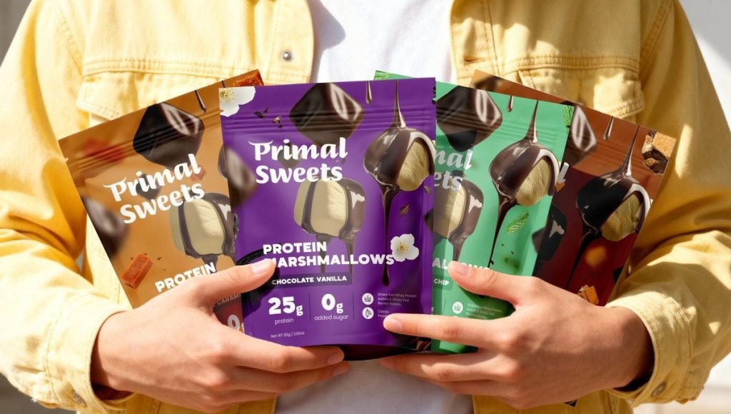
The project demonstrates how good packaging design can balance appetite appeal with functional messaging. Rather than relying on dense text or generic fitness visuals, we created a flexible system that connects the packaging with the brand’s Shopify website. This approach gives each flavor a distinctive personality while maintaining a recognizable identity across retail and ecommerce.
2. Tuned: Premium Packaging for a Sleep Supplement Brand
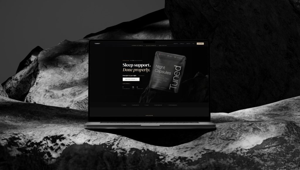
Our Tuned packaging project focused on a sleep supplement brand that required a premium visual identity without relying on traditional clinical packaging. At Bemain Studio, we created branding, packaging design, and a website built around a minimalist aesthetic, clean lines, and carefully organized product information. The dark packaging, restrained typography, and focused layout give the product a distinctive appearance while keeping its purpose clear to consumers.
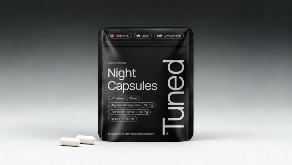
This project shows how minimalist design can communicate quality and build trust in the wellness industry. Rather than filling the package with decorative elements or competing messages, we focused on visual hierarchy and consistency across physical and digital touchpoints. The result is product packaging that maintains its premium character on retail shelves and ecommerce product pages, where clear information and strong brand recognition are equally important.
3. LIST/OF: Making Gut Health Products Easy to Understand
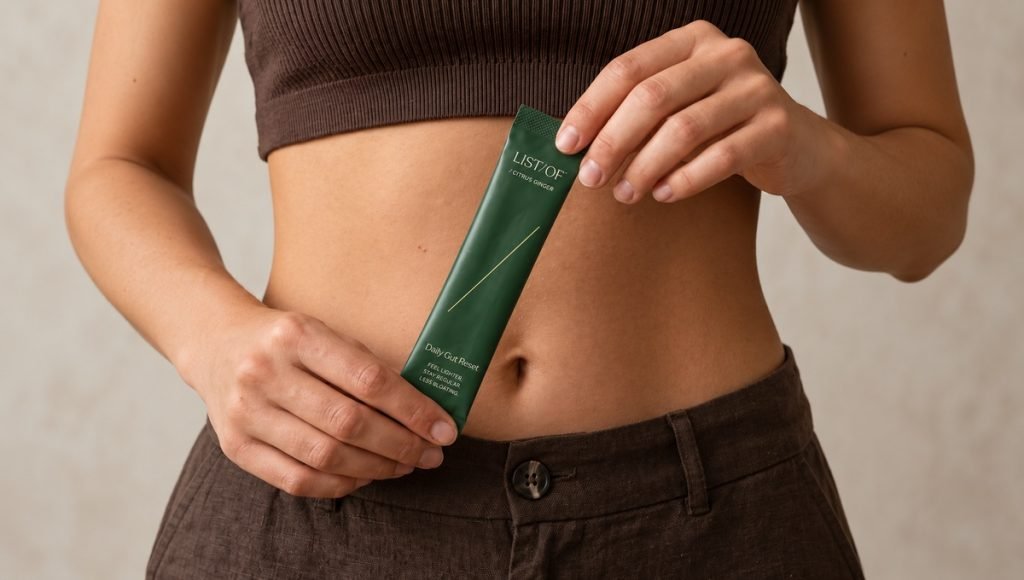
The LIST/OF supplement brand is built around a convenient daily stick-pack format for gut health. At Bemain Studio, we developed its branding, packaging design, and website to create a consistent visual experience across physical and digital channels. The product packaging combines clear typography, ingredient-inspired imagery, and a carefully structured layout that helps consumers recognize the product, understand its purpose, and identify the individual servings inside.
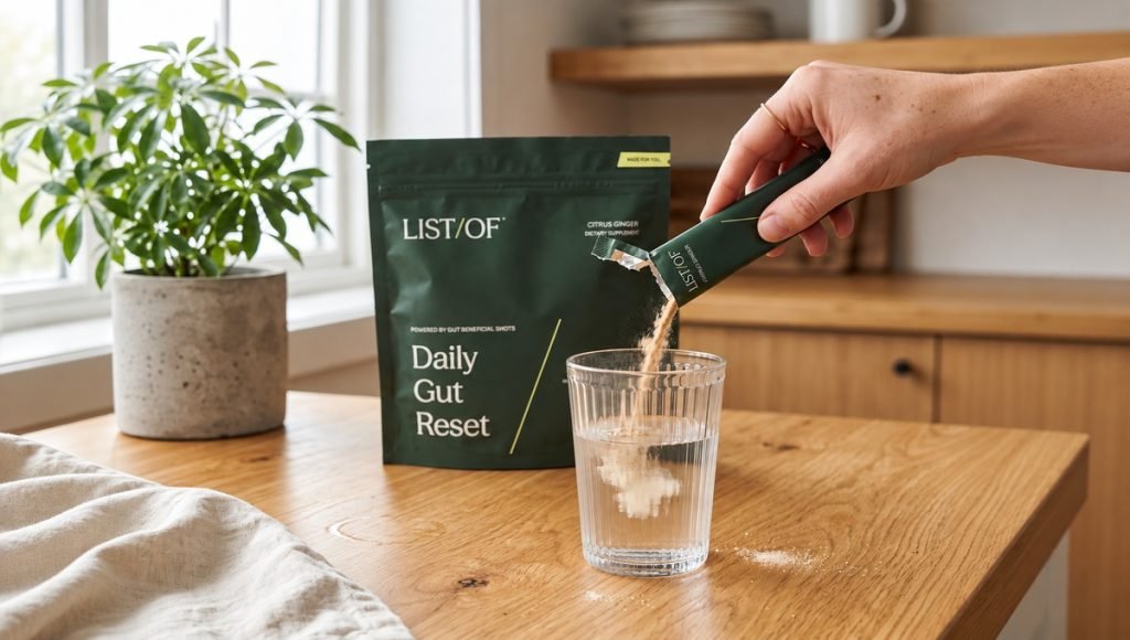
The project highlights how creative packaging can make a specialized wellness product feel approachable without sacrificing clarity. By presenting the outer pouch and individual stick packs as part of one cohesive design system, we helped communicate how the supplement fits into a daily routine. This approach connects packaging appeal with practical product information, creating a recognizable brand experience across different customer touchpoints.
4. Five Stems: Using Color and Imagery Across a Superfood Range
Five Stems is a superfood protein smoothie brand that needed a recognizable packaging system across multiple flavors. At Bemain Studio, we developed a creative packaging design built around vibrant colors, ingredient photography, and consistent typography. Each flavor has its own visual character, while the shared layout keeps the entire product range connected. This approach makes the packaging visually appealing and helps consumers distinguish products at first glance.
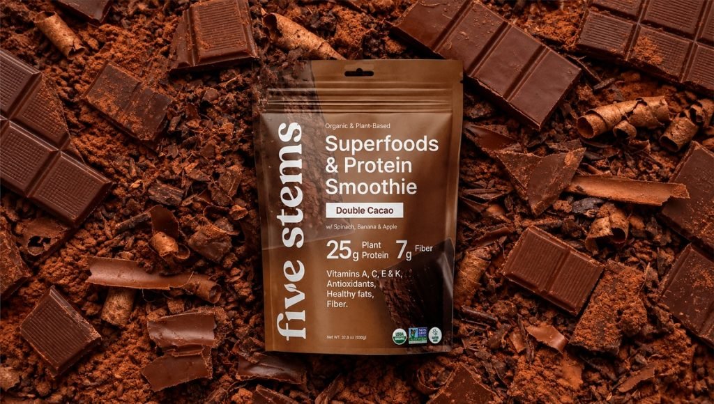
Five Stems demonstrates how thoughtful product packaging design can balance nutritional messaging with appetite appeal. Instead of treating every flavor as a separate design, we created a cohesive visual system that extends across packaging and promotional materials. The combination of bold imagery, distinctive colors, and clear information helps the brand maintain consistency while giving each product enough personality to stand out in a competitive market.
5. Brown Body Reset: Creating a Clear Identity for AM and PM Supplements
Brown Body Reset is a wellness supplement brand offering two products, AM Recharge and PM Restore, designed for different parts of a daily routine. At Bemain Studio, we developed the branding, packaging design, and website with a consistent visual system that connects both supplements. The cream and green labels, clean typography, and organized product information help consumers distinguish the two formulas while recognizing them as part of the same brand.
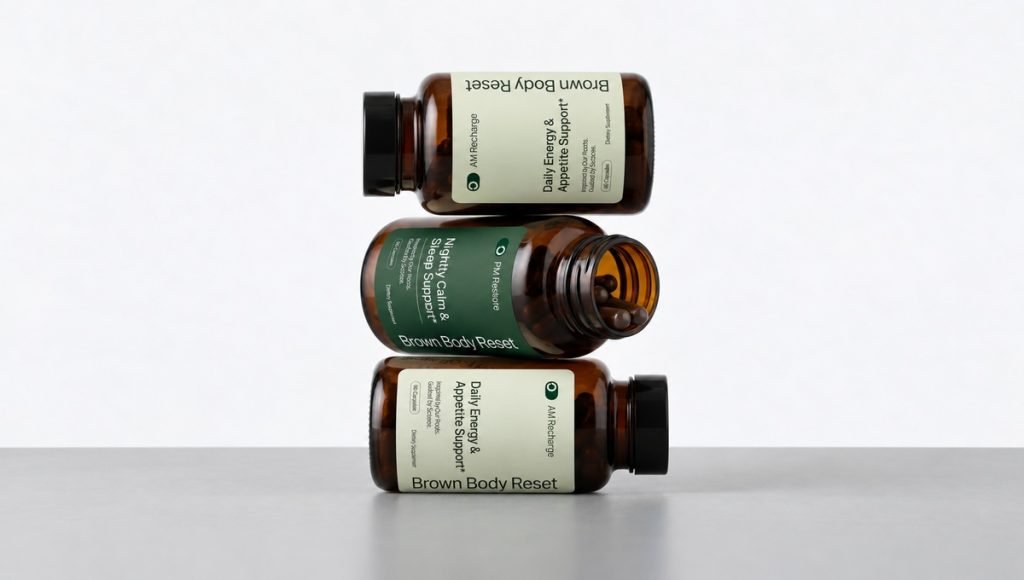
This project demonstrates how good packaging design can communicate different product purposes without creating separate identities for every item. By maintaining consistent visual elements across the bottles and digital experience, we created a cohesive presentation that supports clarity and brand recognition. For wellness businesses, this approach helps customers compare related products while keeping the brand’s packaging distinctive and easy to understand.
6. Mood Jooce: Creative Packaging Beyond Traditional Wellness Design
Mood Jooce is a calming supplement brand that takes a different approach to traditional wellness packaging. At Bemain Studio, we created a playful, retro-inspired brand identity built around oversized typography, vibrant colors, and expressive graphics. Instead of relying on the minimalist aesthetic often seen in the supplement industry, we developed a distinctive packaging design that communicates personality while keeping the product’s purpose easy to understand.
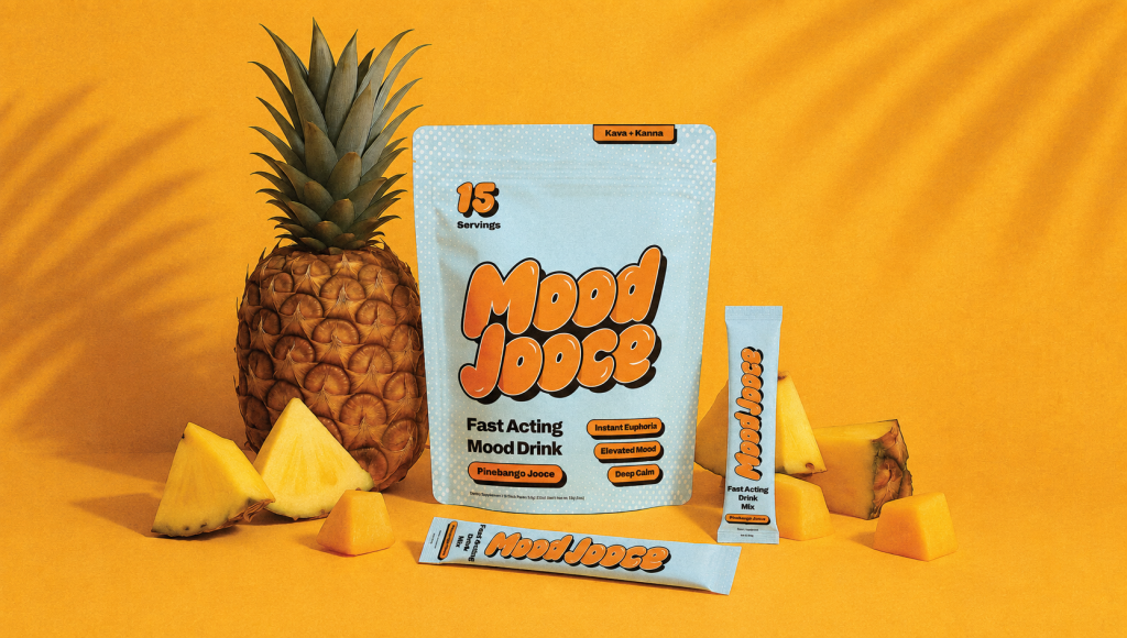
This project shows how creative packaging can challenge familiar industry conventions without losing clarity. The combination of bold lettering, playful graphics, and contrasting colors gives Mood Jooce a fun twist while maintaining a consistent visual identity. For wellness brands targeting a younger or more expressive audience, this approach demonstrates how unique packaging can reflect brand values, create visual appeal, and help products stand out in a crowded market.
7. Thrive: Combining Playful Design With Functional Candy Benefits
Thrive packaging project showcases a protein gummy brand that brings together functional nutrition and the enjoyment of candy. At Bemain Studio, we developed packaging design built around vibrant colors, bold typography, and playful graphics that give the product a distinctive personality. The packaging highlights its protein benefits while using an energetic visual style that makes the gummies feel approachable and appealing to consumers looking for functional snacks.
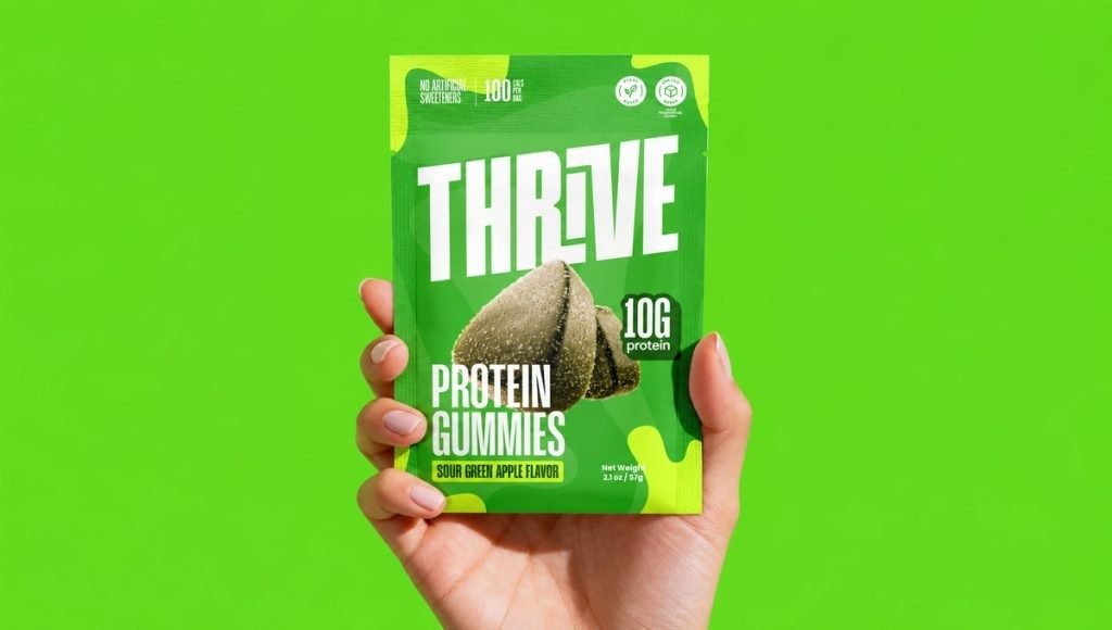
Thrive demonstrates how creative packaging design can balance nutritional information with the fun associated with traditional candy. Instead of relying on generic sports nutrition visuals, we created a recognizable design system that allows different flavors to maintain their individuality while sharing a consistent brand identity. This approach helps the product packaging communicate its value at first glance and gives the brand a flexible visual foundation for future products.
8. OiWhite: Building a Distinctive Oral Care Packaging Identity
Our OiWhite packaging project brings a fresh visual approach to vegan teeth whitening strips in the oral care market. At Bemain Studio, we created branding and packaging design that moves beyond the conventional clinical appearance of dental products. Bold typography, vibrant colors, and a clean layout give the packaging a distinctive personality while making the product’s purpose easy to recognize.
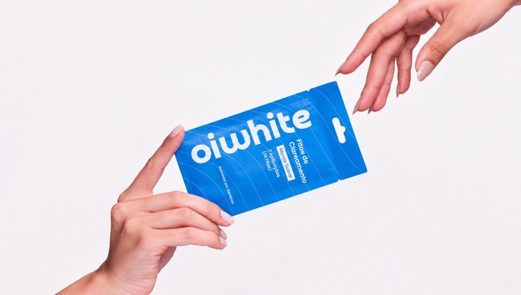
This project demonstrates how creative packaging design can make everyday personal care products feel more engaging without compromising clarity. By combining expressive visuals with a consistent brand design, we developed product packaging that stands apart from traditional oral care aesthetics. OiWhite shows how thoughtful packaging ideas can create a memorable identity while keeping essential product information accessible to consumers.
What These Packaging Design Examples Have in Common
Although each CPG brand serves a different audience, these product packaging examples reveal the same priorities: clarity, consistency, and a distinctive visual identity. Our approach to CPG branding connects those elements to a brand’s wider positioning. Beyond visual appeal, effective packaging design should communicate product value and make brands recognizable at first glance. These product packaging examples demonstrate how thoughtful design decisions work across food, wellness, and personal care products.
Clear Product Information Comes First
Good packaging design helps customers understand a product within seconds. Names, flavors, benefits, and essential details need a clear hierarchy rather than competing for attention. LIST/OF organizes its gut health messaging around daily use, while Thrive keeps protein information visible without losing its playful character.
Clarity matters even more when products serve different purposes. Our approach to supplement label design prioritizes readable information and easy comparison. Brown Body Reset follows the same principle: AM and PM products remain distinct without looking like separate brands.
Strong Brand Identity Across Product Ranges
A strong brand identity should be recognizable across flavors, formulas, and packaging formats. Five Stems differentiates smoothie varieties through ingredient imagery and color, while Primal Sweets uses a consistent layout across its marshmallow range. Both systems let individual products stand out without losing their connection to the wider brand.
At Bemain Studio, we build packaging around repeatable design rules rather than isolated visuals. Consistent typography, imagery, and color help growing brands introduce new products while remaining recognizable on shelves and online.
Creative Packaging That Reflects the Target Audience
Creative packaging works best when it fits the target audience. Mood Jooce uses expressive lettering and playful graphics to make a calming supplement feel approachable. OiWhite takes a bold direction for oral care, replacing familiar clinical cues with vibrant colors and clear product communication.
Tuned shows that a different approach can work just as well. Its restrained colors and minimalist aesthetic communicate a premium wellness experience. The goal is to choose a visual direction that reflects the product and its audience, not simply follow trends.
Packaging Design That Works Online and on Shelves
Packaging must work on a retail shelf and in a small ecommerce thumbnail. Primal Sweets carries recognizable flavor colors into its online presentation, while Five Stems uses ingredient imagery to help shoppers distinguish varieties quickly.
We also consider how packaging connects with ecommerce product pages, where photos, product information, and purchase options share limited space. Strong visual consistency helps customers recognize the same product across physical and digital channels.
How We Approach Product Packaging Design at Bemain Studio
At Bemain Studio, our packaging design process begins with understanding the product, its target market, and the brand’s positioning. We consider what consumers need to recognize at first glance, which information deserves priority, and how the visual identity should reflect the product’s character. From typography and color to imagery and layout, every creative decision should serve a clear purpose rather than simply follow current design trends.
Our work with Primal Sweets, Tuned, LIST/OF, and other CPG brands demonstrates how different products require different design solutions. We develop custom packaging systems that balance creativity, functionality, and consistent brand presentation across product variations and digital platforms. Whether creating a new identity or refreshing an existing one, our goal is to help brands communicate their value through distinctive product packaging that supports recognition and future growth.
Ready to Make Your Product Packaging Stand Out?
The strongest product packaging examples show that effective design goes beyond an attractive appearance. From clear product information to distinctive visuals and consistent branding, every element should help consumers understand and recognize the product. Whether you’re launching a wellness supplement, functional snack, or personal care brand, thoughtful packaging design can create a stronger connection between your product and its target audience.
At Bemain Studio, we help CPG businesses develop brand identities, creative packaging, and digital experiences that work together. Our approach combines strategic thinking with distinctive design to create packaging that reflects your brand values and supports long-term growth. If you’re preparing to launch a new product or improve an existing packaging system, we’d love to discuss how we can bring your vision to life.
Frequently Asked Questions
What Makes a Good Product Packaging Design?
Good packaging design combines clear product information, distinctive visuals, and practical functionality. It should help consumers recognize the product, understand its benefits, and connect it with the brand. Strong product packaging also maintains consistency across different formats, flavors, and retail or ecommerce environments.
How Does Packaging Design Support Brand Identity?
Packaging design communicates a brand’s personality through typography, colors, imagery, and visual consistency. A recognizable design system helps customers identify products from the same brand while distinguishing them from competitors. Creative packaging can also reinforce brand values and create a more memorable customer experience.
What Should CPG Brands Consider Before Designing Packaging?
CPG brands should define their target audience, product positioning, and key information before developing packaging concepts. The design should reflect the product’s purpose, remain readable at different sizes, and accommodate future product variations. Working with a branding and packaging design studio can help connect these decisions into a cohesive visual system.