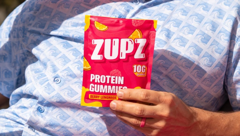
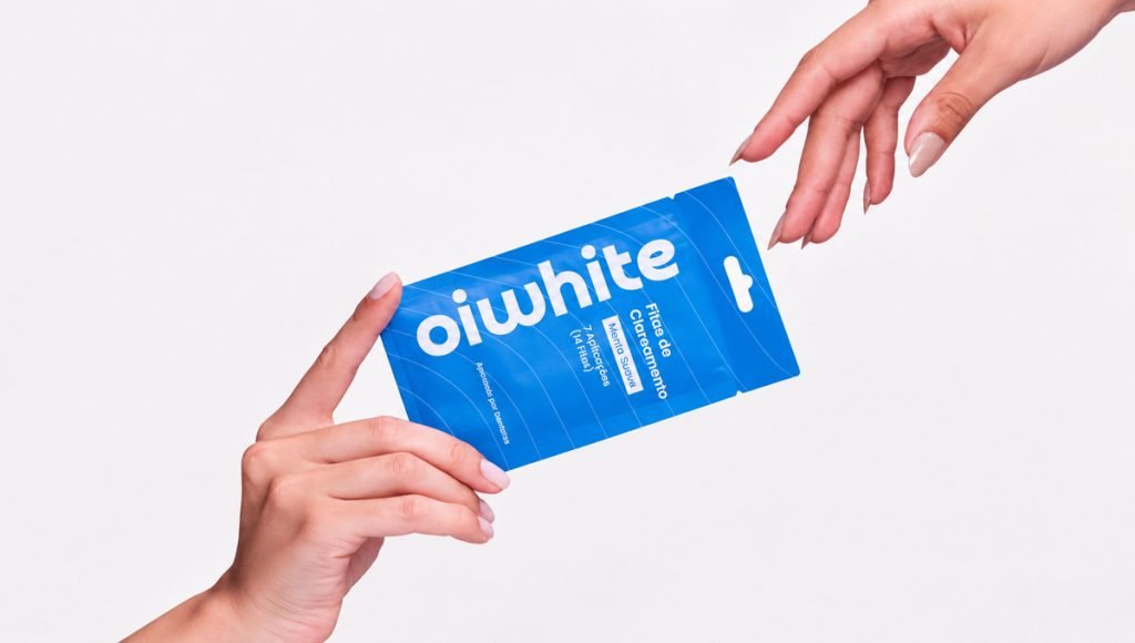
Supplement label design combines visual communication, regulatory requirements, and brand identity within a limited amount of packaging space. A strong supplement label should help people understand what the product is, recognize the most important details quickly, and connect the package with the brand without making the design feel crowded.
This guide explains the core parts of supplement label design, including required details, Supplement Facts, front and back panel structure, typography, supplement packaging, print preparation, ecommerce presentation, and common mistakes. It is written for supplement brands, founders, designers, and teams creating a new label or improving an existing one.
What Is Supplement Label Design?
Supplement label design is the process of organizing the visual and written elements that appear on a supplement package. It brings together the product name, logo, typography, colors, graphics, claims, directions, and compliance content so the label works as one clear system.
Good label design supports supplement branding by making products easier to recognize across retail shelves, Amazon listings, Shopify stores, and future SKUs. Visual hierarchy and typography are important because they help people find the main message first and then move through supporting details in a logical order.
Color psychology can influence consumer perceptions of dietary supplements, while colors and graphics should still align with the wider brand identity and target audience. Transparency in ingredient sourcing can enhance consumer trust in dietary supplements, but any sourcing description should be accurate and supported by the business responsible for the product.
What Should a Dietary Supplement Label Include?
For supplements sold in the United States, FDA requirements influence the structure of a dietary supplement label. Core elements include the statement of identity, net quantity of contents, Supplement Facts, ingredient details when applicable, and the name and place of business of the manufacturer, packer, or distributor.
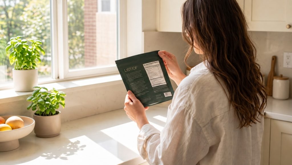
Planning these requirements early gives the designer enough room to build an attractive layout without forcing important details into whatever space is left at the end. It also reduces the risk of major layout changes once compliance content, packaging dimensions, and production specifications are finalized.
Product Name, Identity Statement and Net Quantity
The principal display panel should make the supplement easy to identify at a glance. The statement of identity should clearly state what type of dietary supplement it is, while the net quantity of contents should also appear prominently on that panel. Depending on the format, this may be expressed as the number of capsules, tablets, gummies, packets, or another appropriate measure.
From a label design perspective, the product name, supplement type, main benefit, and quantity should have different levels of emphasis. The main message should remain clear without allowing decorative elements or secondary copy to compete with it.
Supplement Facts, Ingredient List and Allergens
Supplement labels generally include a Supplement Facts panel with serving details and the amounts of dietary ingredients. When an ingredient list is required, ingredients are listed in descending order of predominance by weight. FDA labeling rules also generally require ingredients to be declared by their common or usual names. The FDA ingredient-labeling guidance explains these requirements in more detail.
Major food allergens must also be disclosed under applicable federal allergen-labeling requirements. FALCPA established the original major-allergen framework, while later legislation added sesame as the ninth major food allergen. The ingredient list, allergen disclosure, and Supplement Facts should remain easy to locate instead of being buried among unrelated label content.
Directions, Warnings and Company Information
Directions for use, applicable warnings, and company details should be organized with readable typography and enough contrast. The label also needs the name and place of business of the manufacturer, packer, or distributor, together with other details required for the specific supplement.
Clear organization keeps the functional side of the supplement label consistent with the wider design. A company may have a strong brand vision, but regulatory details still need their own space, hierarchy, and review process.
How to Structure a Supplement Label
A clear supplement label starts with a deliberate information hierarchy. The front should communicate the main message quickly, while the side and back panels should provide deeper detail without making customers search through unrelated content. This structure helps guide attention naturally from the product identity to supporting details and required information.
The front usually needs the logo, product name, supplement type, main benefit or description, important claims, and quantity to work together in a clear order. Size, weight, spacing, and contrast help set the level of emphasis for each element. An attractive front label should not try to sell every benefit at once.
The side and back panels normally carry Supplement Facts, ingredients, directions, warnings, and company details. Grouping related content into clear sections, with consistent alignment and typography, creates a stronger label design system across the entire package.
Supplement Label Design Principles
Strong supplement label design should make products recognizable, readable, and visually consistent. The focus is not to decorate every available area, but to use design decisions that support the product description, target audience, and purchasing decision. Each visual element should have a clear purpose within the overall layout.
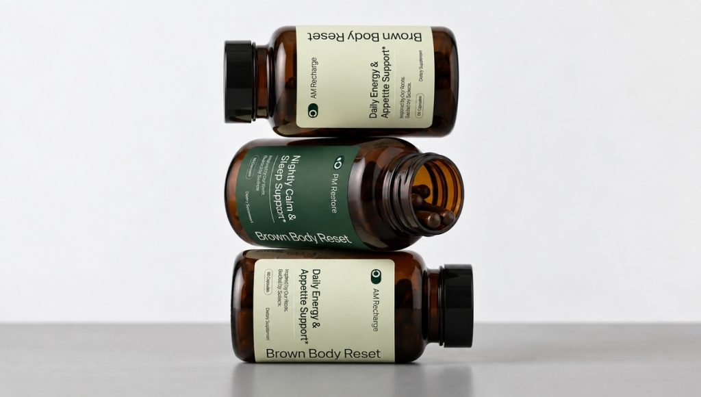
A strong design system also helps the product feel more deliberate and easier to navigate across different touchpoints. When typography, color, spacing, and graphics follow the same direction, the label can communicate more clearly without relying on unnecessary visual complexity.
Visual Hierarchy and Typography
Visual hierarchy determines what customers notice first, second, and third. The product name and primary benefit should have a higher level of emphasis than supporting details, while smaller copy should remain legible at the final size.
Typography should support both the brand and usability. A distinctive display type can add personality, but informational text needs clear letterforms, sufficient contrast, and spacing that still works after the label is printed.
Color, Graphics and Brand Identity
Color can help differentiate formulas, benefits, or SKUs and can influence how supplements are perceived. The palette, logo, graphics, and image style should support the same brand identity instead of feeling like separate design ideas.
Natural imagery may suit some wellness supplements, while performance-focused products may use stronger contrast or a more technical direction. The right approach depends on the audience, category, and positioning rather than copying a style simply because it looks attractive.
White Space and Readability
White space separates sections and gives important elements room to stand out. It can make dense content easier to follow and protect readability when multiple claims, dosage details, or regulatory statements need to fit within a small area.
The artwork should also be checked at actual size on screen and in print. What appears clear when enlarged may become difficult to read once the label reaches its final dimensions.
Supplement Facts and Label Compliance
Supplement Facts is one of the most information-dense parts of supplement label design. The panel has specific formatting rules, so it should be treated as a structural part of the layout rather than something added after the creative work is complete. Its size, placement, and surrounding spacing can influence how the entire back or side panel is organized.
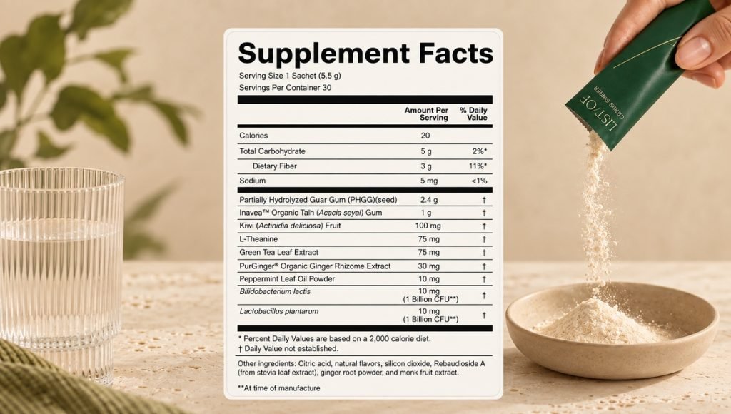
Planning the Supplement Facts area early also makes it easier to balance regulatory content with branding and supporting information. This helps prevent the label from feeling crowded and reduces the need for major layout adjustments later in the design process. It should also work with the wider supplement packaging design so the information fits the format, dimensions, and structure of the final package.
Claims and FDA Disclaimer
Claims should be truthful, non-misleading, and appropriate for the supplement. Dietary supplement labeling cannot present a product as diagnosing, treating, curing, or preventing disease unless it is legally regulated for that purpose.
Certain structure/function claims require substantiation, FDA notification, and the standard FDA disclaimer. The design needs enough space to present that disclaimer properly. The FDA guidance on structure/function claims explains the applicable requirements.
Compliance Review Before Production
Compliance review should happen before files are approved for production. The team should confirm the statement of identity, net quantity, Supplement Facts, ingredient names, allergen disclosure, company details, directions, warnings, and claims that appear on the package.
Design expertise and regulatory expertise serve different roles. Professional design services can organize and present these details clearly, while the business remains responsible for confirming that the final wording complies with the market in which the product will sell.
Supplement Packaging and Print Considerations
Supplement packaging and label design need to work as one system. Container size, material, surface shape, usable print area, and application method can all change how the artwork appears once it moves from a design file to physical packaging. A clear brand identity system helps keep typography, color, graphics, and product presentation consistent across different packaging formats.
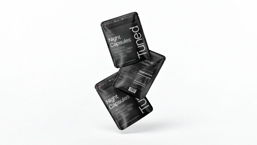
Good packaging design considers these constraints early. This protects the visual system, reduces unnecessary changes, and makes it easier to adapt the same label design across future supplement packaging formats.
Match the Label to the Packaging Format
A label created for a narrow bottle will not behave the same way on a wide jar or flexible pouch. Curved surfaces, seams, and limited viewing angles can change which elements appear first and how much content can be seen at one time.
The designer should adapt the layout to the actual package instead of simply resizing an existing file. This is especially important when a company uses one packaging design system across several types of supplement packaging.
Dielines, Materials and Finishes
An accurate dieline defines the dimensions, trim, bleed, safe areas, and other production boundaries. Artwork should be built on the printer’s specifications rather than estimated from a mockup.
Material choice can also change the finished result. Paper, film, clear stock, matte finishes, gloss finishes, metallic effects, and specialty treatments can affect how color, the logo, typography, and graphics appear. These packaging design choices should support the visual direction while remaining practical for the container and production method.
Proof and Final Package
Before the final print order, review the artwork at actual size and confirm color settings, image resolution, bleed, safe areas, and specialty production instructions. A physical proof or accurate prototype can flag alignment, scale, or readability issues that are easy to miss on a large screen.
The final check should also confirm that the label is attached correctly and that important elements do not disappear around curves or seams. Feedback at this stage can protect both the appearance and usability of the finished supplement packaging.
Designing Supplement Labels for Ecommerce
Supplement label design also needs to work when packaging appears as a small image on a phone, laptop, or another device. On ecommerce pages, customers may first see the product at thumbnail size, so the main identity, product description, and primary differentiator should remain recognizable without zooming in.
This matters on Amazon, Shopify, and other online stores where several products may appear together. Clear ecommerce presentation can make supplements easier to recognize and compare, while a consistent set of images, backgrounds, viewing angles, and supporting graphics helps the range feel connected. Ecommerce assets should extend the same packaging design system rather than introduce a separate visual language.
Common Supplement Label Design Mistakes
Many supplement label design problems come from trying to fit too much into one small area or from designing before final packaging specifications are known. The most common issues can usually be prevented with a clearer process and earlier review.
- Too much on the front: too many benefits, claims, icons, and descriptions weaken the main message.
- Weak contrast: small text or low-contrast typography reduces readability.
- Poor hierarchy: when every element has equal emphasis, customers do not know where to look first.
- Inconsistent SKUs: changing the layout and graphic style across the set reduces recognition.
- Ignoring the final package: flat artwork can hide problems that only appear after the label is attached to the container.
Testing early gives the designer and team time to collect feedback, make necessary changes, and confirm that the system works before production starts.
Supplement Label Design Examples
Real supplement label design examples show how hierarchy, typography, color, and packaging design decisions work together on actual products. They can provide useful ideas for balancing consumer appeal with the amount of content that needs to fit within a limited area. The strongest examples also reflect a clear supplements branding strategy, connecting the label with the product’s wider positioning and visual identity.
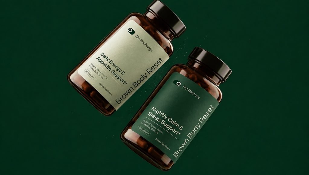
The strongest examples follow a clear set of rules rather than relying on decoration alone. The logo, product name, dosage details, graphics, and supporting copy each have a defined role, helping the label design stay consistent across a growing number of SKUs.
Teams can also be inspired by how real projects solve spacing, hierarchy, or packaging constraints without copying the look itself. Finished work shows how supplement label design performs once it is printed and attached to the final supplement packaging, demonstrating practical expertise more clearly than an isolated concept.
Supplement Label Design Checklist
Before approval, use a short checklist to confirm that the supplement label works visually, technically, and functionally:
- The product name and supplement type are easy to identify.
- The statement of identity and net quantity are positioned correctly.
- Supplement Facts, ingredients, allergens, directions, and company details appear where required.
- The logo, typography, colors, and graphics follow the brand system.
- The hierarchy remains clear at the final label size.
- Claims and disclaimers have been reviewed.
- The dieline, bleed, safe areas, and print setup match the printer’s specifications.
- The label design has been checked on the final supplement packaging format.
- The SKU set is consistent enough to support future products.
- The main ecommerce image remains clear at thumbnail size.
A final proof gives the team one more opportunity to catch issues before the full production run. For brands serving a global community, each target market needs its own regulatory review rather than assuming one label can be used everywhere.
Final Thoughts on Supplement Label Design
Strong supplement label design brings together visual hierarchy, regulatory content, brand identity, packaging design, and production requirements in one focused system. The aim is to create an attractive package that customers can understand quickly while giving every important element enough room to work.
When the structure is planned early, the same label design system can support new supplements, different supplement packaging formats, retail displays, and ecommerce pages without starting from zero each time. Whether the work is handled internally, by an individual designer, or through professional label design services, a clear system creates a stronger foundation for the company as its range grows.
Frequently Asked Questions About Supplement Label Design
What Makes a Good Supplement Label Design?
Good supplement label design combines clear hierarchy, readable typography, consistent brand elements, and accurate details. It should look attractive while making the most important content easy to find on both the physical package and an ecommerce image.
What Information Should a Dietary Supplement Label Include?
For U.S. supplements, the label generally includes the statement of identity, net quantity of contents, Supplement Facts, applicable ingredient details, company information, and other disclosures required for the specific formula and claims. The FDA provides an overview of these core requirements in its dietary supplement guidance.
How Do You Design a Supplement Label for Multiple SKUs?
Start with a shared set of rules for typography, logo placement, hierarchy, spacing, and packaging structure. Colors, names, benefits, or supporting graphics can change between products while the core label design remains recognizable.
What Is the Difference Between Supplement Packaging and Label Design?
Supplement packaging covers the complete physical presentation, including bottles, jars, pouches, stick packs, and other formats. Label design focuses on the visual and written layer applied to that packaging, including typography, graphics, claims, product details, and required statements.
How Should Supplement Labels Be Designed for Ecommerce?
The main identity and key differentiator should remain visible when the package appears as a small image. Clear contrast, controlled hierarchy, consistent photography, and supporting Amazon or Shopify graphics can make products easier to recognize and compare online.