Brand identity design is about more than creating a logo or choosing colors. It brings together visual direction, messaging, personality, and strategy so a company can present itself clearly and consistently. When these elements work together, they help people recognize the company more easily and understand what it represents.
This comprehensive guide is for founders, business owners, marketing teams, and anyone building or refining a brand. It explains what brand identity includes, why it matters, how the branding process works, and how design can support recognition, trust, and long-term growth across websites, packaging, social media, and other customer touchpoints. Most people experience a brand through several touchpoints, so those experiences need to feel connected.
What Is Brand Identity Design?
Brand identity design is the process of creating the visual and verbal elements a company uses to represent itself. These can include the logo, color palette, typography, imagery, messaging, and brand voice, all shaped around the company’s positioning, values, and target audience.
A well-defined brand identity gives a team clear rules for how the brand should look and communicate. It creates a stable identity system that can be applied across different platforms while still leaving enough flexibility for campaigns, products, services, and future growth.
Brand Identity vs. Branding
Brand identity is what a company intentionally creates and controls, while branding is the broader process that shapes how customers perceive and experience the company. Branding is influenced by communication, reputation, customer service, product quality, marketing, and the opinions people form over time.
In one sentence, brand identity is the controlled expression of a company, while branding is the ongoing perception built around it. This difference matters because even a polished identity cannot fully control how customers respond to real experiences.
Brand Identity vs. Visual Identity
Visual identity focuses on the visible parts of a brand, such as the logo, typography, colors, imagery, icons, and graphic style. Brand identity is broader because it also includes voice, messaging, personality, values, and other elements that define how the company communicates.
A clear visual identity helps customers recognize the same company across a website, product, campaign, or social post, but it works best when the visuals support the wider strategy and intended perceptions rather than functioning as decoration alone.
Why a Strong Brand Identity Matters
A strong brand identity gives a company a clearer position in the market and makes its communication easier to understand. It also creates a foundation for building trust, developing loyalty, and shaping consistent customer perceptions over time. When the identity reflects the company’s values and positioning, customers can more easily understand what makes the business relevant to them.

A cohesive brand identity brings logo design, typography, color and visual elements together into one recognizable system.Beyond recognition, a clear identity gives teams a shared direction for future decisions and helps maintain clarity as the company introduces new products, services, or campaigns. This makes it easier to grow without constantly redefining how the brand should look, sound, or present itself to its audience.
Helps Brands Stand Out in Competitive Markets
In a crowded marketplace, many companies offer similar products or services. A distinct identity can make the difference by helping the target audience quickly identify what the company stands for and why its offer is relevant. Clear differentiation also makes it easier for customers to remember the brand when comparing several options.
For example, a premium service business may use restrained typography and a focused color approach, while a playful consumer brand may use more expressive design. The goal is not to follow competitors, but to create choices that reflect the brand’s own positioning. These choices should reinforce the intended market perception rather than rely on style alone.
Builds Recognition and Consumer Trust
Consistency makes it easier for people to recognize a brand across repeated interactions. When the logo, typography, tone, and core design cues remain familiar, customers can connect different experiences back to the same company. Repeated exposure to the same recognizable elements also helps the brand become easier to remember over time.
Polished and consistent communication can also help build trust. Over time, that familiarity can contribute to loyalty, stronger awareness, and a more credible reputation. When customers know what to expect from the brand, each new interaction can reinforce the positive associations they have already developed.
Creates Consistency Across Brand Touchpoints
A brand should feel connected wherever people meet it, from a site or retail store to sales materials, social media, email, and customer support. Consistency does not mean every application must look identical; it means the same core ideas and rules are recognizable across channels. This helps create a more unified customer experience and makes it easier for people to connect each interaction back to the same company.
Core Elements of a Brand Identity
A complete brand identity combines several elements that work together. Each one should reflect the company’s positioning, audience, values, and brand personality while giving the team enough flexibility to create new materials as the organization grows. When these elements are aligned, they create a clearer foundation for how the brand should look, communicate, and behave across different touchpoints.
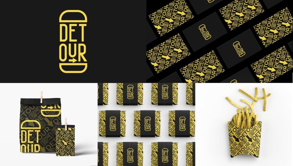
A cohesive brand identity brings logo design, color, typography, imagery and messaging together into one consistent visual and verbal system.The goal is not simply to make each element attractive on its own, but to make sure they support the same overall direction. This creates stronger cohesion between the logo, typography, imagery, messaging, and other brand assets while making future design decisions easier to manage.
Logo Design
The logo is the core anchor mark or symbol of a business. It should be distinctive, legible, and flexible enough to work across large and small applications without losing its meaning. Within a broader identity system, it works alongside other visuals rather than carrying the entire brand by itself.
A practical logo family can include a primary mark and a small number of logo variations for different layouts. The purpose of these variations is flexibility, not to create unrelated versions of the same brand.
Color Palette
A color palette helps define the visual character of a company and can influence how customers interpret its personality. The chosen colors should work together, support the intended positioning, and remain practical across print and digital applications. When used consistently, they can also strengthen recognition and make different brand materials feel more connected.
Typography
Typography establishes hierarchy, voice, and readability. Type choices can make a brand feel modern, premium, technical, warm, or playful, so they should reflect the intended personality rather than simply follow a trend. Consistent typography also makes information easier to navigate while creating a clearer connection between different brand applications.
Imagery and Visual Style
Imagery defines the style of photography, illustration, graphics, icons, and other supporting visuals. These visuals give campaigns and content a more recognizable look, even when the logo is not the leading element on the page. A consistent image direction also helps reinforce the brand’s mood, personality, and overall visual character across different applications.
Brand Voice and Messaging
Brand voice defines how a company speaks, while messaging determines what it needs to communicate. Both should feel authentic to the company’s values, promise, audience, and market position, and they should reinforce the same promise across products and services. Clear messaging also helps customers understand products or services without forcing every piece of communication to sound exactly the same.
How Brand Identity Supports Marketing Strategy
Brand identity and marketing strategy should support the same positioning and business goals. A clear design direction gives marketing teams a reliable foundation for campaigns, content, sales communication, and advertising without rebuilding the brand for every new idea. This alignment also makes it easier to keep communication focused as campaigns change across different channels and audiences.

A flexible brand identity helps maintain recognition as products, formats, and visual applications evolve.When strategy and identity are developed together, marketing decisions become more consistent and easier to scale. Teams can introduce new messages, formats, or offers while still working from the same core direction, which helps the brand grow without feeling fragmented.
Connecting Positioning With Visual Communication
Positioning defines who the company is for, what it offers, and why it matters to the target audience. Design translates that strategy into choices customers can see and understand, including typography, layout, imagery, tone, and other creative concepts.
For example, a company that promises simplicity should avoid putting unnecessary complexity into every page or campaign. The visual direction should reinforce the same meaning as the positioning.
Keeping the Brand Consistent as It Grows
As a company adds services, products, team members, or new markets, consistency becomes harder to maintain. A defined brand identity system gives the organization a consistent framework to follow while still allowing campaigns and content to adapt to different audiences.
This makes it easier to develop future marketing without losing the elements customers already associate with the company or the wider business. It also gives teams more confidence to explore new ideas while keeping the brand recognizable and connected to its established direction.
The Brand Identity Design Process
The brand identity design process turns research and strategy into a practical set of design decisions. A thoughtful branding process usually starts before the logo, with a clear understanding of the market, audience, company goals, and the perceptions the brand wants to shape. This foundation helps the team develop a system rather than a collection of disconnected visuals.
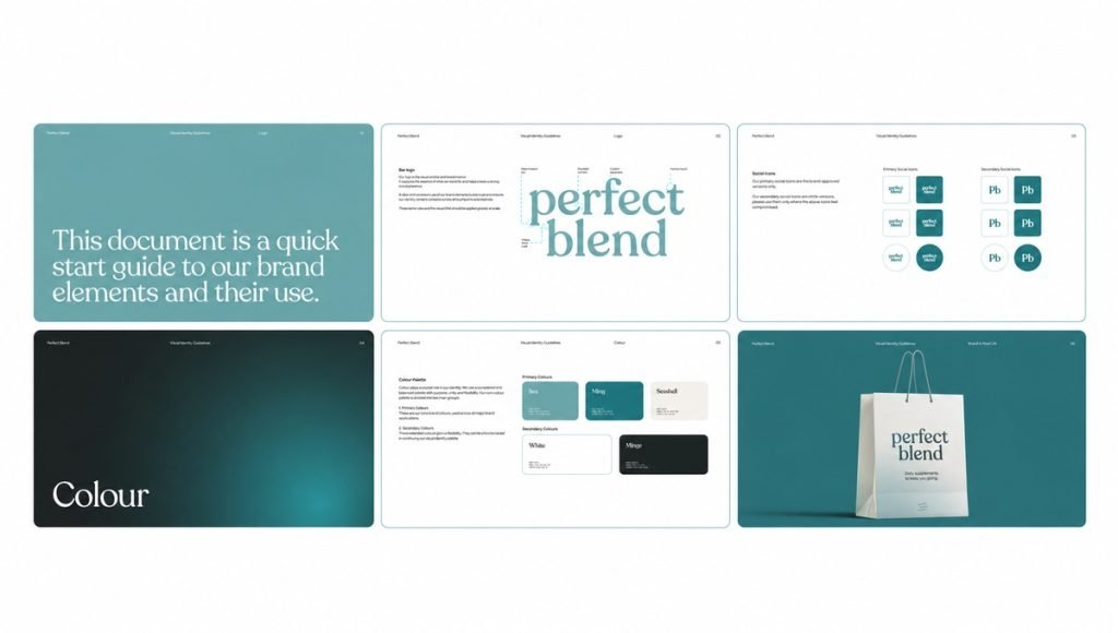
Brand guidelines bring logo, color, and visual identity decisions into a consistent system for future applications.Each stage should build on the one before it, from research and positioning to visual exploration, application, and final brand guidelines. Following a clear process makes it easier to evaluate decisions, gather useful feedback, and create an identity that works consistently across real brand touchpoints.
Research and Brand Strategy
The process starts by researching the company, target audience, competitors, market context, and existing customer feedback. This helps define the mission, vision, values, positioning, and the key concepts the new direction needs to communicate, including the perceptions and promise the company wants to build over time.
Good research also gives designers useful knowledge before visual work begins, reducing the risk of creating something attractive but disconnected from the business strategy. It also helps uncover patterns in customer expectations, competitor positioning, and market gaps that can guide more relevant design decisions.
Defining the Visual Direction
Once the strategy is clear, designers can explore concepts for typography, color, imagery, layout, photography, and other creative elements. Stylescapes or similar visual references can help organize concepts and compare possible directions before detailed design begins.
This stage gives the team a chance to review options, provide feedback, and identify the direction that best reflects the company’s positioning. It also helps narrow the visual concepts before more detailed design work begins, reducing unnecessary revisions later in the process.
Designing the Logo and Visual Identity
The next stage develops the logo together with the wider visual identity system. The mark, typography, graphic language, imagery, and supporting visuals should feel connected rather than designed as separate pieces. This creates a more cohesive direction and makes it easier to apply the identity consistently across different formats.
Testing the work at different sizes and in real examples can reveal whether the design remains clear and practical before the direction is finalized. It can also show where adjustments are needed to improve readability, balance, or flexibility across different applications.
Applying the Identity Across Brand Touchpoints
After the core direction is established, it should be tested across real applications such as a website, packaging, presentations, social media, sales materials, and selected advertising formats. Putting the work into context shows how well the design performs outside a presentation. This step can also reveal practical issues with hierarchy, readability, or consistency before the identity is rolled out more widely.
Creating Brand Guidelines
Brand guidelines document the rules that keep future work consistent. They can define logo usage, typography, colors, imagery, layout, voice, and other standards the internal team or external partners need to follow. Clear brand guidelines also give people easier access to the information they need when creating new materials, which reduces guesswork as the company grows.
How Visual Identity Works Across Real Brand Applications
Design decisions become more valuable when they work in real situations. The same visual direction should be flexible enough to support different formats, digital experiences, products, campaigns, and customer-facing materials without losing familiarity. This flexibility helps the brand stay coherent even when each application has different functional or visual requirements. This becomes especially important when the identity extends into physical product experiences, where structure, materials, hierarchy, and presentation still need to support the same brand direction.
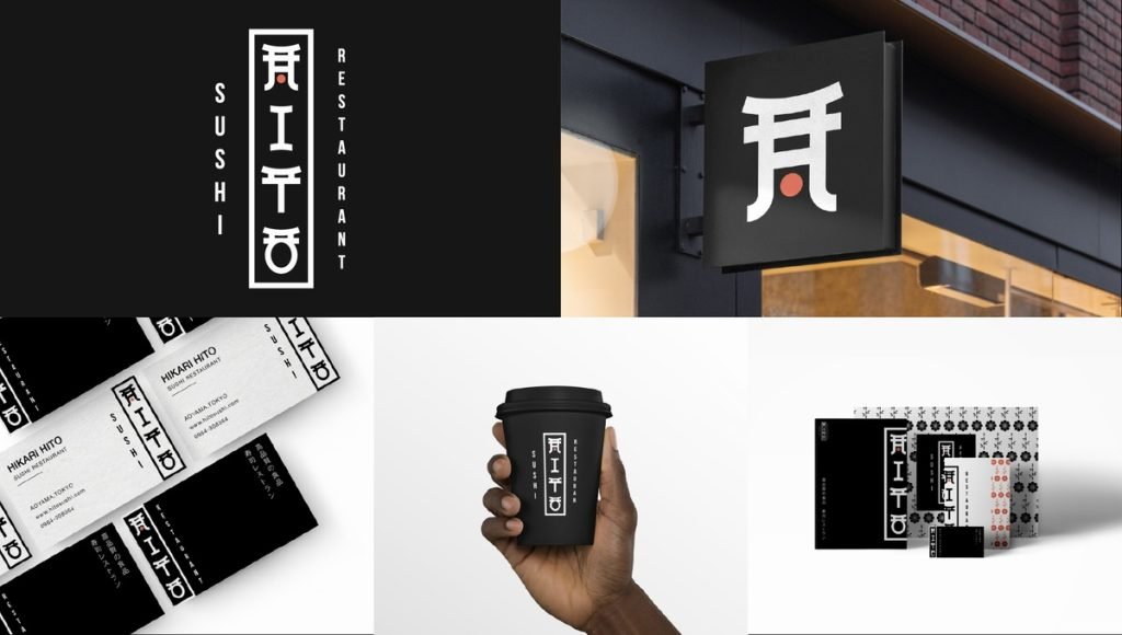
A consistent visual identity keeps the brand recognizable across physical spaces, packaging, print, and other real-world applications.Real-world applications also reveal whether the identity is practical enough for everyday use. Seeing the design across multiple touchpoints can expose where additional rules, adaptations, or supporting elements are needed before the system is used more broadly.
Logo Systems and Brand Marks
A complete logo system can include the primary logo, secondary marks, icons, symbols, and other logo variations designed for different uses. These elements should remain visually connected while adapting to different sizes, layouts, and applications.
A flexible set of brand marks gives a company more ways to apply its identity without losing recognition across websites, packaging, social media, signage, and other touchpoints.
Packaging and Product Design
Packaging can turn brand strategy into a physical customer experience. Typography, layout, product hierarchy, imagery, and materials should help customers identify the product while keeping it connected to the wider company and its design direction.
For example, a growing product line may use shared structural cues while changing selected colors or details to separate individual SKUs. This creates order without making every item look identical, whether it appears in a retail store, online store, or digital product listing.
Websites and Digital Experiences
A website should carry the same design direction through typography, layout, imagery, interface elements, and tone. A consistent site makes it easier for customers to connect the digital experience with other parts of the company. A flexible design framework also allows new pages, services, campaigns, or content to be added without redesigning the site from scratch.
Social Media and Marketing Assets
Social media, email, presentations, and campaign assets often require many formats. Clear rules help the team create and adapt visuals for different platforms while keeping the communication recognizably connected to the same brand. This also makes it easier to produce new assets efficiently without losing consistency as content needs change.
Common Brand Identity Design Mistakes
Brand work can lose effectiveness when individual design choices are made without a clear strategy behind them. The strongest work connects research, design, communication, and practical application instead of treating each asset as a separate task. This broader approach helps each decision contribute to the same overall direction rather than creating isolated pieces that compete with one another.
A clear process also makes it easier to spot weaknesses before they spread across multiple touchpoints. When teams review how the brand performs as a whole, they can correct inconsistencies, simplify unnecessary elements, and make future design decisions with greater confidence.
Following Trends Without a Clear Strategy
Trends can provide inspiration, but they should not lead the branding process. Copying popular styles without considering the audience, positioning, or long-term direction can create work that looks current but has little connection to the company. It can also make the brand harder to distinguish when competitors are relying on the same visual trends.
An authentic approach uses trends selectively and keeps the larger strategy in control. Design choices should support the brand’s character, values, and positioning rather than simply reflect what is popular at the moment. This helps create a direction that can stay relevant for longer and evolve more naturally over time.
Inconsistent Visual Elements
Unrelated fonts, colors, logo treatments, layouts, and image styles can make a company harder to identify. Consistency does not require rigid repetition, but the main design cues should remain connected from one application to the next. A shared visual language helps different materials feel like part of the same brand even when their format or purpose changes.
Overcomplicating the Identity
Too many fonts, colors, concepts, graphic elements, or messages can make communication harder to follow. A focused direction is often easier for customers to understand and easier for a team to maintain as it develops new services and materials. Simplifying the system can also make important information easier to prioritize and reduce unnecessary visual competition.
Designing a Logo Without a Larger Brand System
A logo alone is not a complete identity. Without supporting typography, imagery, layout principles, messaging, and usage rules, a company may struggle to create a consistent experience beyond the mark itself. Building these elements together gives the logo a clearer role within a broader system and makes the brand easier to apply across different touchpoints.
How to Maintain a Brand Identity Over Time
A brand does not stay effective simply because it was designed well at launch. As the business develops, regular review helps the team protect familiar elements while deciding where updates are genuinely needed. This becomes especially important as the organization adds new services or enters new markets.

A before-and-after packaging redesign shows how a brand can evolve its visual identity as its positioning and market presence develop.Ongoing maintenance also helps the company respond to changes in customer expectations, new communication channels, and practical design needs without losing its established direction. Small, intentional adjustments can keep the brand relevant while preserving the elements that already support recognition and trust. The goal is to keep the brand consistent and coherent while allowing enough flexibility for different contexts and formats.
Use Clear Brand Guidelines
Brand guidelines give teams and partners a shared reference for everyday design and communication. They should be specific enough to prevent inconsistency but practical enough that people can use them without unnecessary friction. Clear documentation also makes onboarding easier and reduces the risk of different teams interpreting the brand in conflicting ways.
Keep the Visual Direction Consistent
Consistency helps customers connect separate experiences with the same company. Periodic reviews can identify where templates, rules, or additional feedback are needed, especially when more people gain access to brand assets. This makes it easier to catch small inconsistencies early before they spread across multiple touchpoints.
Evolve the Brand Without Losing Recognition
Brands can evolve without replacing everything customers already know. A visual refresh may refine typography, imagery, or digital applications while preserving the distinctive elements that carry the most recognition and meaning.
Rebranding is a larger decision and may involve revisiting positioning, mission, vision, and values. When change is needed, a well-defined process helps the company evolve with purpose instead of following short-term trends.
Final Thoughts on Brand Identity Design
Effective brand identity design connects strategy, design, and communication into a clear foundation for the company. It helps customers understand who the brand is, supports recognition across touchpoints, and gives teams a practical structure for future work and long-term success. When these parts work together, the brand can communicate more clearly without relying on individual assets to do all the work.
The importance of consistency grows as a company expands. Thoughtful design choices, clear guidelines, and a disciplined branding process make it easier to develop the brand without losing the qualities customers already know and trust. This balance allows the company to evolve while keeping the core identity familiar and relevant.
Frequently Asked Questions About Brand Identity Design
What Does Brand Identity Design Include?
Brand identity design can include logo design, typography, color, imagery, messaging, brand voice, and usage rules. Together, these elements create a controlled expression of the company that can be applied across digital and physical touchpoints.
Why Is Brand Identity Design Important?
It helps a company communicate its positioning, create a more consistent customer experience, and become easier to identify over time. It can also support marketing strategy, trust, loyalty, and future growth.
What Is the Difference Between Branding and Visual Identity?
Branding is the broader process that shapes how customers perceive and experience a company. Visual identity refers specifically to the visible design elements used to represent it, while the wider brand also includes positioning, voice, reputation, customer experience, and other factors that shape perception.