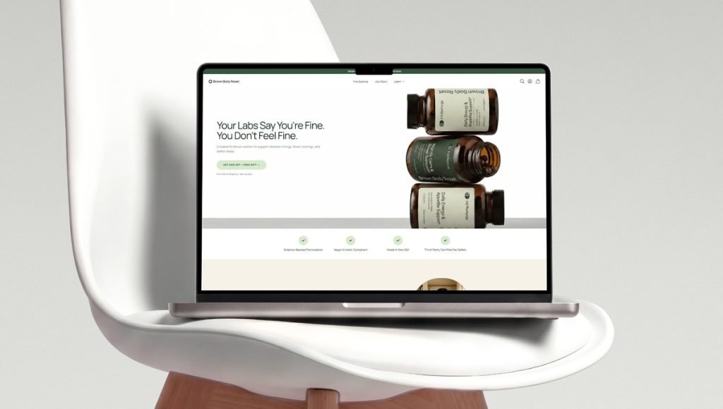
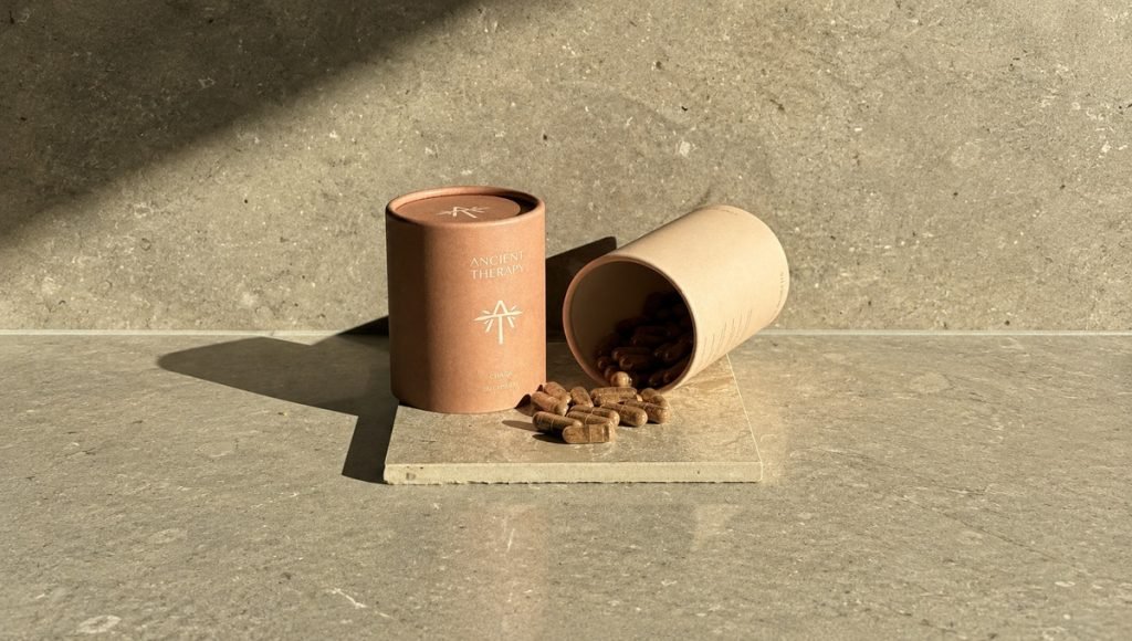
A brand refresh can change how customers recognize, understand, and experience a product without completely reinventing it. In this rebranding case study, we explore how Bemain Studio updated Primal Sweets, a high-protein marshmallow brand, through a new logo, redesigned packaging, and a more cohesive visual identity across its Shopify website.
The project focused on making nutritional benefits easier to recognize, giving each flavor a distinct look, and balancing playful snack appeal with a premium feel. We’ll compare the original and updated packaging, explain the design choices behind the transformation, and share lessons for CPG brands that want to connect with their target audience across retail and e-commerce.
Meet Primal Sweets: The Brand Behind the Project
Primal Sweets is a high-protein marshmallow brand built around a simple idea: giving a familiar sweet treat a functional twist without losing the fun of eating it. Its products combine indulgent flavors with protein-focused nutrition, creating a different option from conventional marshmallow snacks. In a competitive snack market, the brand identity needed to express both sides of that proposition.
Packaging is often a customer’s first introduction to a product. Shoppers need to understand what they’re looking at, spot the nutritional highlights, and tell flavors apart at a glance. Those priorities informed our strategy for Primal Sweets and helped shape a recognizable design system for its packaging and website.
The brand’s positioning creates an interesting challenge for its packaging: it needs to feel like an enjoyable treat while keeping the protein-focused message visible. That balance is especially relevant for better-for-you snack brands that need to communicate more than one product benefit at a glance.
Before the Refresh: The Original Brand Identity
Before the redesign, Primal Sweets used a predominantly black resealable pouch with cream-colored, block-style lettering and a prominent logo. Nutritional information, including 25g of protein and calorie details, occupied much of the front. Small illustrations and limited flavor accents added detail, but the marshmallows themselves were less visually prominent.
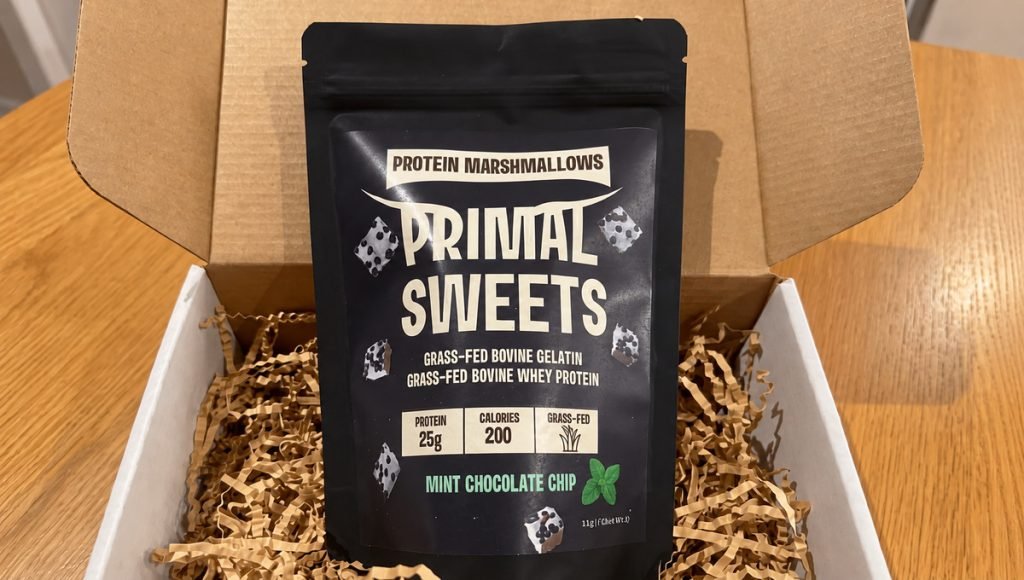
The original design communicated the product’s functional positioning. However, its darker color palette and text-heavy layout offered fewer visual cues about flavor and indulgence. There was an opportunity to influence first impressions by showing the product more clearly while retaining the nutritional messaging customers valued.
The original pouch also relied on several text elements to explain the product. In smaller online images, a simpler focal point could give shoppers a quicker sense of the flavor and the marshmallows inside. This was an opportunity to refine the presentation rather than change the product itself.
The Goal Behind the Brand Refresh
The goal was not to change what Primal Sweets stood for. It was to communicate that value more clearly through packaging that paired protein benefits with an inviting snack experience. Flavor recognition, product photography, and a stronger visual hierarchy became central to the updated design direction.
Brand consistency mattered just as much as the front of the pouch. The logo, color palette, and messaging needed to work together on retail shelves, in smaller e-commerce images, and across the Shopify website. A coherent visual identity would help customers recognize Primal Sweets wherever they encountered the products.
The updated system also needed enough flexibility to work across a range of flavors. Keeping the core layout recognizable while changing flavor-specific details would help each variety feel distinct without losing its connection to the wider brand.
The Rebranding Process: What We Changed
At Bemain Studio, we treated this project as a focused update rather than a complete rebranding. Our approach connected three parts of the customer experience: the logo, the packaging system, and the Shopify website. Each needed to reflect the brand’s playful personality while keeping its protein-focused positioning clear.
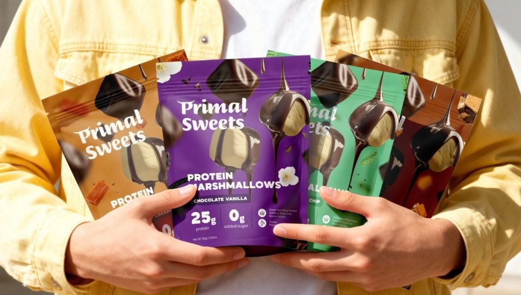
We replaced the original heavy lettering with a softer, more expressive new logo. Bold colors and product-focused imagery brought greater energy to the identity, while the updated typography made the overall presentation feel friendlier and more modern. These design choices gave the product’s indulgent side more room without removing its functional message.
The packaging redesign brought those decisions together. Larger marshmallow photography, clearer flavor identification, and a more deliberate arrangement of nutritional highlights changed how the pouch communicates at a glance. We also carried the refreshed identity into the Shopify website, bringing greater consistency to the online shopping experience.
Primal Sweets Before and After: The Packaging Transformation
The before-and-after comparison makes the change immediately visible. The original Mint Chocolate Chip pouch relied on a dark background, block-style typography, and a primarily text-driven layout. The updated version introduces a mint-green color palette, a playful logo, and large photography of chocolate-covered marshmallows. The flavor becomes easier to identify, and the product itself takes center stage.
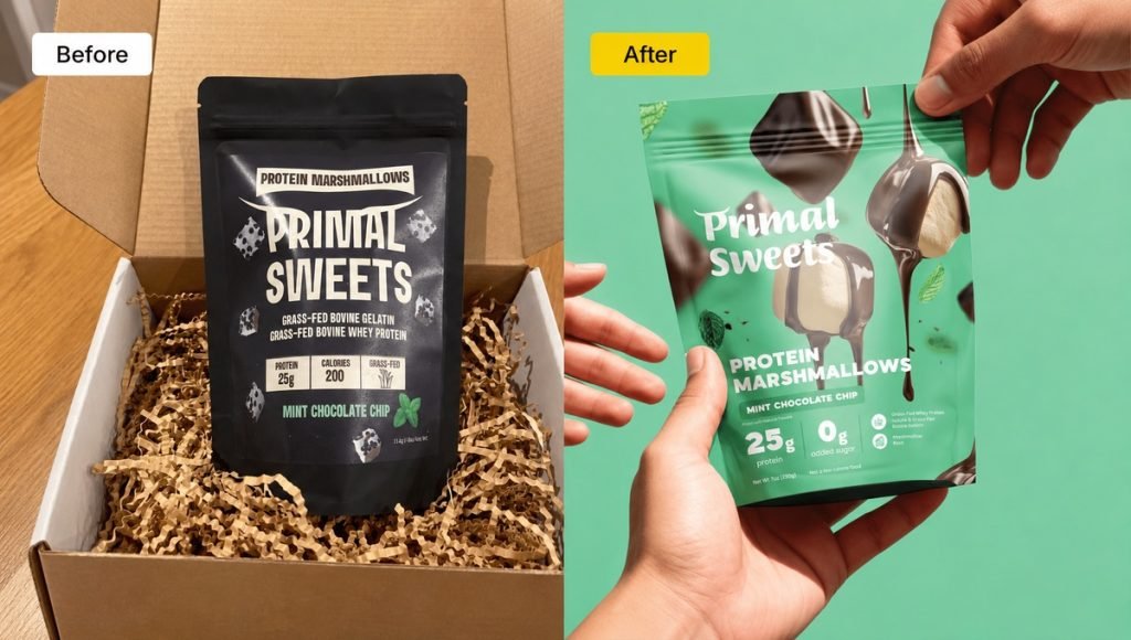
Importantly, the update did not remove the nutritional information. Highlights including 25g of protein and 0g added sugar remain visible alongside the product imagery. The change is in how those elements work together: the packaging now gives shoppers a clearer sense of both the flavor experience and the functional benefits. This rebranding case study illustrates how design can reshape product perception without changing the underlying product proposition.
Viewed side by side, the difference is also one of emphasis. The earlier design relied largely on typography to explain the product, while the refreshed pouch lets photography, color, and messaging work together. Each element has a clearer role in communicating the product’s identity.
The Final Brand Identity and Packaging Design
The final packaging system uses recognizable typography, distinctive flavor colors, and appetizing photography to connect the product range. Each variety has its own character, but the shared layout and logo make the packs feel like part of the same family. That balance helps the brand stand out without sacrificing consistency.
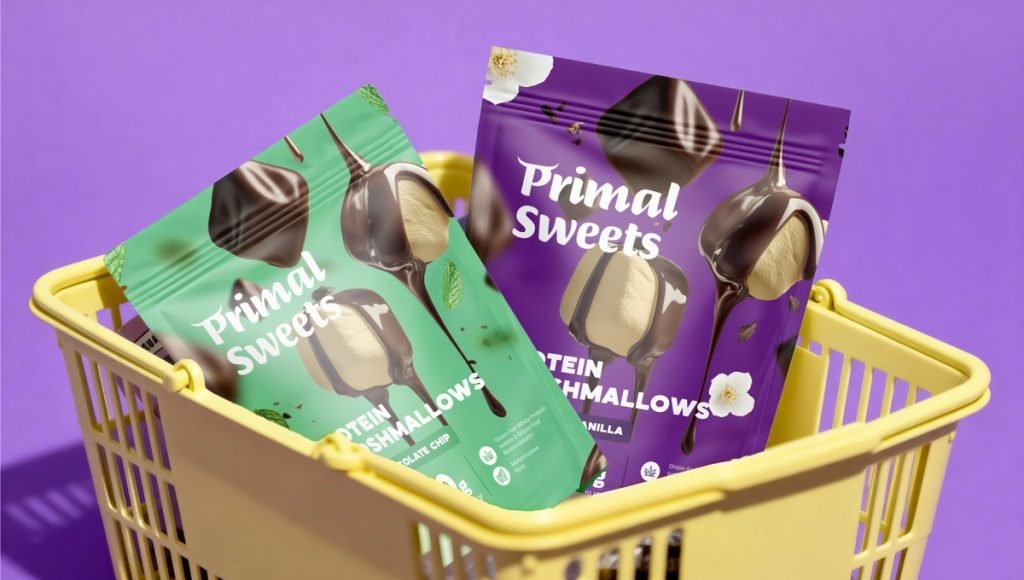
The visual system also appears across branded merchandise, social media graphics, outdoor advertising concepts, and the Shopify website. Rather than approaching each format as a separate design task, the project uses a consistent identity that can adapt to different sizes and contexts. This gives the brand a practical foundation for future product launches and growth.
A flexible system matters as a product range develops. Repeating the key elements, such as the logo placement, product imagery, and nutritional callouts, can make future packaging feel connected while still leaving room for flavor-specific details.
What CPG Brands Can Learn From This Rebranding Case Study
One lesson from this rebranding case study of Primal Sweets is that a successful update does not always require a new market position or a completely different brand. Sometimes, the strongest move is to present the value of an existing product more clearly. Showing the marshmallows prominently, strengthening flavor recognition, and preserving protein messaging made the design better aligned with the product’s appeal.
The second lesson is to connect visual decisions with the wider customer experience. A logo or color palette may attract attention, but packaging hierarchy, product messaging, and consistency across channels help make that attention meaningful. For CPG brands looking to stay relevant, a strong design strategy starts with understanding the audience and improving what customers see, rather than following trends for their own sake.
As this rebranding case study shows, a useful exercise for any packaging refresh is to compare the original and new designs at the size shoppers are most likely to see them. If the product, flavor, and main benefit are clear in a quick glance, the design is doing more than simply looking different.
Ready to Refresh Your CPG Brand?
The Primal Sweets project shows how a focused refresh can make an established product feel more inviting while keeping its core identity intact. Clear packaging and consistent design can help customers recognize what makes a product different.
At Bemain Studio, our design studio helps CPG brands create distinctive identities, packaging, and digital experiences. If your business is ready to improve how its products appear across retail and e-commerce, let’s discuss your next project.
If you’re considering a refresh, start with your current packaging, the products in your range, and the information shoppers need most. Those details can help identify which parts of the identity are worth keeping and which could communicate more clearly.
Frequently Asked Questions
Was Primal Sweets a Complete Rebranding or a Brand Refresh?
It was a brand refresh. Bemain Studio updated the logo, packaging, and visual identity while keeping the focus on high-protein marshmallow snacks. The goal was to create a more playful and recognizable brand experience without changing the product’s core identity.
What Changed in the Primal Sweets Packaging Design?
The packaging gained brighter flavor colors, a softer logo, and larger product photography. Its revised layout makes flavor and nutritional information easier to identify.
Why Is Brand Consistency Important During a Rebranding Process?
Consistency helps customers recognize the same brand across packaging, websites, and promotional materials, whether they shop in stores or online. A cohesive visual identity also builds familiarity and reinforces the brand’s personality across different customer touchpoints.
What Can Other CPG Brands Learn From This Rebranding Case Study?
A good refresh improves product clarity without losing the brand’s recognizable qualities. Strong imagery, clear messaging, and coordinated design can work together to achieve that.