Wellness packaging brings product protection, clear information, and a distinctive visual identity together. For the health and wellness industry, effective packaging should help consumers understand what a product contains, how it is used, and why it belongs in their routine. The right packaging solutions can also make health and wellness products easier to recognize on a retail shelf or in an online store.
At Bemain Studio, we design identities and packaging systems for CPG businesses. This guide explains the formats, design decisions, and sustainability considerations behind wellness products, then looks at real Bemain projects: Five Stems, Mood Jooce, Thrive, and Tuned. Rather than a generic materials guide, we focus on how thoughtful design can communicate a brand’s value and make product information easier to navigate.
What Is Wellness Packaging and Why Does It Matter?
Wellness packaging is the design and presentation of products connected to nutrition, personal care, supplements, and everyday well-being. It includes the container or pouch, the label, and the visual system around them. Effective packaging design balances function with easy-to-read information, so consumers can identify the product and its benefits at first glance.
For wellness brands, every package is a first impression. Growing brands also need packaging that looks consistent wherever the product appears. Shoppers may compare ingredients, recommended use, product quality, and price within seconds. Clear hierarchy and accurate claims can help build trust, while distinctive design creates shelf impact without borrowing the same visual cues as every competitor. Packaging solutions need to work in both retail and e-commerce environments.
Wellness Packaging Solutions for Different Product Types
The right packaging solutions depend on the formulation, the target audience, and how a product will be stored and used. For example, a daily vitamin, a protein smoothie, and a beauty product call for different containers and information layouts. A clear supplement packaging strategy helps connect functional requirements with consistent brand presentation.
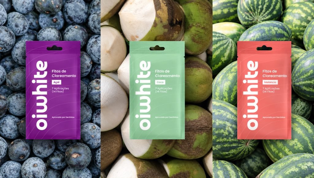
Consider barrier needs, labeling space, portability, and convenience before selecting a format. Packaging solutions that perform well for one product may be unsuitable for another. Health and wellness brands also need to assess the regulations and distribution conditions relevant to their category.
Vitamins and Daily Supplements
Bottles, jars, sachets, and stick packs are familiar formats for vitamins and daily supplements. For brands in this category, a label should make ingredients, directions, and applicable warnings easy to locate. For supplements with sensitive ingredients, the chosen materials may need a barrier against moisture, oxygen, or light. Product safety and shelf life should guide these decisions, not appearance alone.
Functional Foods and Sports Nutrition
Protein powders, superfood blends, and functional snacks need packaging that delivers both useful information and appetite appeal. Ingredient photography can highlight natural ingredients, while color and typography distinguish flavors. Resealable flexible packaging may improve convenience for certain products, provided it meets the formula’s storage requirements.
Personal Care and Beauty Products
Beauty and personal care packaging brings additional considerations, such as dispensing, handling, and the shape of the container. A simple layout can communicate product purpose without making unsupported clinical or health claims. The best packaging solutions match the product experience and the brand’s positioning.
Wellness Packaging Design in Practice: Four Bemain Projects
Wellness products do not all need the same visual style. Our work across nutrition, functional candy, and sleep support shows how different audiences call for different choices. Each project below illustrates a specific packaging design decision, from ingredient imagery and typography to presentation across different channels.
Five Stems: Making Superfood Nutrition Easy to Recognize
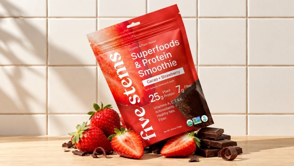
Five Stems uses flavor-specific colors and ingredient photography across its superfood protein smoothies. Bemain developed a shared layout and typography system so the product lines look connected without making each flavor identical. The visual approach communicates nutrition and taste together, allowing the product to feel functional as well as appealing.
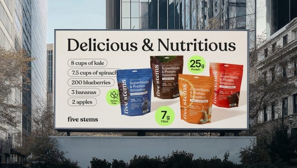
This project shows how a recognizable system can scale. Consumers can compare flavors quickly, while a shared layout keeps multiple packages and promotional formats consistent. That is useful for nutrition brands expanding their range. A cohesive visual identity also makes it easier to introduce new products while maintaining strong brand recognition across different sales channels.
Mood Jooce: A Different Visual Direction for a Calming Product
Mood Jooce moves away from the restrained look often associated with wellness products. Bemain created a playful, retro-inspired identity with oversized typography and expressive colors while keeping the product’s calming purpose understandable. The result demonstrates that a brand can feel friendly without relying on generic clinical design cues.
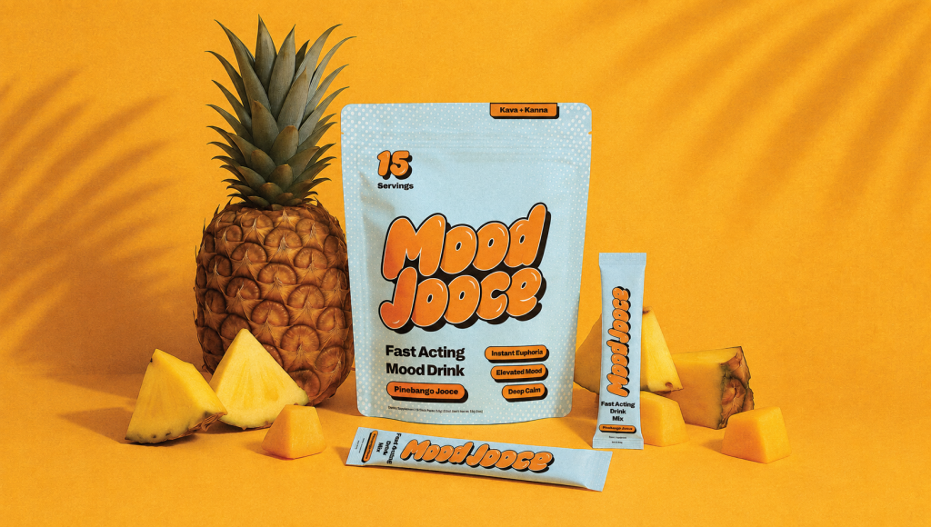
The important lesson is relevance: the brand’s design should speak to its intended audience. A memorable personality is useful only when consumers can still understand what the product offers. By balancing creativity with clear communication, brands can create a distinctive identity that builds recognition and connects with their customers.
Thrive: Clear Benefits and Strong Shelf Impact
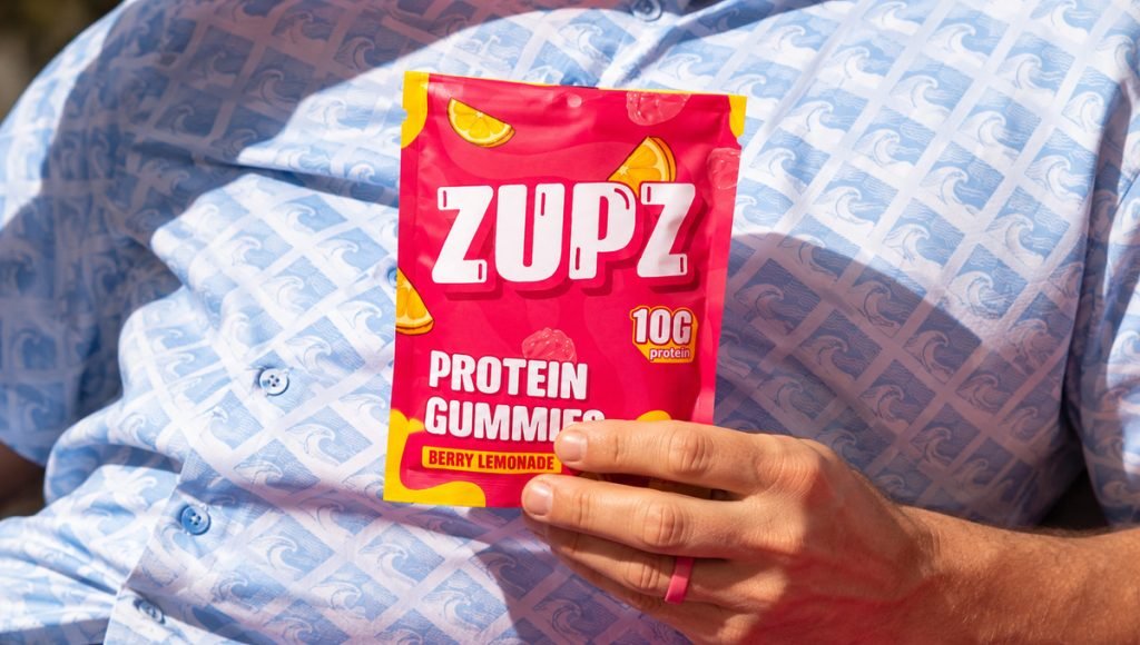
Thrive is a protein gummy brand. Bemain built its packaging around energetic colors, approachable lettering, and a prominent nutritional benefit. These elements make the product feel playful while establishing a consistent identity for future flavors and formats. The bold visual approach also helps the brand stand out on shelves while keeping its core product message clear and easy to recognize.
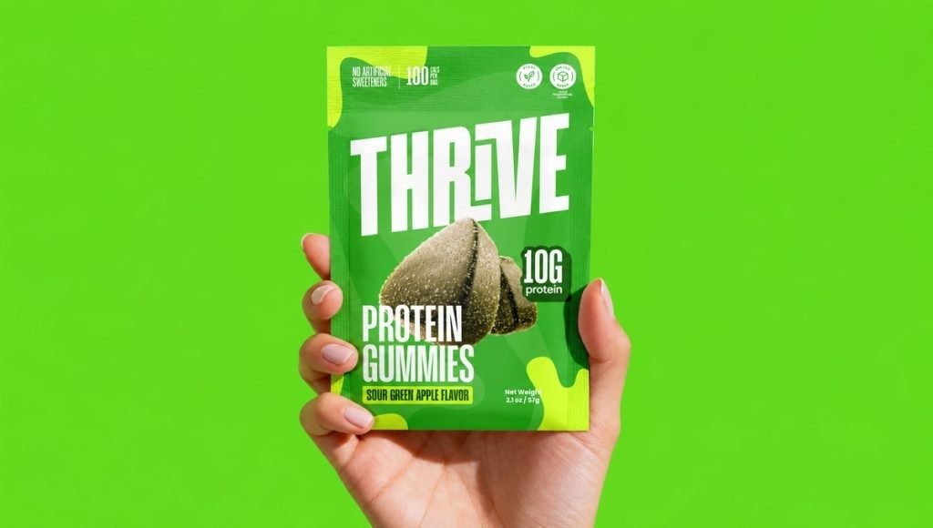
That balance matters for functional candy brands: shoppers need to identify the benefit without losing the enjoyment associated with the category. Information hierarchy becomes a trust signal when it makes important details easy to find. A well-structured design also helps communicate product value quickly while creating a memorable and consistent brand experience.
Tuned: Premium Sleep Support Without a Clinical Look
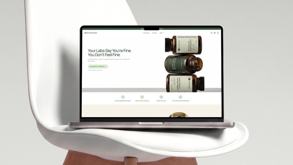
Tuned needed a premium, calm presentation for its sleep product. Bemain designed branding, packaging, and a website around a focused information hierarchy and clean typography. The result connects physical packaging with digital product pages, where the label must remain legible even at thumbnail size.
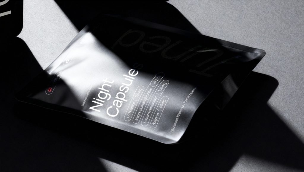
Tuned illustrates how a coherent design process can make an identity recognizable without unnecessary decoration. For wellness businesses, credibility often comes from clarity, consistency, and ingredient transparency rather than promises that a package cannot substantiate. This thoughtful approach helps create a premium brand experience while keeping the product’s purpose and key information easy to understand.
7 Wellness Packaging Design Tips That Build Trust
For established and emerging brands, strong packaging should match the wider health and wellness branding strategy. These practical tips help brands create attractive, informative packaging while keeping the customer’s decision-making process in mind.
1. Understand What Consumers Need to Know
A person choosing a daily vitamin may prioritize ingredients and directions; a functional snack buyer may focus on flavor and nutritional information. Creating a clear hierarchy begins with these differences. Design priorities should follow what matters to the audience, not only the latest visual trends.
2. Make the Main Message Visible at First Glance
Start with the product name, type, and essential benefit. A clear hierarchy gives people a logical reading order and helps the product stand apart on a busy shelf. Details belong where they can be found without competing with the main message.
3. Use Color and Typography to Differentiate
The logo, color palette, and typography should reflect the brand’s identity across products. Five Stems uses color to distinguish flavors, while Mood Jooce uses expressive lettering to convey personality. Different approaches can both succeed when readability remains a priority.
4. Show Ingredients and Product Character Honestly
Relevant photography and graphics can communicate flavor, function, and natural ingredients. Do not imply that a formulation contains something it does not, and avoid imagery that creates misleading health expectations. Accurate presentation reinforces consumer trust.
5. Check Packaging at Actual and Thumbnail Size
A design may look excellent on a large mockup but lose important details on a small pouch or mobile listing. Test the scale of product names, benefits, and supporting information in the formats customers will actually see.
6. Treat Product Claims as Part of the Design
Clear claims, usage details, and relevant warnings are part of the customer experience. Delivering accurate information is a basic quality standard. Health-focused products may also have specific labeling rules, depending on where they are sold. Good packaging solutions leave room for this information without making the front panel feel crowded.
7. Plan for a Growing Product Range
New flavors and SKUs should share enough visual elements to stay recognizable. A consistent layout with room for product-specific color, imagery, and copy makes packaging systems easier to extend as demand grows.
Sustainable Wellness Packaging and Flexible Packaging Options
For wellness brands, sustainability is both a practical consideration and part of how a product is presented. Sustainable packaging solutions should protect the contents while supporting the brand’s values and customer expectations. The challenge is choosing suitable materials and communicating environmental benefits accurately, without making unsupported claims about recyclability or impact.
From a packaging design perspective, sustainability should also be reflected in how information is organized and presented. Clear labeling, thoughtful typography, and specific environmental messaging can help consumers understand a brand’s commitment to responsible packaging. When these elements align with the overall visual identity, wellness brands can communicate their values while maintaining credibility and a recognizable shelf presence.
How Packaging Formats Influence Brand Design
Flexible packaging and rigid containers create different opportunities for visual communication. Pouches offer broad printable surfaces for typography, imagery, and product information, while bottles and jars require layouts that work on curved or smaller labels. The right packaging solutions should balance design flexibility, convenience, product protection, and shelf presence.
Flexible packaging may also reduce packaging weight or shipping volume compared with some rigid formats. However, it is not automatically the most sustainable option. Material composition, production energy, transportation, and disposal conditions all influence environmental performance.
Communicating Sustainable Packaging Choices Clearly
Eco friendly packaging and recyclable materials can support a wellness brand’s positioning when the claims are accurate. Brands exploring innovative packaging solutions should consider whether a chosen material suits the product, preserves shelf life, and offers realistic recycling or reuse options. Sustainable packaging should support product quality rather than compromise it.
From a design perspective, sustainability information should be easy to understand without overwhelming the package. Clear disposal instructions and specific, verifiable material claims communicate more than vague environmental promises. Any claim about reducing waste or carbon footprint should be supported by reliable evidence, helping brands maintain transparency and consumer trust.
Building Consistent Packaging Systems as Wellness Brands Grow
A recognizable range makes it easier for shoppers to identify products that belong together. For growing wellness brands, creating consistent product families can help maintain recognition. A scalable packaging design system defines the rules for logo placement, typography, information hierarchy, and supporting imagery. Individual SKUs can then vary without losing the shared visual identity.
Growing demand may also call for new formats, sizes, or channels. Packaging solutions should be reviewed as the portfolio expands, including how they appear in e-commerce thumbnails and on shelves. A thoughtful system helps preserve brand trust and gives the business room to introduce a new product without starting over visually.
Ready to Strengthen Your Wellness Brand’s Packaging?
Effective wellness packaging combines accurate information, a recognizable identity, and a format suited to the product. The aim is not to make every health product look alike, but to give consumers a clear reason to understand and remember yours.
At Bemain Studio, we work with CPG clients on brand identities, packaging, and digital experiences. Whether you’re launching a product or refining an existing range, we can discuss packaging solutions that align with your goals, delivering clear product communication and a recognizable identity.
Frequently Asked Questions
What Makes Good Wellness Packaging?
Good wellness packaging pairs clear benefits and directions with appropriate materials and consistent branding. It should protect the product, make key information accessible, and help shoppers recognize the brand.
Which Packaging Solutions Work for Wellness Products?
Common options include bottles, jars, cartons, pouches, and stick packs. The best format depends on the product, how it is used, its shelf life, and the labeling and barrier requirements of the market.
How Does Packaging Help Build Trust?
Accurate product claims, readable ingredients, consistent visual cues, and honest communication can build trust. Packaging should make relevant information easy to check rather than relying on vague health promises.
What Makes Sustainable Wellness Packaging Credible?
Credible sustainability claims are specific and supported by evidence about materials, recyclability, sourcing, or waste reduction. Environmental choices must also maintain the level of protection the product needs.