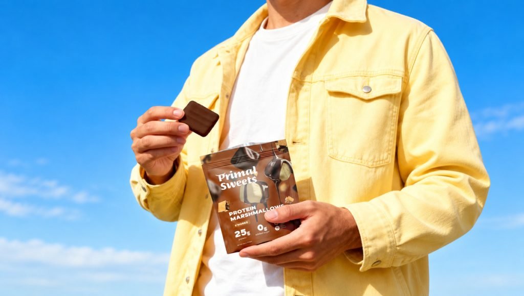
Supplement branding brings brand strategy, visual identity, packaging design, and product messaging together to create a recognizable supplement brand. In a crowded market, strong branding helps consumers understand what a product offers, who it is for, and what makes it different. From gut health to sleep support, every supplement category requires a visual identity that communicates its purpose while building consumer trust.
At Bemain Studio, we develop branding, packaging, and digital experiences for supplement and wellness businesses. This article explores five real projects from our work: Tuned, LIST/OF, Brown Body Reset, Mood Jooce, and Ancient Therapy. Each example shows how thoughtful supplement branding can create a distinctive identity, support product recognition, and connect packaging with the wider customer experience.
What Is Supplement Branding and Why Does It Matter?
Supplement branding is the process of defining how a supplement company is positioned, presented, and recognized. It connects brand identity, visual design, messaging, and supplement packaging into one consistent experience. Effective branding helps supplement consumers understand a product and recognize it across retail shelves, ecommerce websites, and other customer touchpoints.
Across the vitamin and supplement industry, many products compete with similar ingredients, formats, and health-related messaging. A distinctive brand needs more than attractive packaging. It requires clear positioning, relevant product information, and a visual system that reflects its target audience. These decisions help businesses communicate credibility and build recognition within the competitive supplement industry.
5 Supplement Branding Examples From Our Work
The strongest supplement branding examples demonstrate how different brands solve different communication challenges. These real world examples show how brand strategy, typography, color, and packaging design create recognizable identities for dietary supplements with different purposes and audiences.
1. Tuned: Premium Branding for Sleep Support
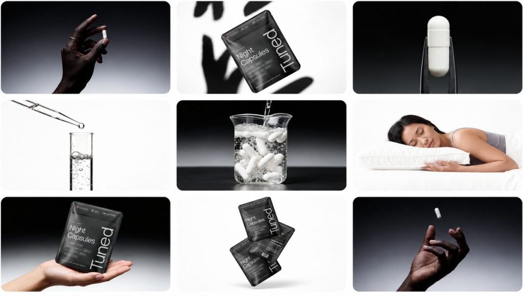
Our Tuned project focused on creating a premium identity for a sleep supplement brand without relying on traditional clinical packaging. We developed branding, packaging design, and a website using a dark color palette, minimalist typography, and a clear information hierarchy. The restrained visual direction communicates the product’s purpose while giving the brand a distinctive appearance.
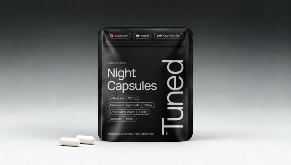
Tuned demonstrates how supplement branding can communicate quality through clarity rather than unnecessary decoration. Clean layouts and consistent design elements connect the physical packaging with the website and ecommerce presentation. This approach makes the product recognizable at first glance while supporting a calm, premium brand identity across different channels.
2. LIST/OF: Making Gut Health Branding More Approachable
The LIST/OF supplement brand centers its product experience around daily gut health support and convenient stick packs. We developed branding, packaging, and website design using a dark green color palette, refined typography, and organized product information. The visual identity connects the outer pouch, individual servings, and digital presentation into one recognizable system.
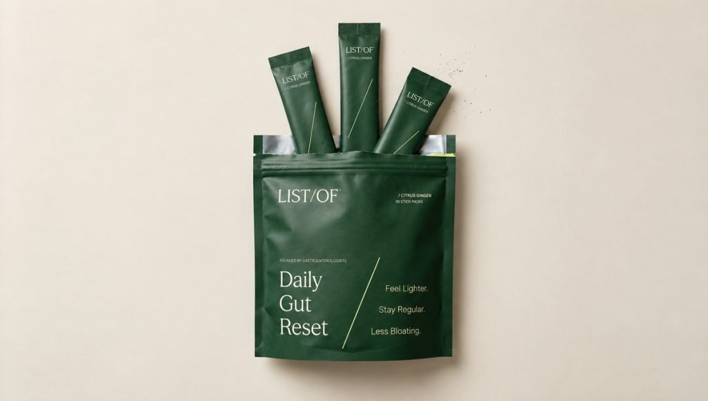
This project shows how effective supplement branding can simplify a specialized wellness product without losing its personality. Instead of competing messages, the design uses a clear hierarchy to help supplement consumers recognize the product and understand its daily-use format. The consistent presentation also makes the brand easier to identify across packaging and digital marketing materials.
3. Brown Body Reset: Connecting AM and PM Supplements
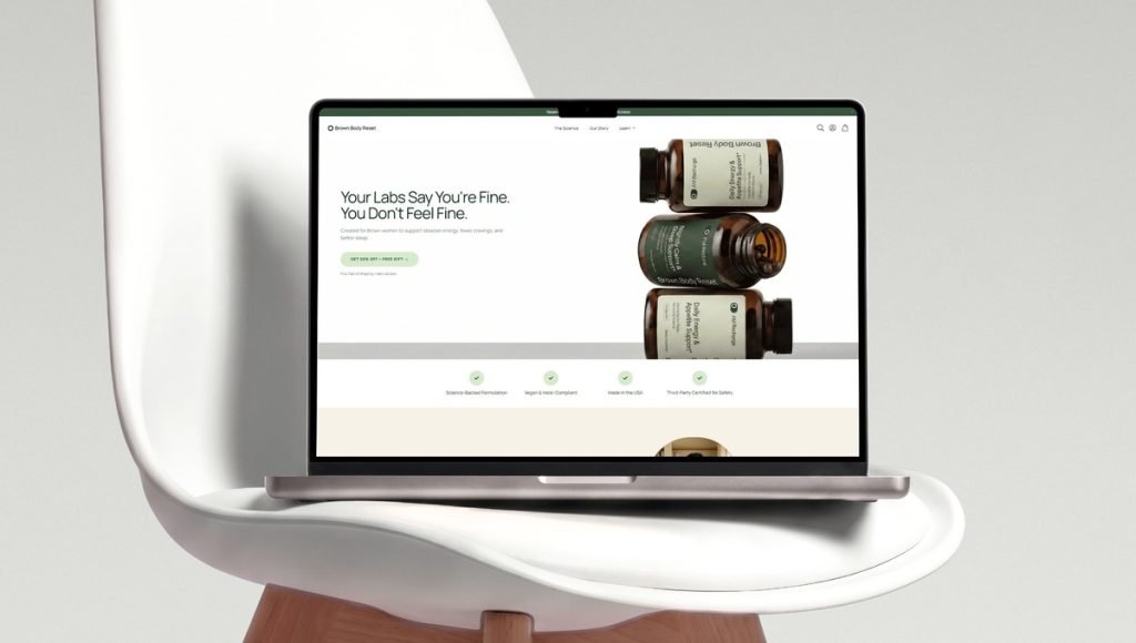
Brown Body Reset is a wellness supplement brand offering AM Recharge and PM Restore, two products designed for different parts of a daily routine. We developed branding, packaging, and website design around a consistent visual system. The cream and green labels, clean typography, and organized product information distinguish both formulas while connecting them under one brand identity.
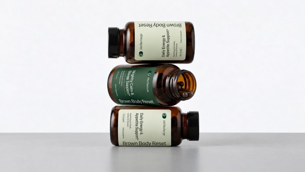
Brown Body Reset demonstrates how a well-developed branding system can support multiple dietary supplements without making every product look identical. Consistent design elements strengthen recognition, while product-specific information helps consumers distinguish each formula. This approach creates a clearer product range and reinforces the connection between supplement packaging and brand identity.
4. Mood Jooce: Breaking Away From Clinical Supplement Design
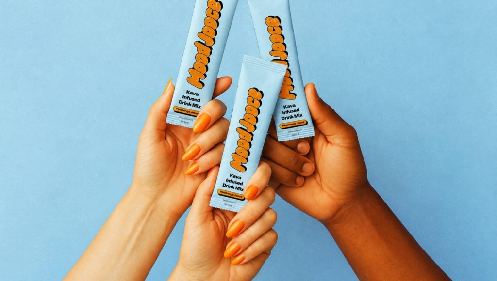
Mood Jooce is a calming supplement brand with a more expressive approach to wellness branding. We created a retro-inspired visual identity built around oversized typography, vibrant colors, and playful graphics. The design moves away from familiar clinical aesthetics while keeping the product’s calming purpose understandable.
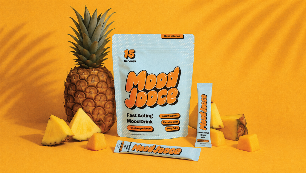
Mood Jooce shows that supplement branding does not have to follow the same visual formula. Bold lettering, simplified layouts, and a recognizable brand voice create a personality that feels approachable while maintaining consistency across packaging and digital communication. The project illustrates how a clear design strategy can help a product stand out in a crowded market.
5. Ancient Therapy: Building a Refined Wellness Identity
Ancient Therapy is a Nordic wellness brand offering plant-based and CBD-related products. We developed a refined brand identity and supplement packaging system focused on calm, premium simplicity. The restrained typography, balanced layouts, and cohesive visual direction distinguish the products from more generic wellness packaging.

Ancient Therapy demonstrates how minimalist design can reinforce a supplement brand’s positioning without overcrowding the packaging. Consistent typography, color, and product presentation create a recognizable system across different wellness products. The project highlights how effective branding can communicate a premium identity while keeping the packaging clear and approachable.
What These Supplement Branding Projects Have in Common
Although these brands serve different supplement categories, their design systems share three important principles: clear positioning, recognizable visual identities, and consistent product communication. These key elements connect packaging, branding, and digital design into one recognizable experience rather than treating them as separate projects.
Brand Identity Should Reflect the Product
Effective supplement branding starts with understanding the target audience, product positioning, and consumer expectations. Tuned uses a restrained visual direction for sleep support, while Mood Jooce communicates a more playful personality. Each identity reflects a different purpose and audience, showing why successful branding requires more than following familiar visual trends.
Packaging Should Communicate Clearly
Good supplement packaging needs to make product names, intended use, and essential information easy to understand. LIST/OF demonstrates this through its stick-pack presentation, while Brown Body Reset distinguishes AM and PM formulas using consistent design elements. A strong supplement packaging system supports product clarity, functionality, and brand recognition.
Consistency Matters Across Every Touchpoint
Supplement consumers should recognize a brand whether they encounter it on a bottle, pouch, retail shelf, or ecommerce website. Typography, imagery, colors, and messaging need to remain connected. Tuned and LIST/OF demonstrate how physical packaging and digital presentation can communicate the same brand identity, creating a consistent experience from first discovery to purchase.
How We Approach Supplement Branding
Our supplement branding process begins with understanding the product, its target market, and the competitive landscape. Research into consumer expectations, lifestyle preferences, and competing brands helps define the positioning before visual design begins. This approach creates a foundation for branding that feels relevant to the audience instead of relying on familiar supplement industry trends.
We then translate the brand strategy into typography, color systems, imagery, packaging design, and product messaging. These core elements form a cohesive identity that can adapt across different supplement formats and SKUs. For brands selling online, our approach to ecommerce product pages shows how packaging imagery and clear product communication support a consistent customer experience.
Supplement branding should also connect the physical product with digital marketing and other communication channels. Whether consumers discover a supplement through an online store, educational content, or social media, the same visual identity and brand voice should guide the experience. This consistency helps businesses maintain recognition as their products and marketing strategies develop.
Why Transparency Matters in Supplement Branding
Building trust is essential in the health and supplement industry because consumers need accurate information about the products they choose. Effective supplement branding should make ingredients, intended use, dosage instructions, and relevant warnings easy to understand. Clear packaging design helps communicate this information while preserving the brand’s visual identity.
Supplement businesses must also consider applicable industry regulations and ensure their marketing claims are accurate and supported by appropriate evidence. Health claims should not suggest benefits that the product cannot substantiate. Scientific validation, third-party testing, and third-party certifications can strengthen credibility when they genuinely apply, but branding should never imply verification that has not been established.
For supplement consumers, transparency is an important part of the brand experience. Clear product information, credible messaging, and consistent design can support consumer trust before the first purchase. Supplement packaging should balance visual appeal with practical communication, including relevant labeling and food safety requirements, rather than relying on unsupported claims or decorative trust symbols.
What Makes Supplement Branding Stand Out?
The most effective supplement brands communicate a clear reason for consumers to recognize and remember them. That does not always mean using bold graphics or following a premium minimalist aesthetic. It means creating a visual identity that reflects the product, its audience, and the brand’s position in the market. A well-defined CPG branding strategy helps connect these decisions across packaging, messaging, and the wider customer experience.
Our work with Tuned, Mood Jooce, Brown Body Reset, LIST/OF, and Ancient Therapy shows that different visual approaches can be effective when they are intentional. Clear brand strategy, credible messaging, consistent supplement packaging, and thoughtful design decisions are more valuable than applying the same creative formula to every supplement category.
Building Brand Recognition Beyond the First Purchase
Supplement branding should remain consistent as customers interact with a business through product pages, social media, and educational content. Recognizable visuals and useful information help reinforce familiarity, while authentic customer feedback and community engagement can support trust. Any social proof or user-generated content should represent genuine customer experiences without making unsupported health claims.
For supplement brands, maintaining a consistent identity across these interactions is more useful than creating disconnected marketing campaigns. Clear communication and relevant content help keep customers engaged while supporting long-term recognition. This approach also gives businesses a consistent foundation for future products, marketing strategies, and customer relationships.
Ready to Build a Distinctive Supplement Brand?
Strong supplement branding connects positioning, visual identity, and packaging into a recognizable experience. Whether launching a new supplement product or refreshing an existing brand, the goal is to communicate its value clearly and give consumers a consistent identity they can recognize across different channels.
Bemain Studio helps supplement and wellness businesses create brand identities, packaging systems, and digital experiences that work together. If you’re preparing to launch a supplement brand or improve an existing product range, let’s discuss how thoughtful design can support your goals.
Frequently Asked Questions About Supplement Branding
What Makes Supplement Branding Effective?
Effective supplement branding combines clear positioning, a recognizable brand identity, consistent messaging, and packaging that communicates product information accurately. It helps supplement consumers understand what makes a product different while supporting consumer trust and recognition.
How Is Supplement Branding Different From Packaging Design?
Supplement branding defines the overall identity, positioning, and communication of a business. Packaging design applies that identity to bottles, pouches, labels, and other product formats. Branding also extends to websites, messaging, and the wider customer experience.
How Can a Supplement Brand Stand Out?
A supplement brand can differentiate itself through clear audience positioning, distinctive visual design, and consistent communication. Instead of copying popular supplement packaging trends, the identity should reflect the product’s purpose and the expectations of its target audience.
Why Is Brand Consistency Important for Supplement Companies?
Consistency helps consumers recognize supplements across packaging, websites, retail displays, and digital channels. It also supports future product launches by giving new products a familiar visual foundation while allowing their individual purposes and benefits to remain clear.