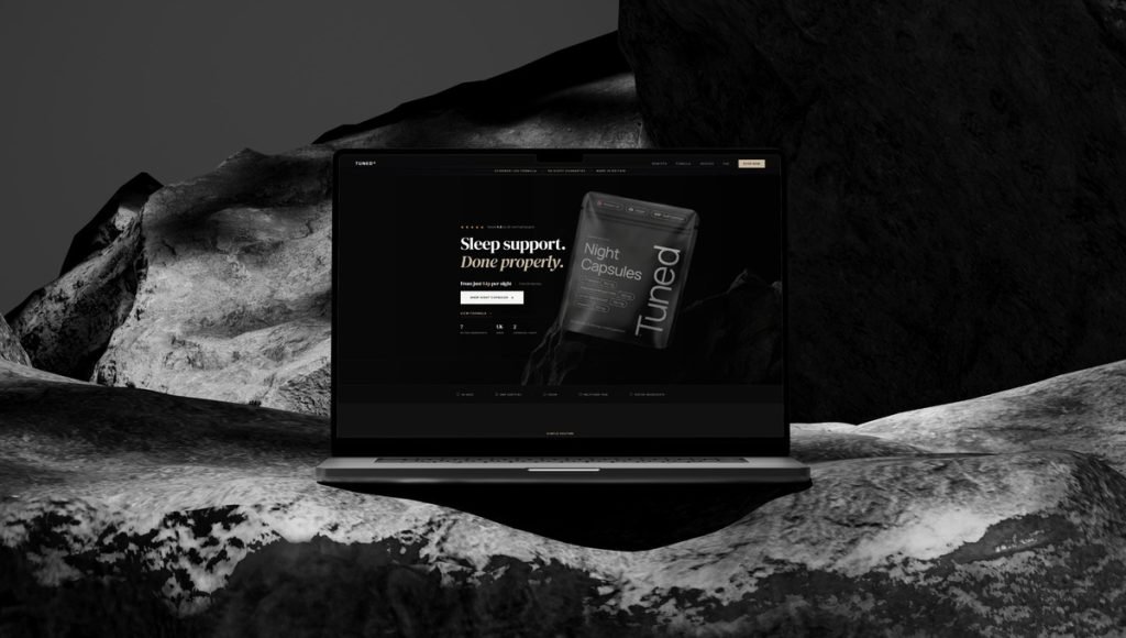
The best brand identity examples show how a product becomes recognizable before customers even try it. From a distinct visual identity and memorable color palettes to packaging and brand voice, every element helps communicate a brand’s personality and connect with the people it was created for.
For CPG founders, a strong brand identity creates a lasting first impression in a crowded market. Below, we explore five real Bemain Studio projects: Zupz Candy, Bricks Protein, Perfect Blend Nutrition, Ancient Therapy, and Thrive. Each offers a different approach to building a recognizable consumer brand through thoughtful design, positioning, and consistent visual elements.
5 Real Brand Identity Examples From Bemain Studio
These five brand identity examples explore how CPG products use color, typography, messaging, and visual design to express their personalities. From playful candy branding to minimalist wellness aesthetics, each project demonstrates a different way to create a recognizable identity that reflects the product and its intended audience.
1. Zupz Candy: A Playful Identity Built Around Bold Typography
Zupz Candy is a protein gummy brand that brings the excitement of candy into the functional snack category. Bemain Studio developed its logo and packaging design around a playful creative direction that communicates the brand’s energetic personality while keeping its nutritional benefits visible.
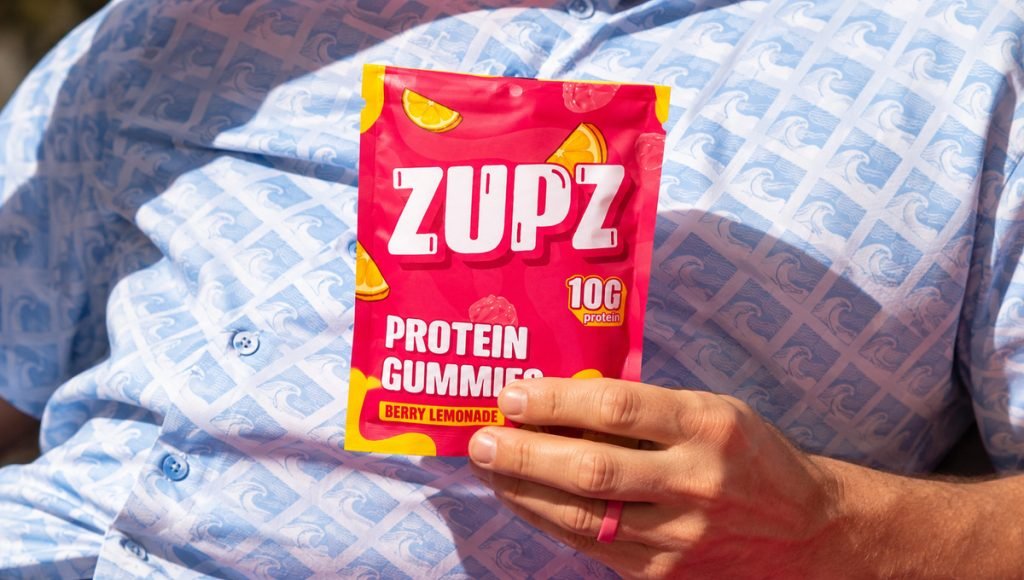
Oversized white lettering creates an instantly recognizable focal point, while vibrant pink and yellow colors give Zupz a distinct visual identity. Fruit illustrations reinforce the candy-inspired character, and a prominent protein callout makes the product’s functional benefit easy to understand. These brand elements work together to create a clear hierarchy that remains recognizable across different packaging formats.
Zupz is a compelling brand identity example because it balances two messages: the enjoyment of candy and the appeal of functional nutrition. Rather than copying the serious appearance of conventional sports nutrition products, its expressive typography, consistent color palette, and playful visual elements create a strong brand personality suited to its target audience.
2. Bricks Protein: Bringing Energy and Flavor Into One Brand Identity
Bricks Protein is a high-protein snack brand built around dessert-inspired flavors and functional nutrition. Bemain Studio developed its brand identity, packaging, and e-commerce website to create a cohesive visual experience that feels energetic, modern, and approachable.
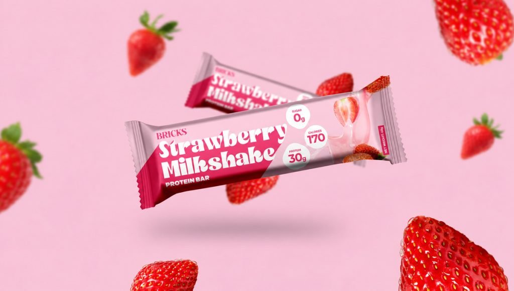
Vibrant color palettes, expressive typography, and appetizing imagery communicate both flavor and performance. A refined BRICKS wordmark acts as a recognizable visual anchor, while oversized flavor names and contrasting colors give each product its own personality. The packaging balances nutritional information with an appealing product presentation, helping customers understand the offering at a glance.
What makes Bricks Protein a strong brand identity example is how its design works across multiple touchpoints. Individual wrappers, product boxes, and the website share a consistent visual language while allowing different flavors to remain distinctive. This approach helps the entire product line feel connected rather than presenting each product as a separate brand.
3. Perfect Blend Nutrition: A Calm Visual Identity for Everyday Wellness
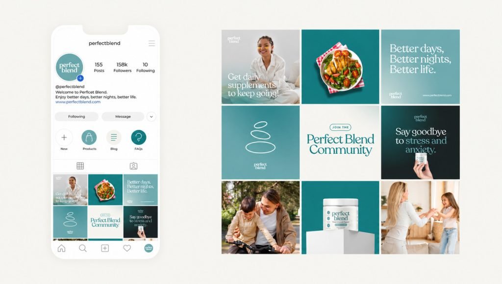
Perfect Blend Nutrition is a wellness supplement brand created for parents navigating the demands of everyday life. With an emphasis on clarity, emotional balance, and approachable wellness, Bemain Studio developed its branding, packaging, and website design around a clean and calming creative direction.
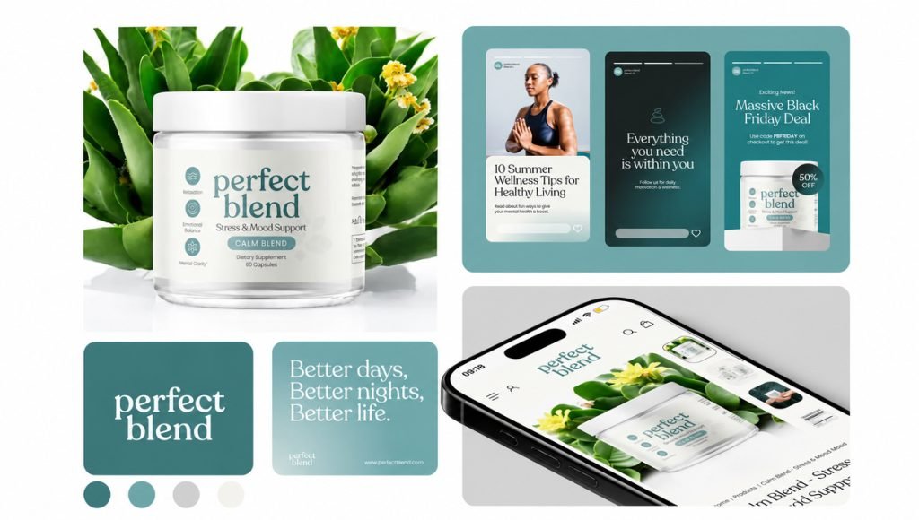
Instead of relying on loud graphics or aggressive product messaging, the brand’s visual identity uses thoughtful typography, iconography, and carefully organized design elements. Its packaging presents information clearly, while the website extends the same visual language into a welcoming digital experience. These details reflect the brand’s purpose and the everyday needs of its intended customers.
Perfect Blend Nutrition demonstrates how a strong brand identity can communicate reassurance without sacrificing personality. Its restrained design, clear messaging, and consistent visual elements create a cohesive experience across physical and digital touchpoints. The result is an approachable identity that expresses support rather than competing for attention through unnecessary decoration.
4. Ancient Therapy: Minimalist Branding for a Premium Wellness Experience
Ancient Therapy is a Nordic wellness brand offering plant-based supplements and CBD-related products. Bemain Studio refined its brand identity and packaging to move away from generic supplement aesthetics, creating a calmer and more premium appearance connected to the brand’s natural wellness positioning.
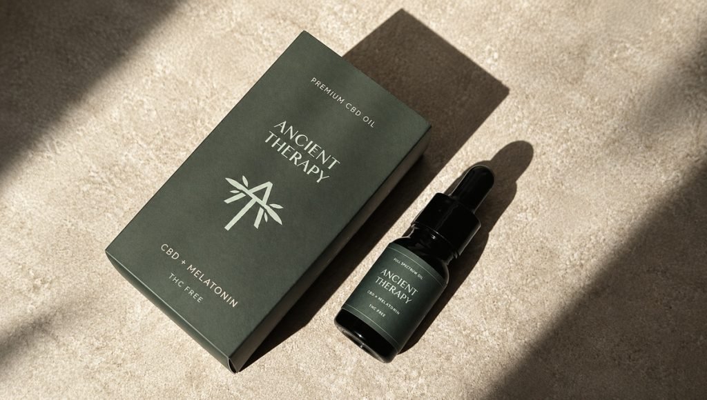
A restrained color palette, understated typography, subtle textures, and balanced layouts communicate simplicity and quality. Consistent visual elements keep the identity recognizable across the product line, while thoughtful spacing and a clear information hierarchy give the packaging a refined character. Each design decision supports a distinct visual identity without overwhelming the product.
Ancient Therapy illustrates how minimalism can become memorable when every element serves a purpose. Rather than relying on bright graphics, its brand identity uses clarity and restraint to express confidence. This creative direction offers a useful example for founders who want their products to communicate a premium experience in a crowded wellness market.
5. Thrive: A Bold Visual Identity for Functional Candy
Thrive is a protein gummy brand designed to make functional nutrition feel fun, accessible, and appealing. Bemain Studio developed a vibrant brand identity that combines the playful energy of candy with the clarity of a nutrition-focused product, giving Thrive an expressive personality.
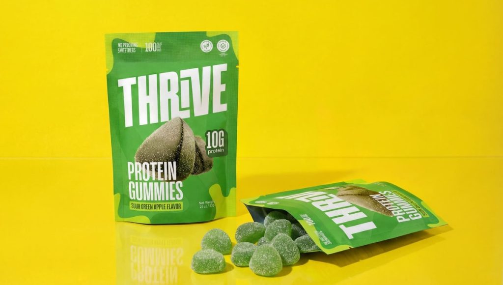
Bright green and yellow color palettes, bold typography, and energetic graphic elements create instant recognition. The same visual identity extends beyond packaging into branded apparel, tote bags, lifestyle photography, and billboard designs. These applications show how a consistent design system can maintain its character across different formats and customer touchpoints.
Thrive also provides an interesting example of brand evolution. Its original creative direction established a playful foundation for the protein gummy concept, which later developed into the refreshed Zupz Candy identity. Together, these identity examples show how a brand’s visual expression can change as its positioning evolves while maintaining a connection to the original product idea.
What Brand Identity Elements Make These Examples Unique?
These brand identity examples demonstrate how different creative directions can communicate different personalities. Zupz Candy and Thrive use playful colors and energetic graphics, Bricks Protein combines dessert appeal with functional nutrition, Perfect Blend Nutrition takes a softer approach to wellness, and Ancient Therapy relies on minimalism. Each identity reflects a particular product category, brand strategy, and set of customer expectations.
A strong brand identity connects its visual elements to the brand’s purpose and positioning. Logo design, color palettes, typography, imagery, and brand voice should work together rather than compete for attention. Color psychology can influence perception, but the most appropriate design choices depend on the audience and the emotions a business wants to communicate. A clear identity helps customers recognize what makes a product different and can influence their buying decisions.
For founders, these examples highlight the importance of creating a distinctive identity instead of simply following industry trends. Understanding customer needs, studying the market, and identifying what competitors are missing can help define a direction that reaches the right audience. When brand identity elements support a clear brand story, they create a stronger foundation for recognition and customer relationships. To explore these principles in more detail, read our brand identity design guide.
How Brand Identity Extends Beyond Packaging
Packaging is often the first place customers encounter a product, but brand identity extends across every interaction with a business. Websites, social media, advertising, and physical products should express a connected visual language. Thrive demonstrates this through apparel, tote bags, and promotional designs, while Bricks Protein and Perfect Blend Nutrition carry their creative directions into their websites. These applications help customers recognize the same brand across different experiences.
Brand guidelines provide consistency as a business grows. A brand style guide can document typography, a consistent color palette, imagery, logo usage, and other tangible elements that define the identity. These rules help a graphic designer, creative director, or internal marketing team maintain a recognizable appearance across product launches and campaigns. Repeating familiar visual elements reinforces recognition, while unnecessary changes can weaken the connections customers have already formed with a brand.
Consistency also applies to communication. A clear brand voice, appropriate customer service tone, and messaging that reflects the company’s core values can support brand trust and stronger customer relationships. When a business delivers on the promises expressed through its visual identity, it creates a more credible customer experience. Over time, that familiarity can support brand loyalty and encourage loyal customers to return. Our article on health and wellness website design explores how these principles extend into digital experiences.
How Brand Identity Evolves as a Brand Grows
A brand identity can evolve as a business introduces new products, reaches different customers, or changes its market positioning. The challenge is creating a fresh visual direction without losing the qualities that make the brand memorable. Strong brands develop while staying true to their purpose, core values, and recognizable personality. Maintaining familiar elements can help existing customers understand the change rather than feel disconnected from the brand.
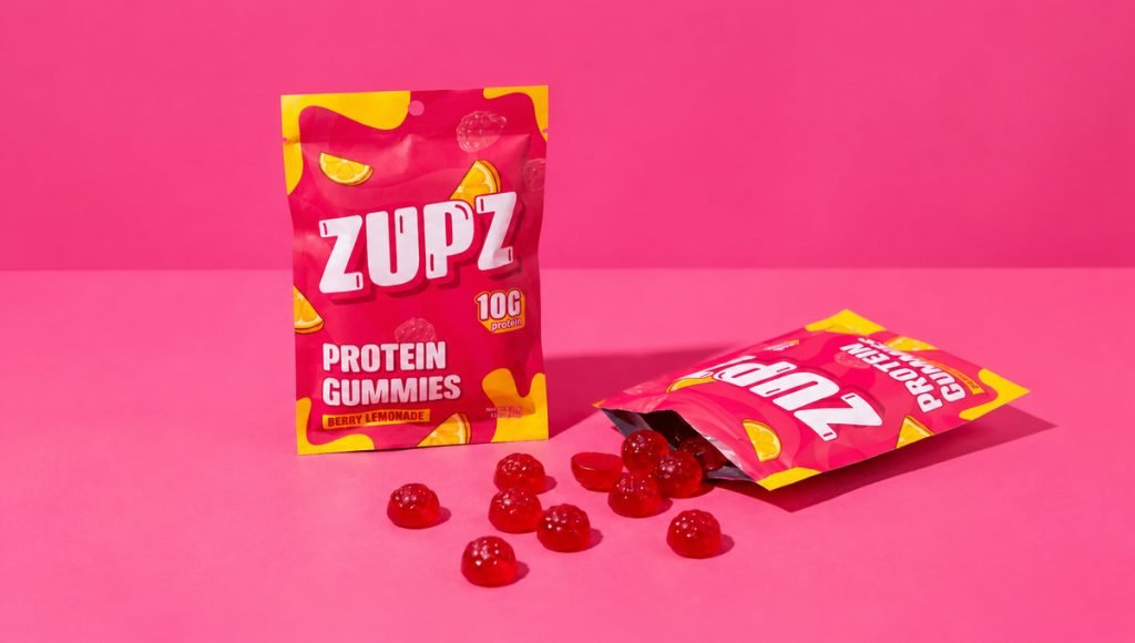
Thrive and Zupz Candy illustrate this process through two different creative directions for a functional candy concept. Thrive used bright green and yellow colors, expressive graphics, and an energetic style, while Zupz adopted bold lettering, fruit illustrations, and a striking pink-and-yellow palette. The shift places greater visual emphasis on the candy experience, showing how brand identity can respond to changing priorities while retaining the playful foundation of the original concept.
Not every evolution requires rebuilding an identity from the beginning. Some brands benefit from refining their typography, messaging, or visual elements, while others need a more substantial creative change. The important decision is understanding what customers already recognize and which design choices no longer support the business. Our packaging redesign guide explores how brands can refresh their appearance while preserving the elements that still contribute to recognition.
Ready to Bring Your Brand Identity to Life?
These five brand identity examples show that there is no single formula for creating a recognizable CPG brand. Whether your vision is playful, bold, or minimal, building a brand identity should be a strategic process that reflects your brand story, connects with the right audience, and helps customers understand what makes your product different. A strong brand identity brings these elements together into a memorable experience that communicates the brand’s value beyond its appearance.
At Bemain Studio, we help food, wellness, and consumer product businesses turn their ideas into cohesive visual identities. From brand strategy and design to packaging and digital experiences, we create work that reflects each brand’s personality and goals. Whether you are preparing your first product launch or evolving an existing identity, you can get in touch with our team to discuss your project.
Frequently Asked Questions About Brand Identity Examples
What Are Some Examples of Brand Identity in CPG?
CPG brand identity examples include Zupz Candy’s playful typography, Bricks Protein’s energetic visual style, and Ancient Therapy’s minimalist wellness design. Each uses distinct colors, messaging, and packaging to create a recognizable personality.
What Makes a Brand Identity Memorable?
A memorable brand identity combines distinctive colors, typography, imagery, and a clear brand story. When these elements stay consistent, customers can recognize and remember the brand more easily.
How Is Brand Identity Different From Packaging Design?
Brand identity defines how a business looks, communicates, and presents itself across different channels. Packaging design is one part of that identity, alongside websites, advertising, social media, and other customer touchpoints.
Can a Brand Identity Evolve as a Business Grows?
Yes. A brand identity can evolve as a business expands or changes its positioning. Thrive and Zupz Candy illustrate how a product concept can adopt a fresh visual direction while preserving its playful character and recognizable personality.