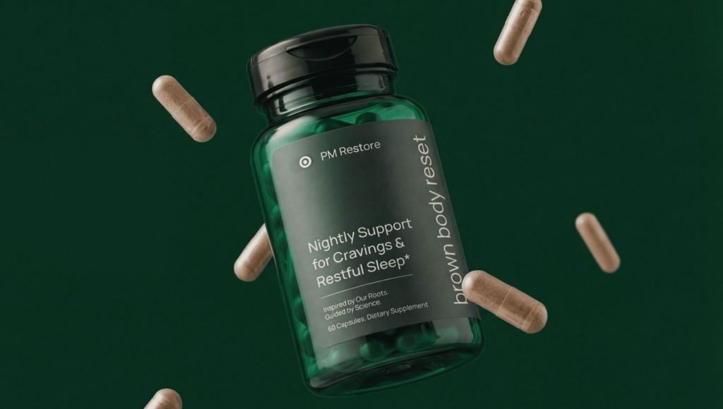
A strong health and wellness website design should do more than look professional. It needs to clearly communicate what the business offers, make products or services simple to explore, and help visitors feel confident from the first interaction. For companies in the health and wellness space, the website often becomes a key place where potential clients or customers discover the offer and decide whether to take the next step.
Effective web design brings content, navigation, product presentation, visual identity, and functionality into one consistent experience. A good wellness website should feel clear, accessible, and easy to navigate while giving visitors the information they need without overwhelming them.
What Is Health and Wellness Website Design?
Health and wellness website design is the process of creating a website that presents a wellness brand, its products, and its services in a clear, credible, and user-friendly way. It combines visual identity, content, layout, navigation, and functionality so visitors can quickly understand what the business offers and move through the site without unnecessary friction.
Good website design should reflect the brand’s personality while keeping important information accessible. This can apply to product-led wellness businesses, service providers, spas, practitioners, and holistic health practices, although each may require a different structure. The goal is to create a professional digital experience that supports the wider brand and gives people a clear path forward.
Why Web Design Matters for Health and Wellness Brands
A website often shapes one of the first meaningful interactions between a wellness business and its audience. Clear structure, thoughtful messaging, quality presentation, and consistent design can strengthen credibility while helping people quickly understand the product, service, or philosophy behind the business. A well-organized website can also make the experience feel more trustworthy by presenting important information in a clear and professional way.
Good website design also supports the wider customer journey. It can help people discover products, compare options, explore services, and move toward a purchase, booking, or contact decision. For service-based businesses, well-structured information can help potential clients understand the kind of support being offered before booking a session or contacting a therapist or practitioner.
3 Health and Wellness Website Design Examples
Strong health and wellness websites combine focused messaging, thoughtful design, and clear product presentation. These three examples show different ways a wellness website can turn a specific product idea and brand position into a coherent digital experience. Each example also shows how strategy, visual identity, and user experience can work together to support a distinct wellness brand.
1. LIST/OF: Doctor-Founded Gut Health Made Simple
LIST/OF is built around a simple idea: daily gut support should not require several different products. Its Daily Gut Reset combines prebiotic fiber, probiotics, botanicals, and gut-brain support in one daily stick pack, while the website focuses on digestive comfort, regularity, bloating, and a straightforward daily routine.
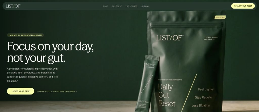
BeMain Studio developed the website design and product presentation around the same idea of simplicity. Clear sections, focused messaging, ingredient explanations, and founder expertise help present what the product does, why the ingredients are included, and how it fits into everyday use.
- Gastroenterologist-founded positioning
- One daily stick pack
- Clear ingredient purpose
- Evidence-informed product education
- Simple path from education to purchase
LIST/OF shows how wellness website design can simplify a complex category without removing the information needed to support credibility. Product information, founder credentials, educational content, and the design system all reinforce the same goal: making daily gut support more approachable.
2. Brown Body Reset: Wellness Designed Around a Clearly Defined Audience
Brown Body Reset is built for Brown women, with a strong focus on research and health patterns relevant to South Asian populations. Its AM Recharge and PM Restore system organizes the product story around energy, cravings, mood, sleep, and the different needs of morning and nighttime routines.
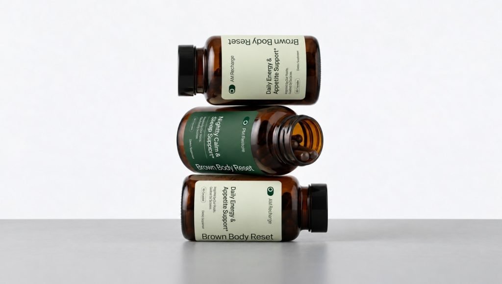
BeMain Studio developed the website and product presentation to support this focused positioning. Strong hierarchy, research-led content, product presentation, and the AM/PM system help communicate who the brand is for, why the products were created, and how they fit into a daily wellness routine.
- Clearly defined target audience
- Research-led positioning
- AM + PM product system
- Culture-aware messaging
- Consistent website and product presentation
Brown Body Reset demonstrates how a wellness brand can become more distinctive by speaking to a clearly defined audience. Its website gives enough space to the brand story, research, product system, and founder perspective while keeping the core offer focused.
3. Tuned: Premium Sleep Support With a Clear Nightly Routine
Tuned focuses on sleep support through a simple two-capsule nightly routine. The website highlights seven active ingredients, transparent dosing, UK manufacturing, GMP certification, a vegan formulation, and a melatonin-free approach while organizing deeper information into clear sections.
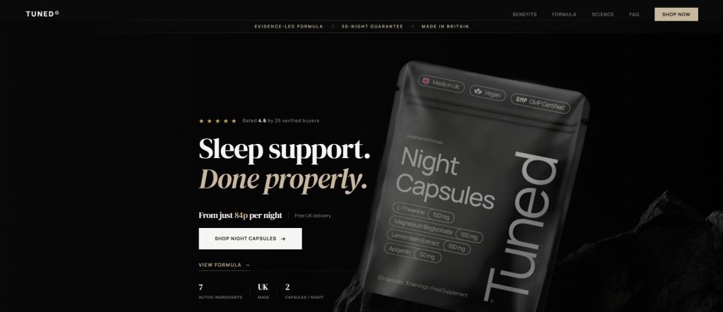
BeMain Studio developed Tuned’s website and packaging around a calm, premium design system. Controlled typography, focused product presentation, ingredient explanations, and clear calls to action guide visitors from the main sleep benefit toward more detailed information without making the experience feel overly clinical.
- Melatonin-free positioning
- Seven active ingredients
- Transparent dosing
- Two-capsule nightly routine
- Calm, premium visual direction
Tuned shows how health and wellness website design can balance scientific credibility with simplicity. People can explore the formula, product philosophy, and supporting information while the main proposition and next step remain clear throughout the website.
6 Principles of Effective Health and Wellness Website Design
Effective website design needs to make information clear, support credibility, and guide visitors through the experience without unnecessary friction. For wellness businesses, that means creating a site that feels professional while making products or services simple to explore. Every design decision should help visitors understand the brand and move toward the information or action that matters most.
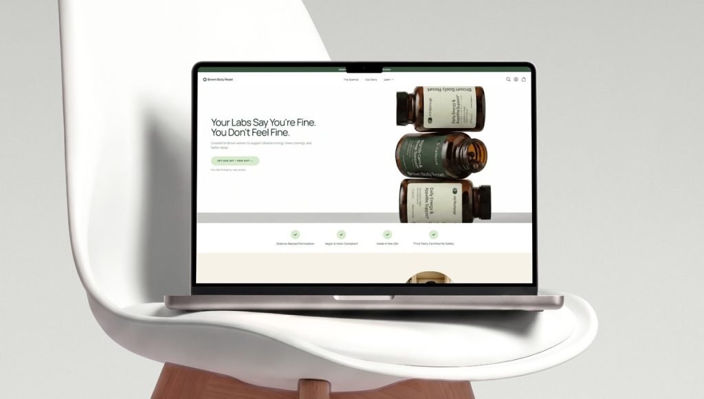
Brown Body Reset website design by BeMain Studio, combining clear hierarchy, product presentation, and a focused wellness experience.The strongest wellness websites also balance visual appeal with practical usability. Clear navigation, readable content, consistent branding, and purposeful calls to action work together to create an experience that supports both the visitor and the business.
1. Start With Clear Positioning
Visitors should be able to grasp the purpose of a website within the first few moments. The main message, offer, and intended audience should appear early rather than being buried beneath general wellness language. Clear positioning gives the rest of the site a stronger foundation, helping the design, messaging, and structure work together more effectively. The website should translate that positioning into clear messaging, hierarchy, and visual direction across the entire experience.
2. Build a Strong Visual Hierarchy
Good web design controls what visitors notice first and what they discover next. Headlines, supporting copy, product images, buttons, and key information should follow a deliberate hierarchy instead of competing for attention. A skilled designer can use a clean design and enough space between sections to create a more effortless reading experience.
Some wellness brands benefit from a warm and welcoming direction using whitespace, restrained colors, and thoughtful photography or graphic elements. When it fits the positioning, this kind of calm visual approach can create a more focused experience, but the design should remain unique to the brand rather than repeating the same aesthetic used across the entire category.
3. Make Products and Services Clear
A wellness website should explain what is being offered without requiring people to search through several pages for basic information. Product benefits, service descriptions, ingredients, routines, pricing, or other important features should be organized into a structure that can be scanned quickly while still providing useful detail.
For a service-based practice, the same principle applies to communicating expertise, care, appointments, and the practitioners or team behind the business. Wellness website templates often include built-in appointment booking systems, but the overall structure should still reflect the specific services, audience, and customer journey rather than relying on a template alone.
4. Keep the Experience Consistent and Accessible
Typography, page layouts, messaging, interface elements, and photography should feel connected throughout the website. Consistency creates a more professional experience and helps people navigate between sections without having to relearn how the site works. A consistent system also helps the internal team and designer create new sections without introducing unnecessary differences as the website expands.
Accessibility should also be considered throughout the design. Readable contrast, descriptive headings, clear form labels, meaningful alternative text, predictable navigation, and responsive layouts can make the experience more usable for a wider range of visitors. Contact forms, booking tools, and other interactive features should be configured so they remain clear and functional across different devices.
5. Build Credibility Through Useful Information
Credibility becomes especially important when a business operates in the health and wellness field. Clear product information, relevant credentials, transparent explanations, testimonials where appropriate, and educational content can build trust by showing who is behind the offer and what customers can realistically expect without relying on exaggerated claims.
Presentation also affects how a business is perceived. Structured content, quality photography, consistent branding, and a thoughtful layout can make a website feel more established than an experience where important information is difficult to locate.
6. Design for Mobile, Performance and Ecommerce
Mobile devices account for more than half of global web traffic, making mobile-first design an important consideration for modern wellness websites. Navigation, forms, product information, calls to action, and checkout paths should remain clear on smaller screens. Performance matters too: fast-loading pages can reduce unnecessary abandonment and help visitors reach important product, service, or purchase information without delays. For ecommerce businesses, the platform should also make products simple to manage, display, purchase, and expand as the brand grows.
Interactive tools such as product-finder quizzes, simple assessments, or progress tracking can increase engagement and help visitors identify a relevant next step. At the same time, these features should remain lightweight and purposeful so they support the experience instead of slowing the site down or creating additional friction.
How Packaging and Website Design Work Together
For health and wellness companies, the website should feel like a natural extension of the brand rather than a separate design project. Typography, messaging, layout, and product presentation should reflect the same direction used across packaging and other customer touchpoints, creating a more recognizable experience. A clear visual identity system helps keep these elements aligned across channels.
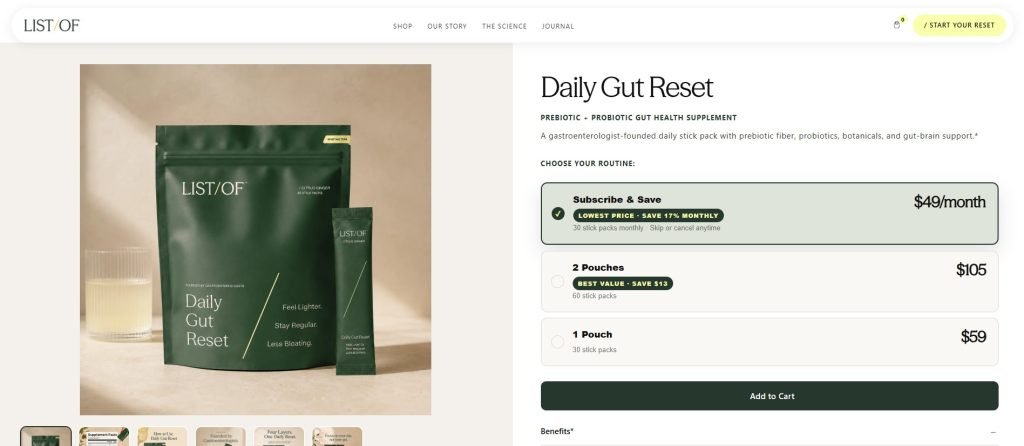
LIST/OF product page showing how packaging and website design work together within one consistent wellness brand system.Packaging plays an especially important role because it often becomes one of the strongest brand elements on product pages. When packaging and digital design share the same language, customers can connect the physical product with the wider business more naturally, creating a stronger sense of brand consistency.
A clear design system gives the team a stronger foundation for decisions across product pages, new website sections, launches, and future digital touchpoints. Instead of designing each element separately, the website can use a flexible structure that supports new products, services, content, and functionality over time.
Designing Wellness Product Pages That Convert
Product pages are where a wellness website needs to turn initial interest into a clear buying decision. A strong page should present the product, explain its value, and provide enough supporting information without forcing customers to search throughout the rest of the site. Every element should help answer the questions customers are most likely to have before they feel ready to purchase.
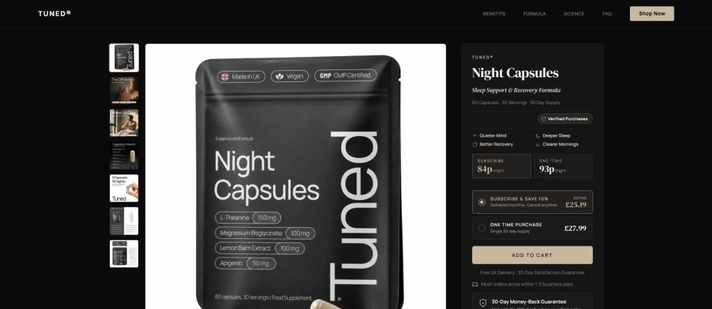
Tuned product page by BeMain Studio, combining product information, pricing, purchase options, and a clear path to checkout.For supplement brands, this product presentation should also reflect a clear supplement branding strategy across every customer touchpoint. The strongest product pages balance persuasive messaging with practical details. Benefits, ingredients, usage information, pricing, product imagery, and purchase options should work together in a clear structure that helps customers evaluate the offer with confidence.
Lead With the Main Product Benefit
The first section should quickly communicate what the product is and the primary benefit it offers. A focused headline, supporting copy, strong product photography, and a visible call to action give customers the essential information before they move into more detailed sections. This clarity helps visitors understand the offer faster and reduces hesitation early in the buying journey.
Make Product Information Easy to Scan
Ingredients, features, usage instructions, and supporting details should be organized into short sections rather than long blocks of copy. Descriptive headings, short paragraphs, icons, and structured information can improve reading and make important details quicker to find. A clear information hierarchy also helps customers compare key details without feeling overwhelmed by too much content at once.
Use Product Imagery Strategically
High-quality product imagery should do more than simply display the packaging. Renders, close-ups, lifestyle photography, and supporting graphics can show scale, communicate how a product is used, and connect the physical packaging to the wider website design. Consistent visual presentation also helps reinforce the brand and makes the product feel more polished across different digital touchpoints.
Keep the Path to Purchase Clear
Pricing, product options, subscription choices, purchase buttons, and other next steps should be clearly positioned, especially on mobile. When visitors are ready to buy, book, or contact the business, the next step should be immediately visible rather than hidden behind unnecessary navigation. A clear path to action can reduce friction and make it easier for customers to complete the next step without second-guessing where to go.
Common Health and Wellness Web Design Mistakes
Even a well-designed wellness website can lose impact if its structure, messaging, or user experience introduces unnecessary friction. The most common problems happen when appearance is prioritized over clarity, usability, and the actual journey people take through the website. Small issues in navigation, content structure, or calls to action can quickly make an otherwise polished website harder to use.
Looking Too Similar to Other Wellness Brands
Many health and wellness websites rely on similar visual patterns, colors, and messaging, which can make businesses feel interchangeable. Pre-built wellness website templates can make this problem worse when they are used without adapting the layout, content, and presentation to the specific brand.
The goal is not to follow a particular wellness aesthetic, but to create a unique experience that can elevate the brand and make it easier to recognize. Distinctive visual choices, messaging, and page structure can help the website feel specific to the brand rather than interchangeable with competitors.
Hiding the Main Product Benefit
Customers should not have to read several sections before discovering what a product or service is meant to do. Clear messaging, focused headlines, and a logical page structure should communicate the main proposition early while leaving room for deeper information further down the page. Making the core benefit obvious from the start helps visitors understand the offer faster and decide whether it is relevant to them.
Overloading Pages With Information
Trying to display every feature, ingredient, service, and explanation at once can make a page difficult to scan. Good website design creates balance by separating information into meaningful sections and using enough space to keep longer pages readable. A clear content hierarchy helps visitors focus on the most important information first without feeling overwhelmed.
Treating Packaging and Website as Separate Systems
A disconnect between packaging and digital design can weaken recognition. The website should reflect the same visual direction, tone, and product presentation as the packaging so customers encounter one cohesive identity across physical and digital touchpoints. Keeping both systems aligned also makes it easier to maintain consistency as new products, pages, and campaigns are introduced.
Health and Wellness Website Design Checklist
Before launching or redesigning a health and wellness website, review the experience from the visitor’s perspective. Each element should contribute to a clearer, more consistent experience while supporting the wider business. A final review can also reveal gaps in navigation, content, accessibility, or conversion paths before the website goes live.
| Website Element | What to Check |
| Main Offer & Audience | Make the main offer and target audience clear from the first screen. |
| Navigation | Keep important pages simple to locate and organize the site logically. |
| Visual Identity | Maintain consistent typography, colors, photography, and design elements. |
| Product or Service Information | Present benefits, features, ingredients, or services in a scannable format. |
| Credibility | Include relevant credentials, expertise, reviews, or supporting information where appropriate. |
| Accessibility | Review contrast, labels, navigation, alternative text, and responsive behavior. |
| Calls to Action | Make purchasing, booking, or contacting the business straightforward. |
| Mobile Experience | Check navigation, product information, forms, and buttons on smaller screens. |
| Performance | Avoid unnecessary elements that slow loading or responsiveness. |
| Brand Consistency | Connect the website, packaging, and other customer touchpoints. |
| Scalability | Build a flexible system that can accommodate future products, services, and sections. |
A practical checklist keeps website design focused on more than appearance alone. Strong wellness websites combine communication, structure, accessibility, consistency, and a straightforward path toward the next step.
Final Thoughts
A strong wellness website should make the business easier to explore and recognize. Clear positioning, thoughtful structure, consistent design, useful product information, accessibility, performance, and a smooth mobile experience all contribute to a site that supports both customers and the wider brand.
The most effective website design also connects naturally with packaging, messaging, and other touchpoints instead of treating digital design as a separate system. When those elements work together, health and wellness brands can build a more distinctive experience that is ready to grow alongside new products, services, and opportunities.
Frequently Asked Questions About Health and Wellness Website Design
What makes a good health and wellness website?
A good health and wellness website combines clear positioning, logical navigation, strong hierarchy, useful content, and a professional design system. Customers should be able to learn about the brand, explore products or services, and identify the next step without unnecessary friction.
Why is website design important for wellness brands?
Website design shapes how people experience a brand before they make a purchase, book a service, or contact the business. Clear structure, consistent branding, accessible information, and organized content can strengthen credibility and make the offer easier to evaluate.
What pages should a wellness website include?
The exact structure depends on the business, but most wellness websites benefit from a homepage, About page, product or services pages, educational content, FAQs, and a clear contact or purchase path. Ecommerce businesses may also require product, collection, and ingredient pages, while service businesses may benefit from booking and practitioner information.
How should a wellness website reflect the brand?
A wellness website should use the same visual language and messaging as the wider brand. Typography, colors, photography, product presentation, packaging, and tone of voice should feel connected so customers encounter one consistent identity across digital and physical touchpoints.