
Zero Degree Gelato
Zero Degree Gelato is a sweet desserts brand based in Saudi Arabia that is redesigning their brand. They are offering multiple range of products but their most popular delights are ice creams.
The reason for a rebrand is because their old brand looked very outdated, cheap, and it appeared too skinny. The goal was to portray our brand as a fun, warm, premium and clean looking. Since we had multiple local competitors, our brand blended with the crowd which affected our sales heavily.
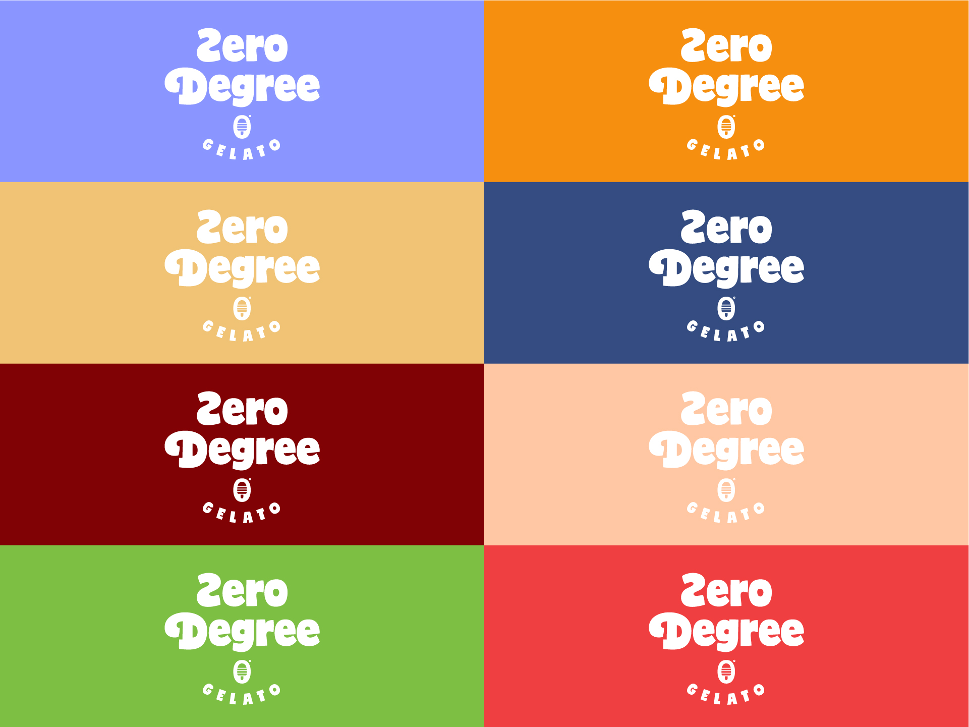
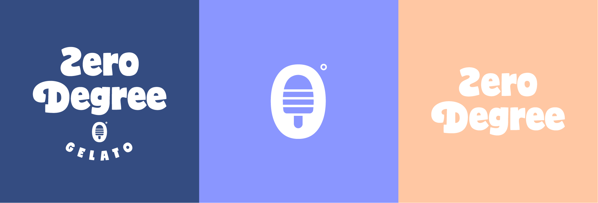
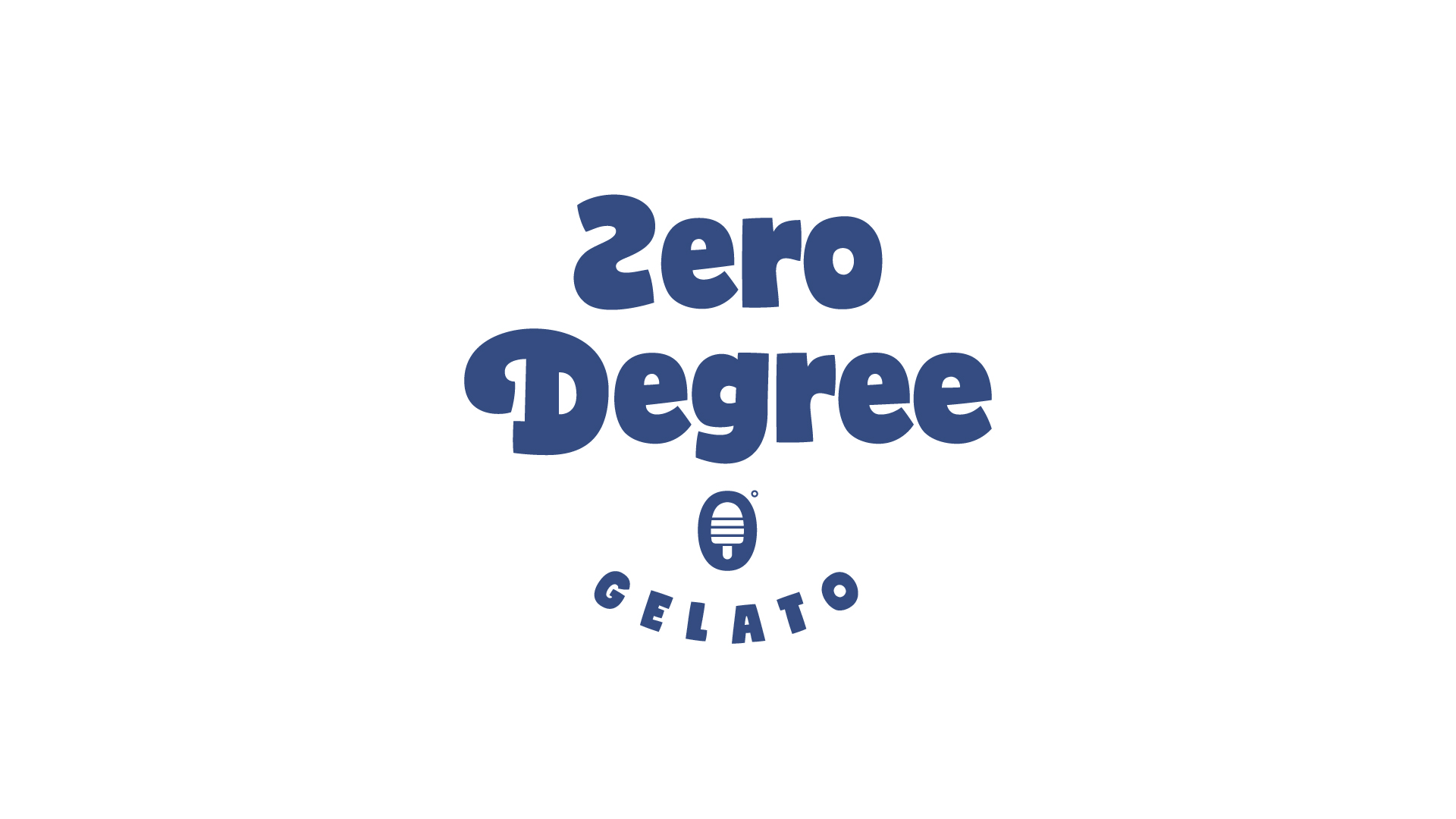
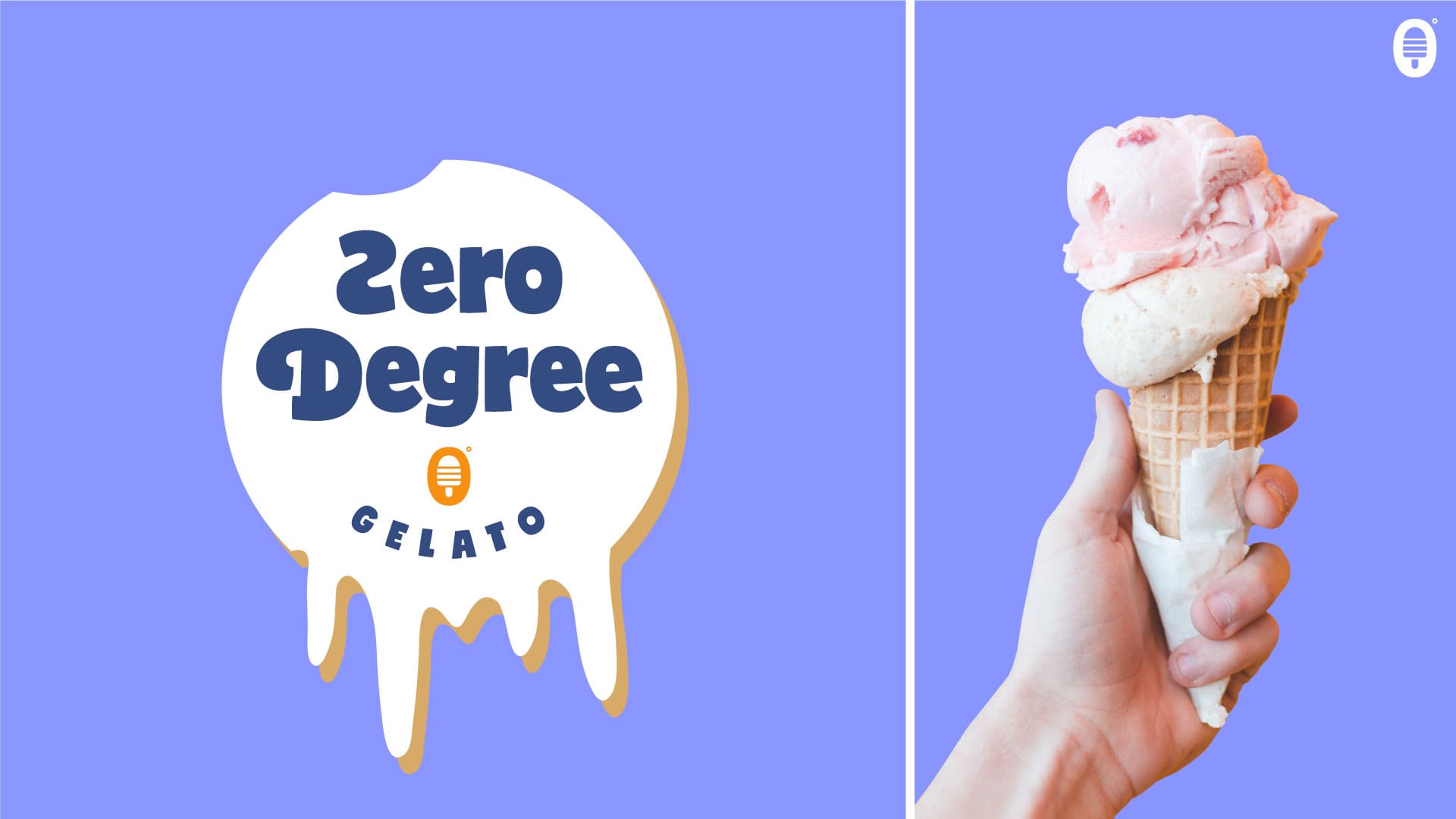
For this project, the whole idea was to design both our logo and packaging according to our brand characteristics. We want our logo to be responsive – shape-shifting logos that change in size, complexity or even color. It is important for our logo to accommodate and adapt to wherever it is being placed.
About the project:
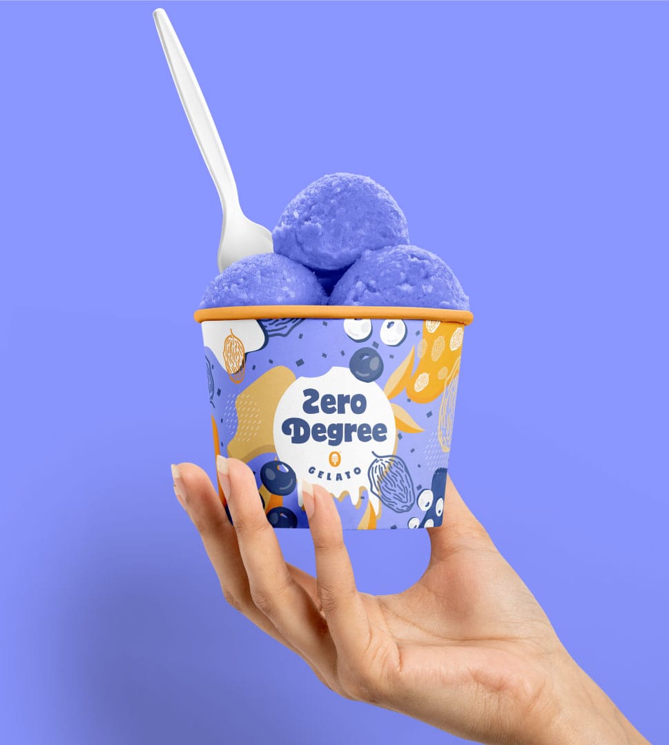
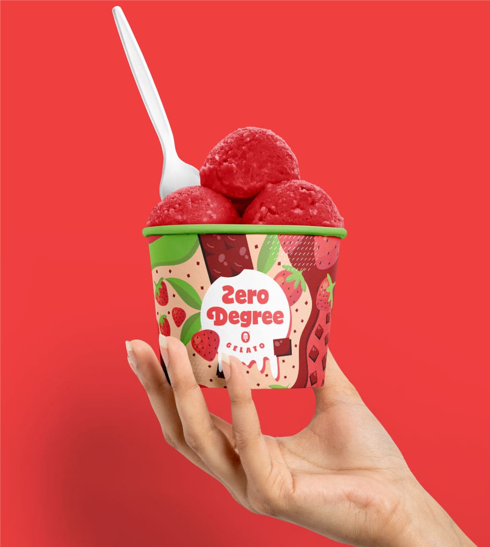
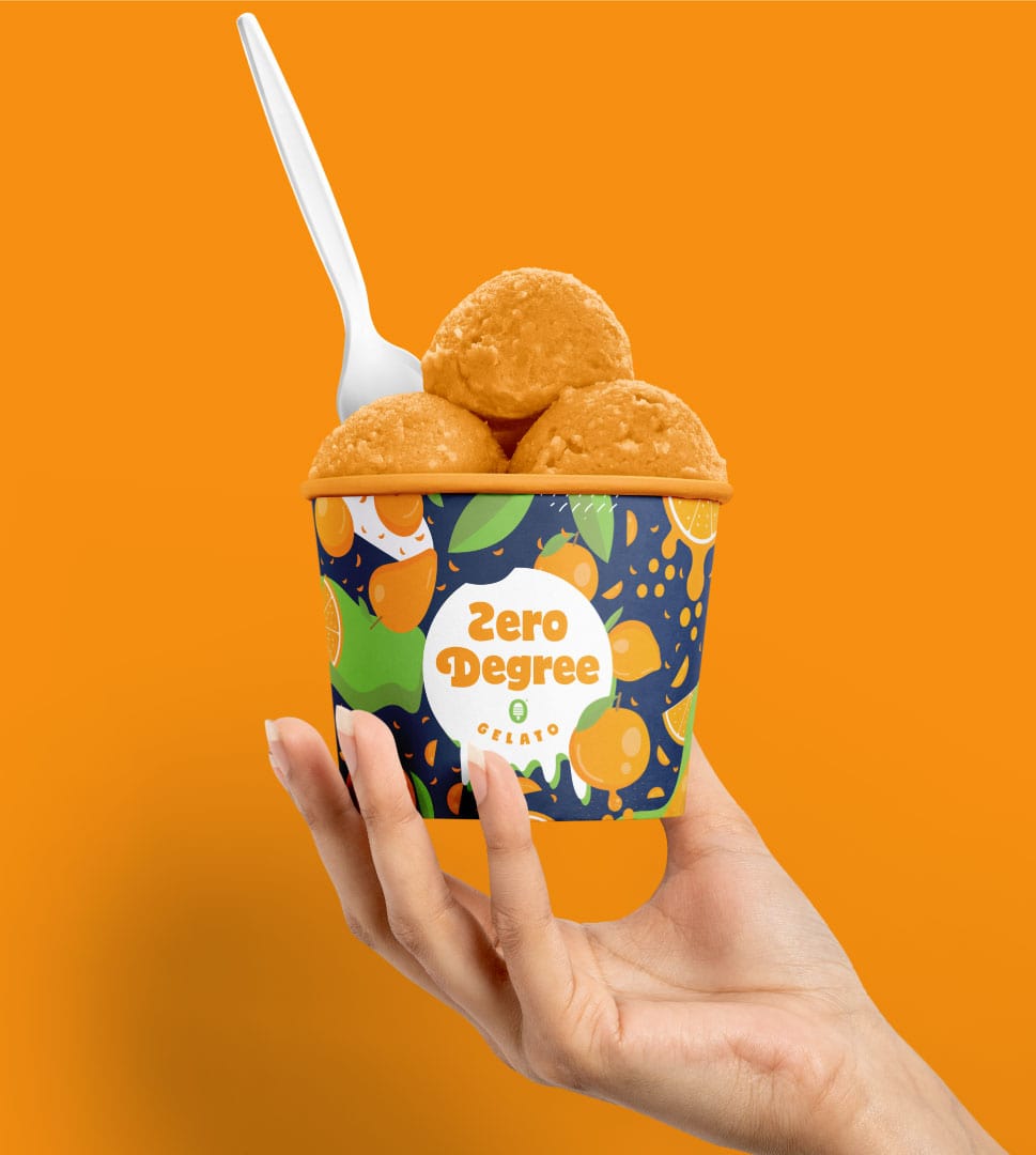
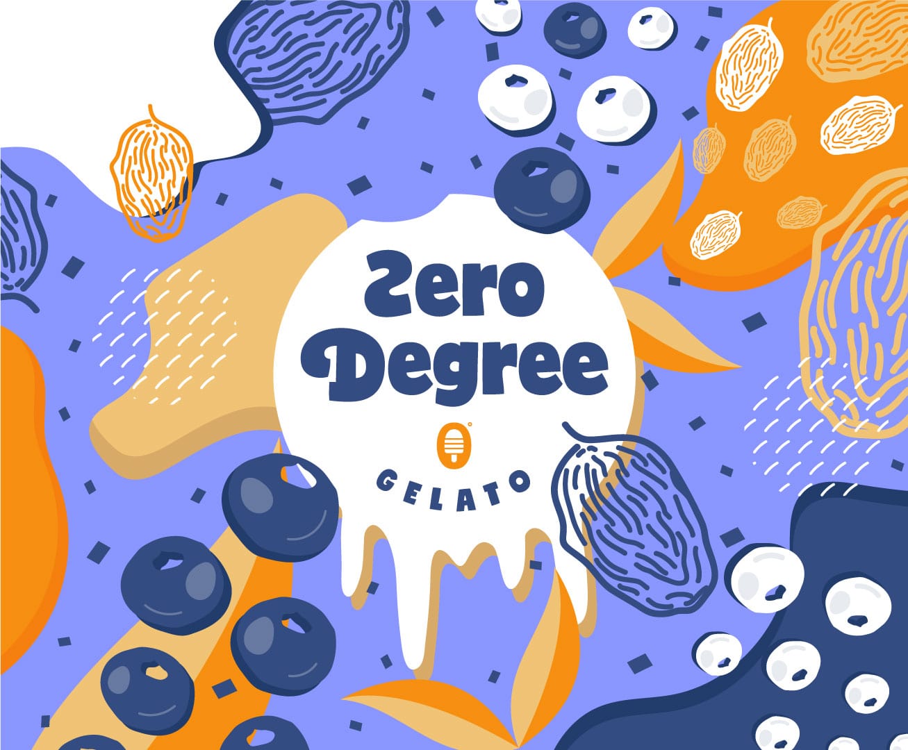
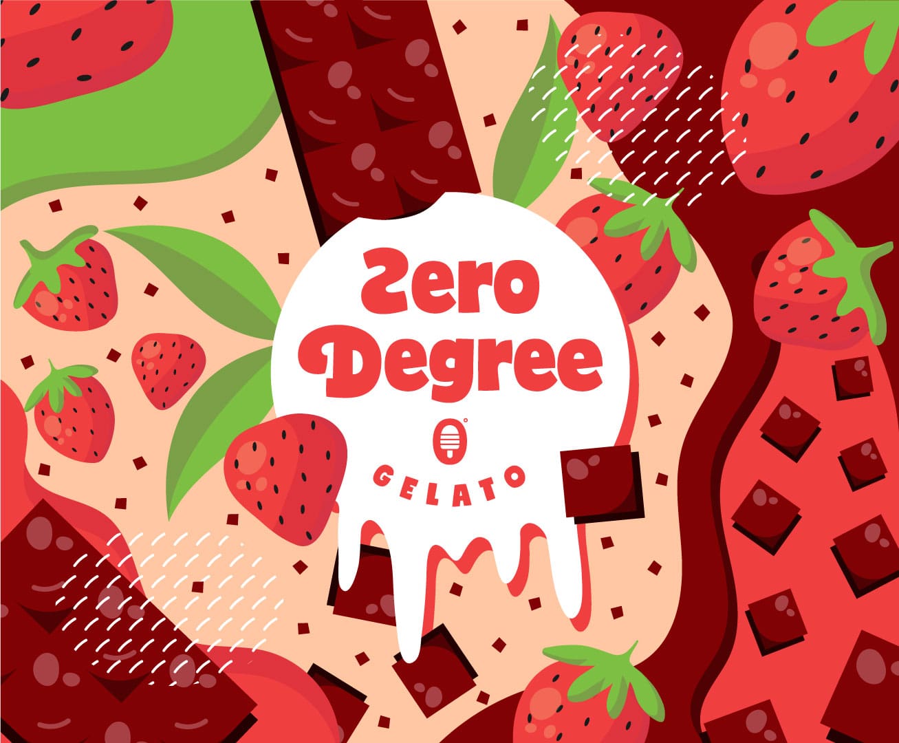
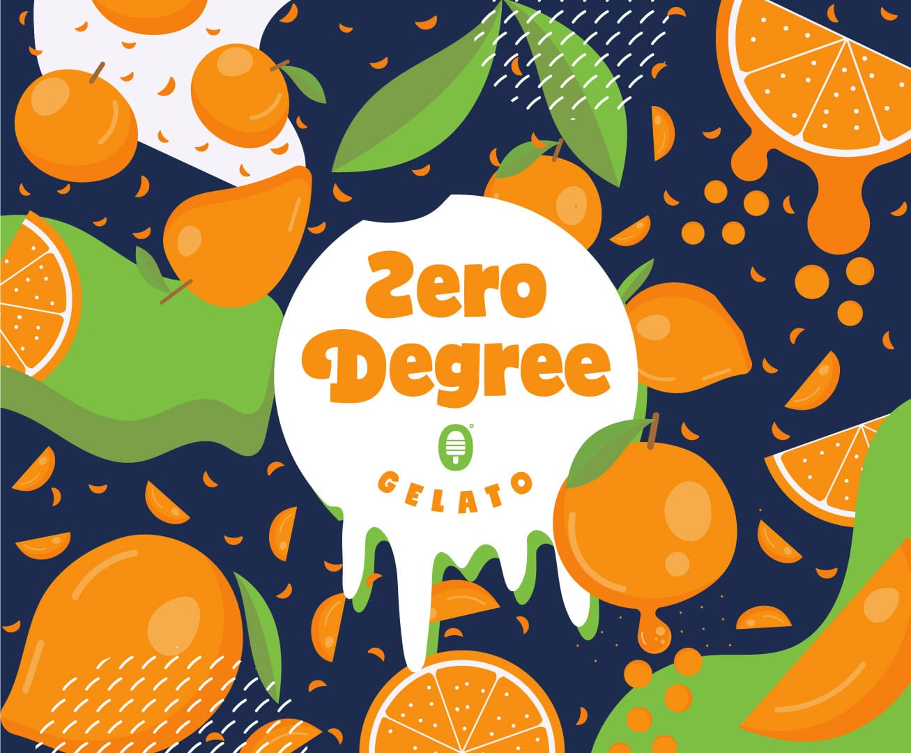
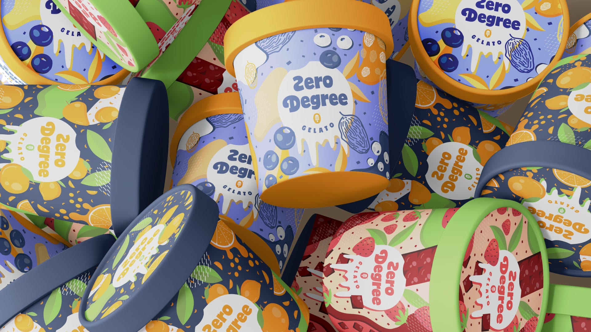
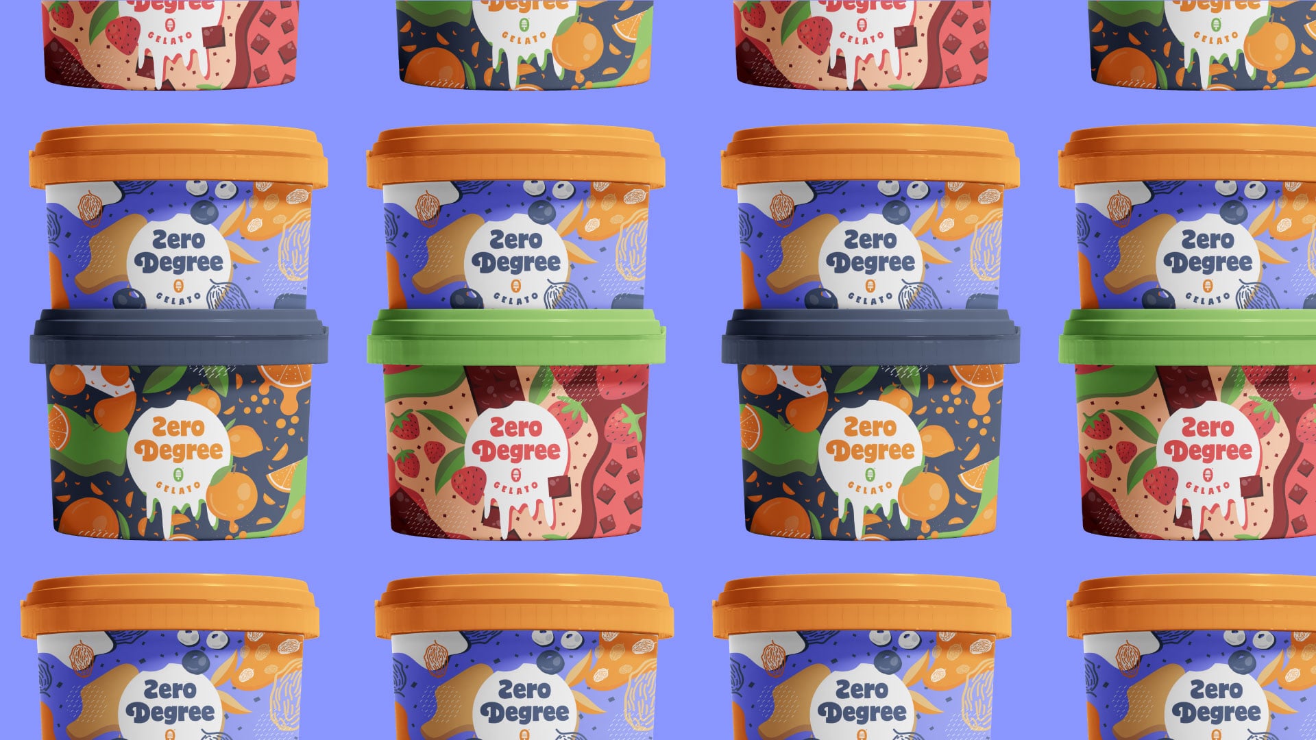
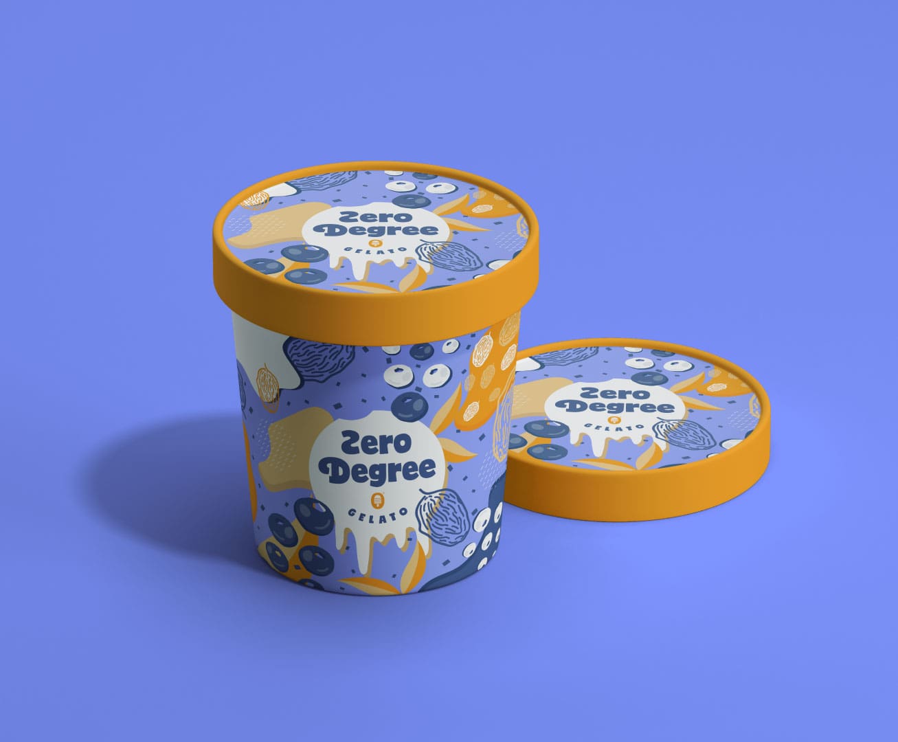
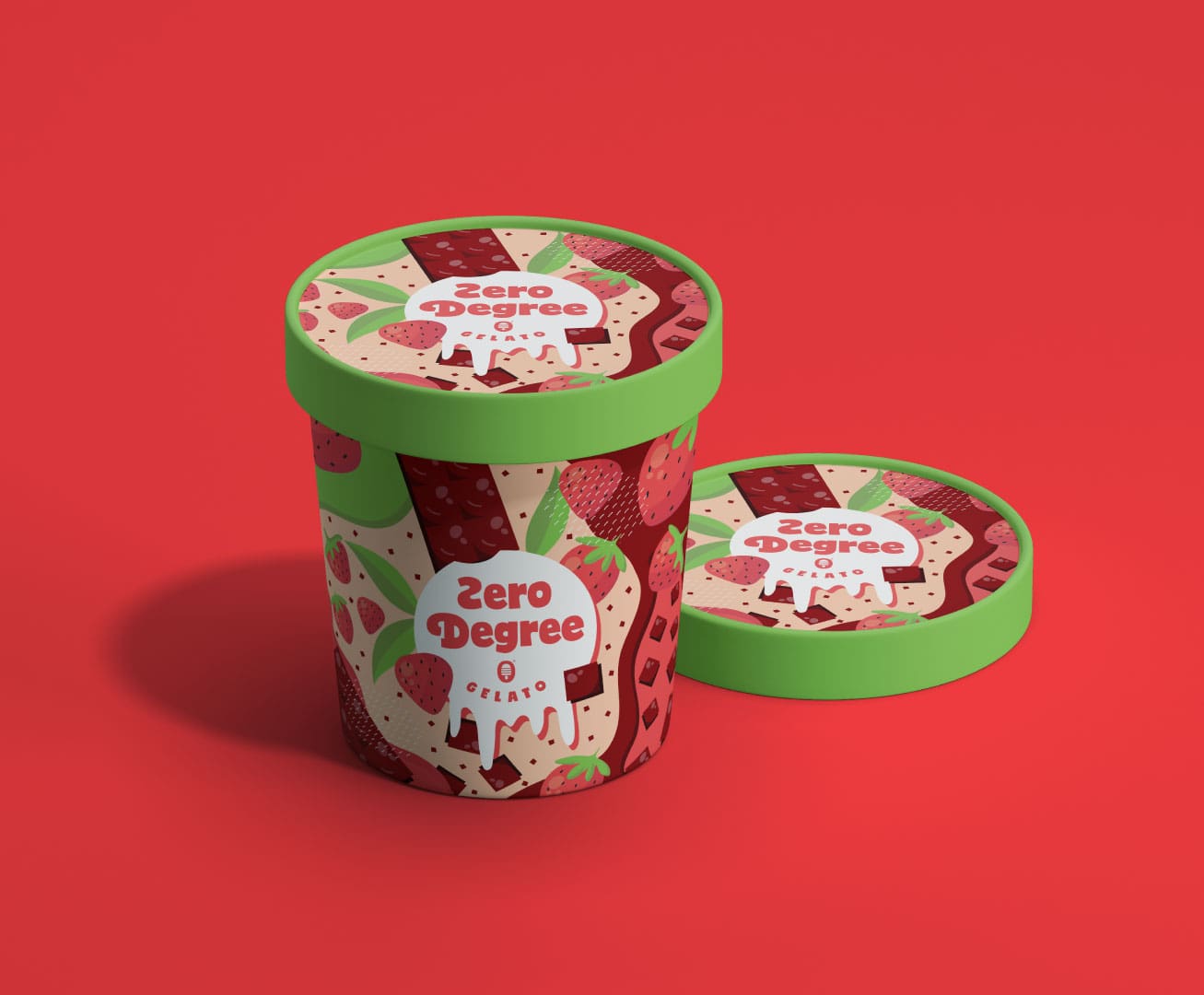
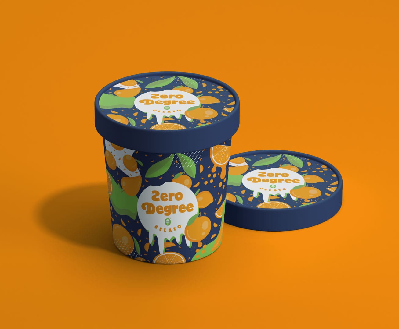
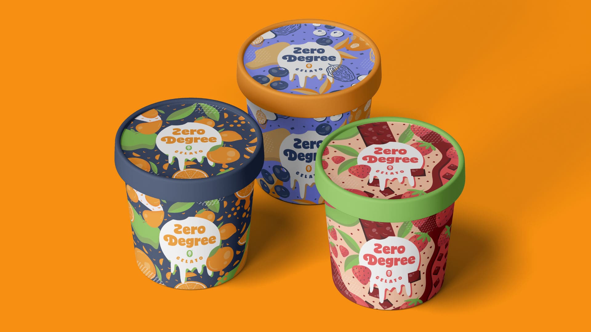
Furthermore, for our packaging, we played with different variations and came up with 3 different concepts that go for 3 flavours. First flavour is strawberry-chocolate, second is blueberry-dates and third is mango-orange. Different fruit and abstract shapes have been designed in order to make our brand appear tailored to our target audience. When it comes to our fruit illustrations, they can also be used not only on print, but also digitally on social media and website.
People we are trying to target are upper and upper-middle class who like to enjoy a great flavoured ice cream on Sunday evening. Our ideal client like to eat healthy but still doesn’t mind spoiling themselves every now and than with delicious sweets. They are between 20-35 years old they enjoy life.
Color palette was picked according to our packaging design flavour. For the typography, modern, clean and fun looking font options were picked that go well with the logo and the packaging.