
pH Wellness
pH Wellness is a Rehabilitation facility centre nested in the hills of Southern California. pH is a brand that helps people struggling with alcohol and drug addiction.
Our founders have been to treatment and sober for over 14 years. We understand the importance of getting your life back on track via a lifestyle change. We believe in replacing old habits by implementing fitness into your daily life and creating transferable skills for life after treatment.
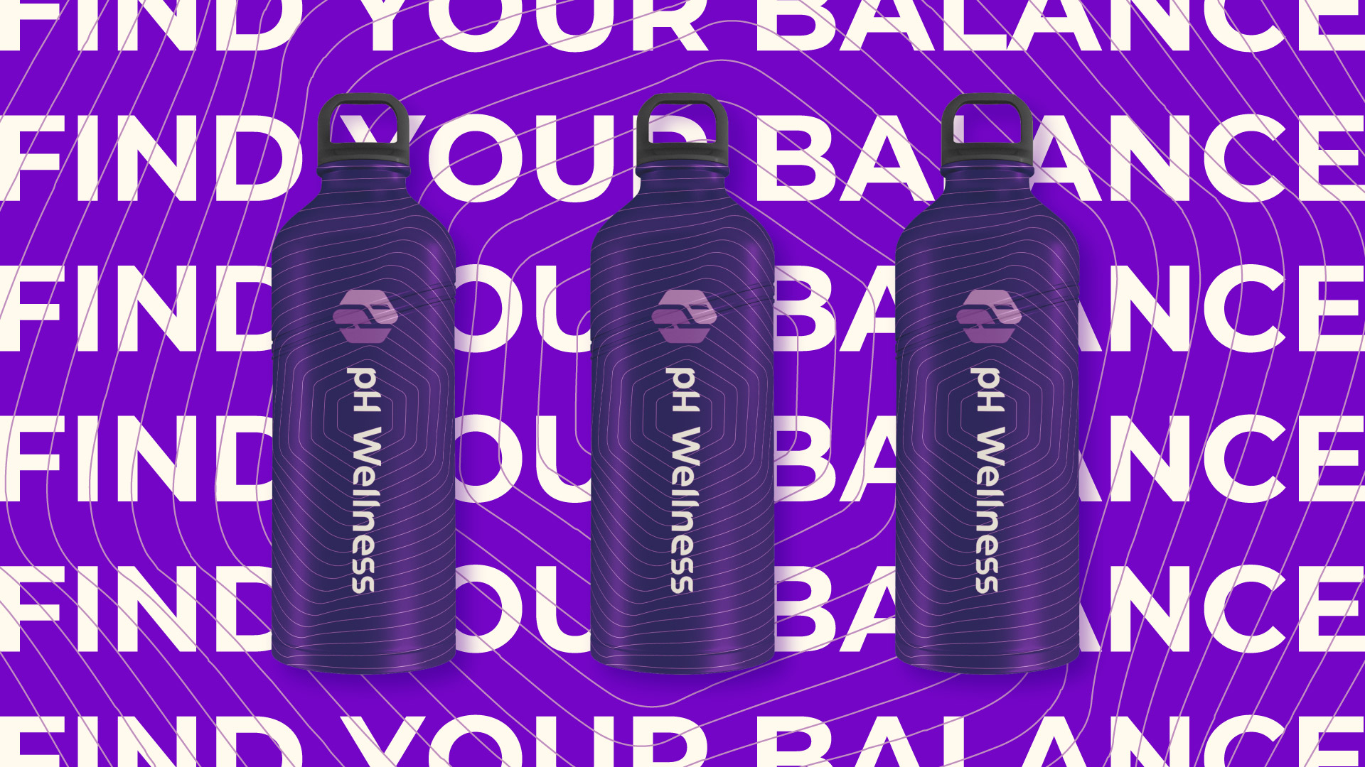
Because pH Wellness helps you find your balance, our whole branding system thus revolves around the word “balance”.
pH Wellness has a ton of competition. What differs us from others is the heavy use of fitness, life skills, and also access to career placement. Our target audience is anyone who is dealing with the drug and alcohol addiction.
About the project:
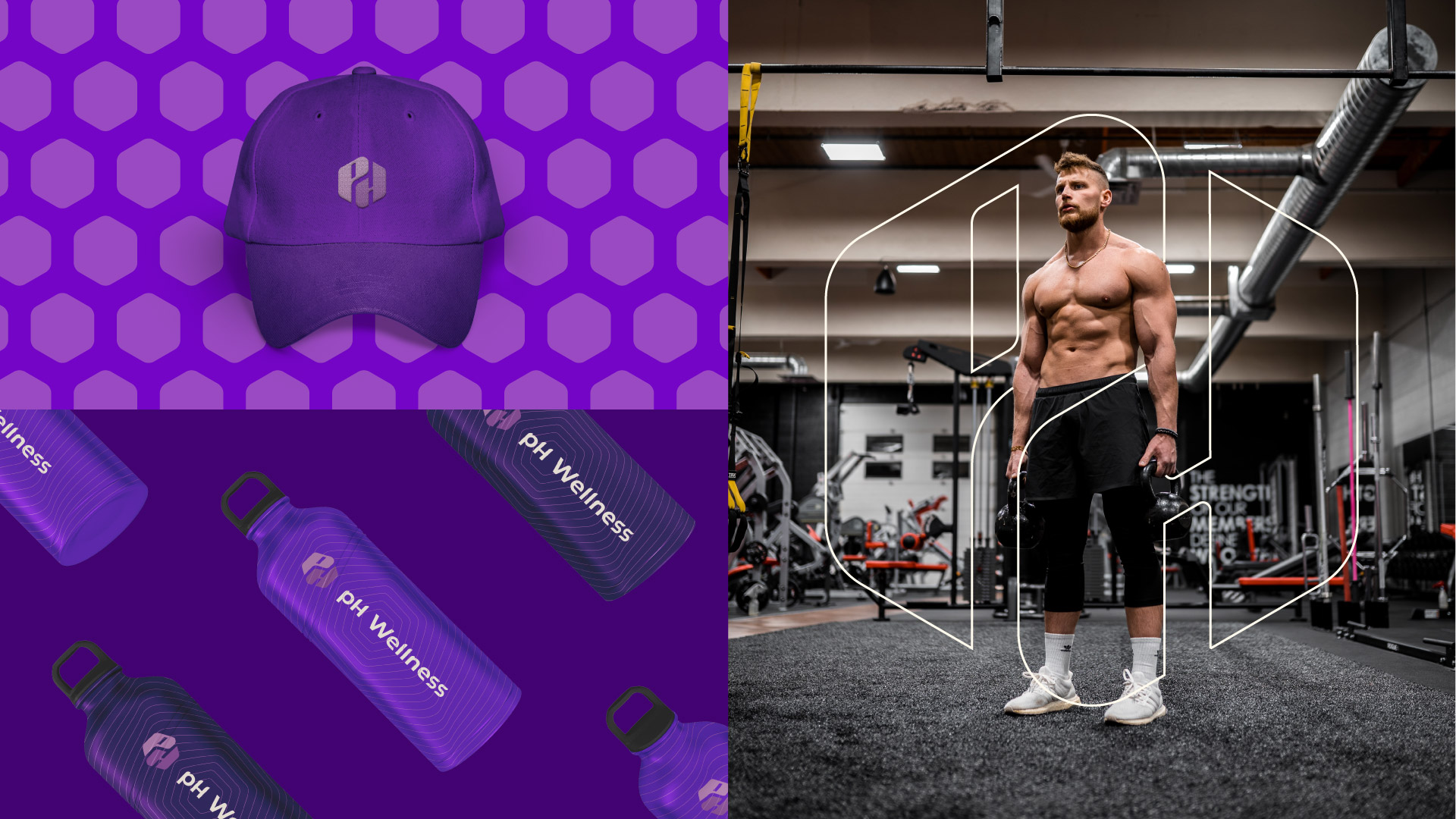
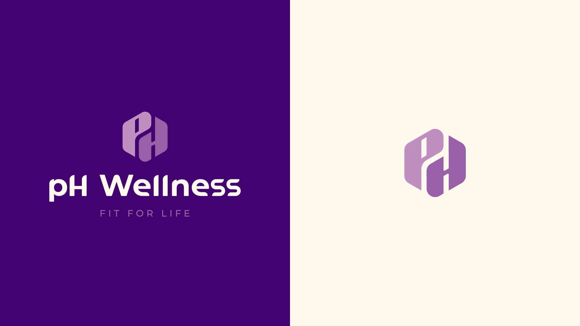
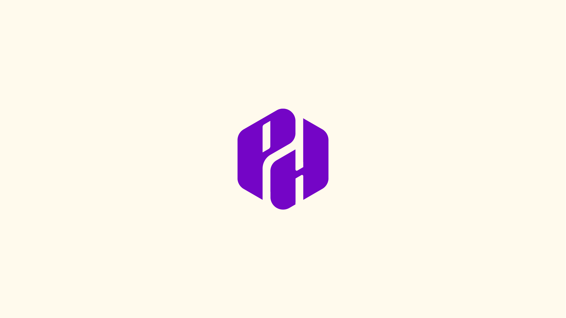
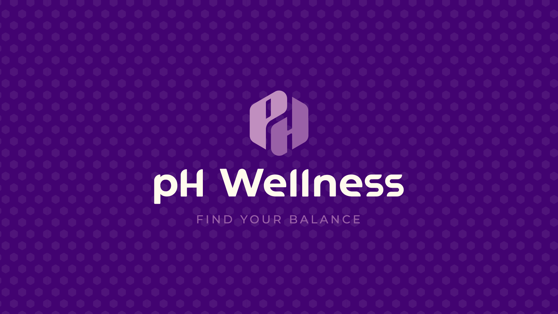
First, the idea for our logo design was making pH monogram which stands for 2 partner names (Matt ‘Paz’ and Tony ‘Hoffman’). Our logo is designed in a hexagon shape (gym) where both letters are equal in size representing our tagline “Find your Balance”. We also went with purple color palette for high contrast, and because it is portraying a treatment centre.
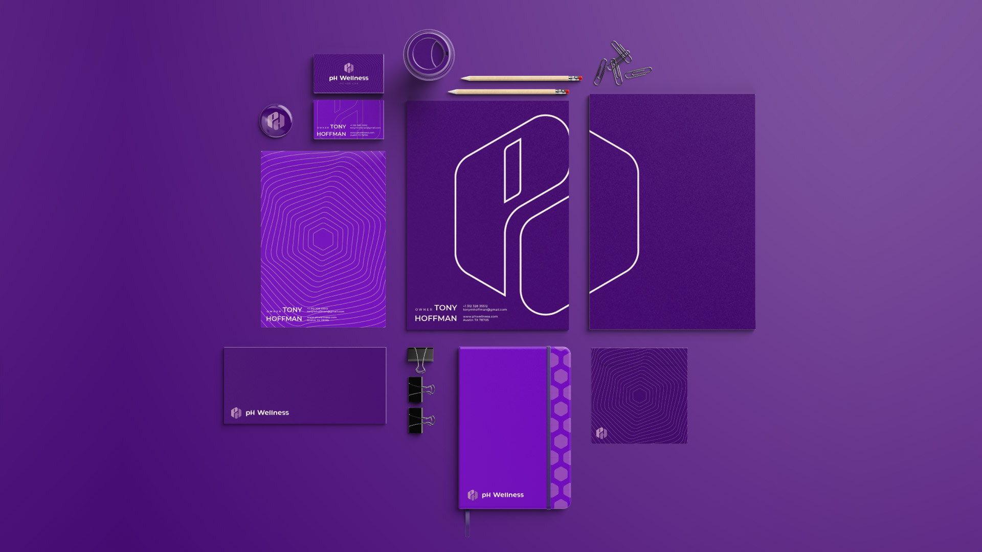
Second, the brand design has been presented as an example, on multiple applications such as stationery, posters, clothes and etc. Furthermore, to make our brand more unique, multiple patterns have also been. For example, hexagon shape patterns with different twists on it. As a result, they match what we are trying to do and what makes us different.
Client’s Testimonial: “Great work as always! We are really happy with everything and are very thankful to have worked with you, and we appreciate the effort you have put into our brand.