
Flourhouse
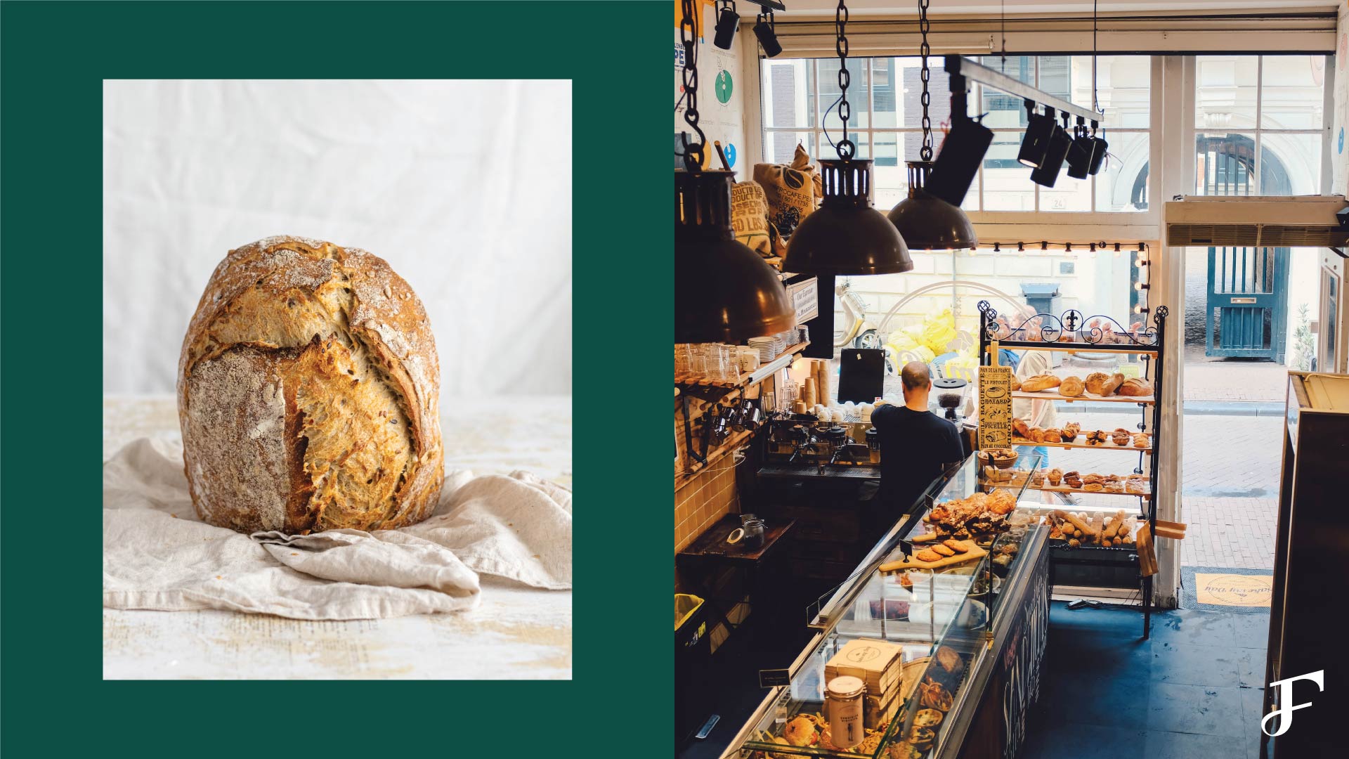
From the team behind Mike & Patty’s and Pastry Chef Hannah Krowne. Flourhouse is a bakery based in the Boston US, that sells high quality baked goods. Pastries that they are selling are ranging from classical breads and baguettes to more unique cookies and sweets. They are offering their delights for retails but will have a wholesale channel as well in the future. Their most popular yummy delights are English muffins and cookies.
The problem Flourhouse faced was how to appeal to a more younger, millennial generation that would be interested in their menu and digital online presence. Boston is full of bakeries, branding was needed as a way to differentiate from the competition. They are also looking for a strong iconography to achieve the brand’s presence and memorability too. Goal is to make Flourhouse stand out from amongst bunch of local bakeries and national competitors.
About the project:
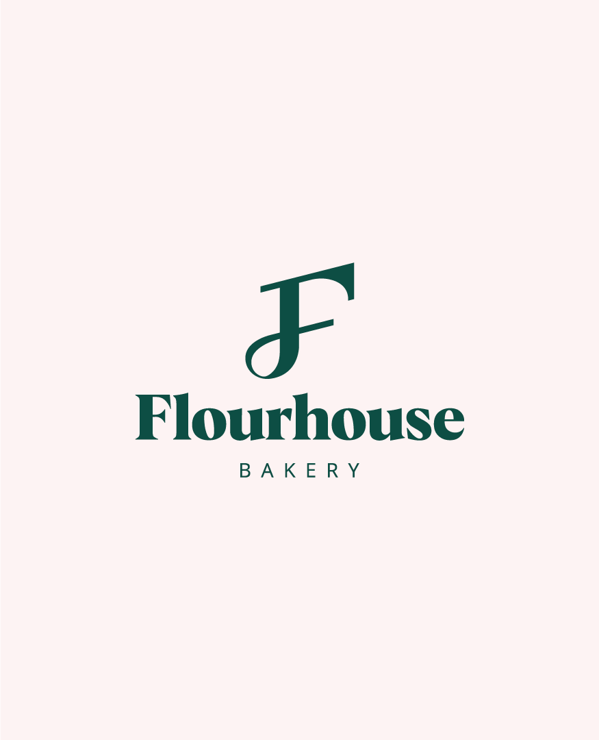
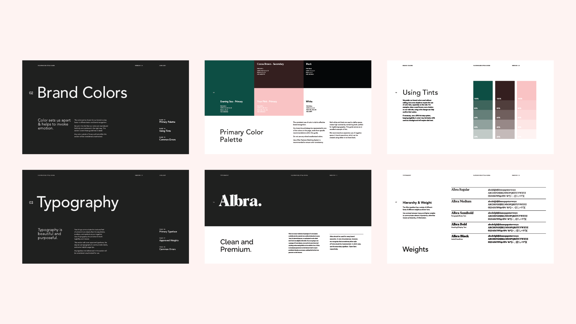
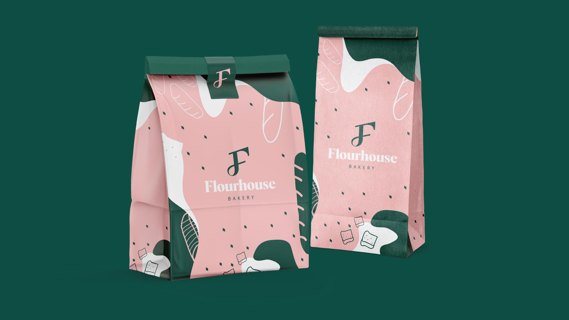
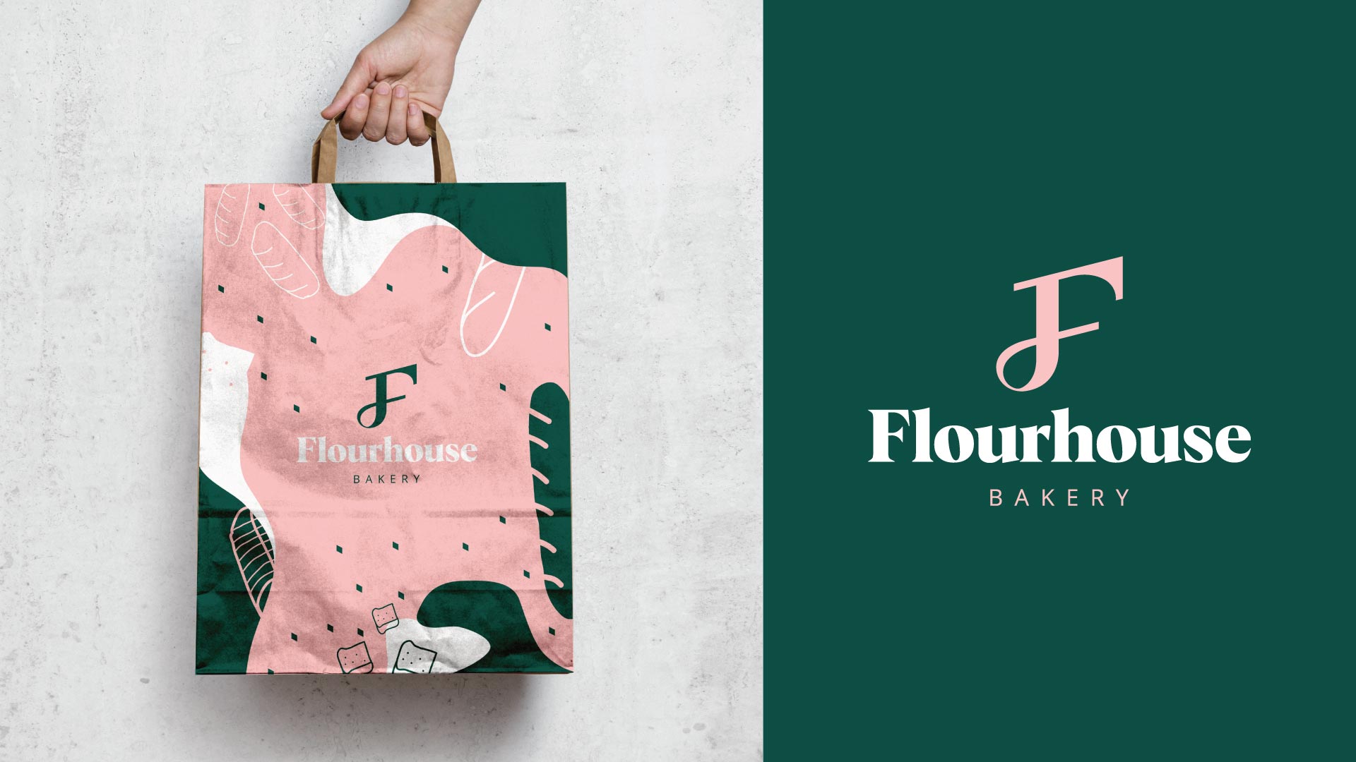
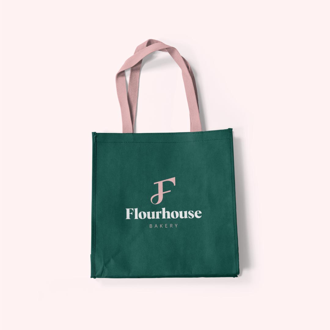
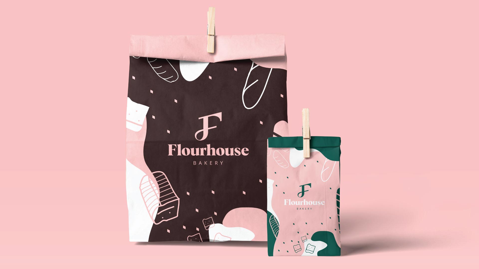
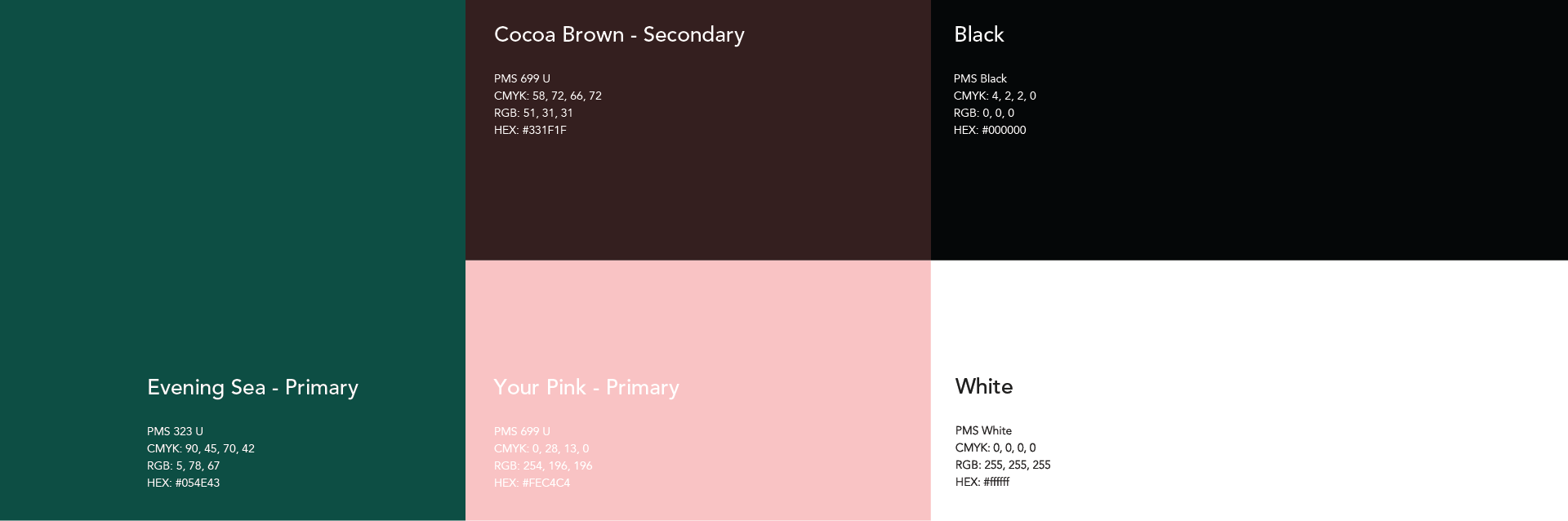
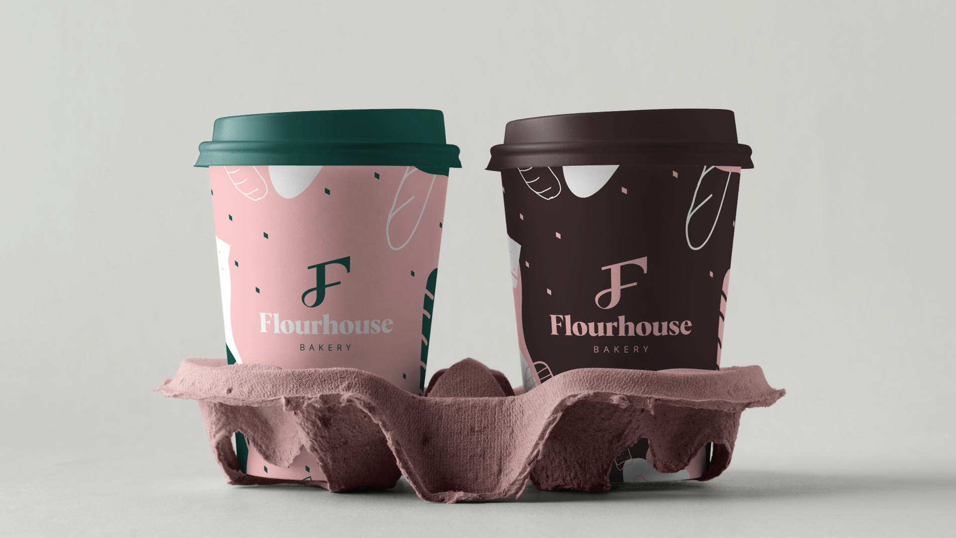
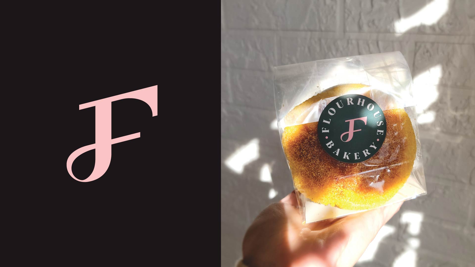
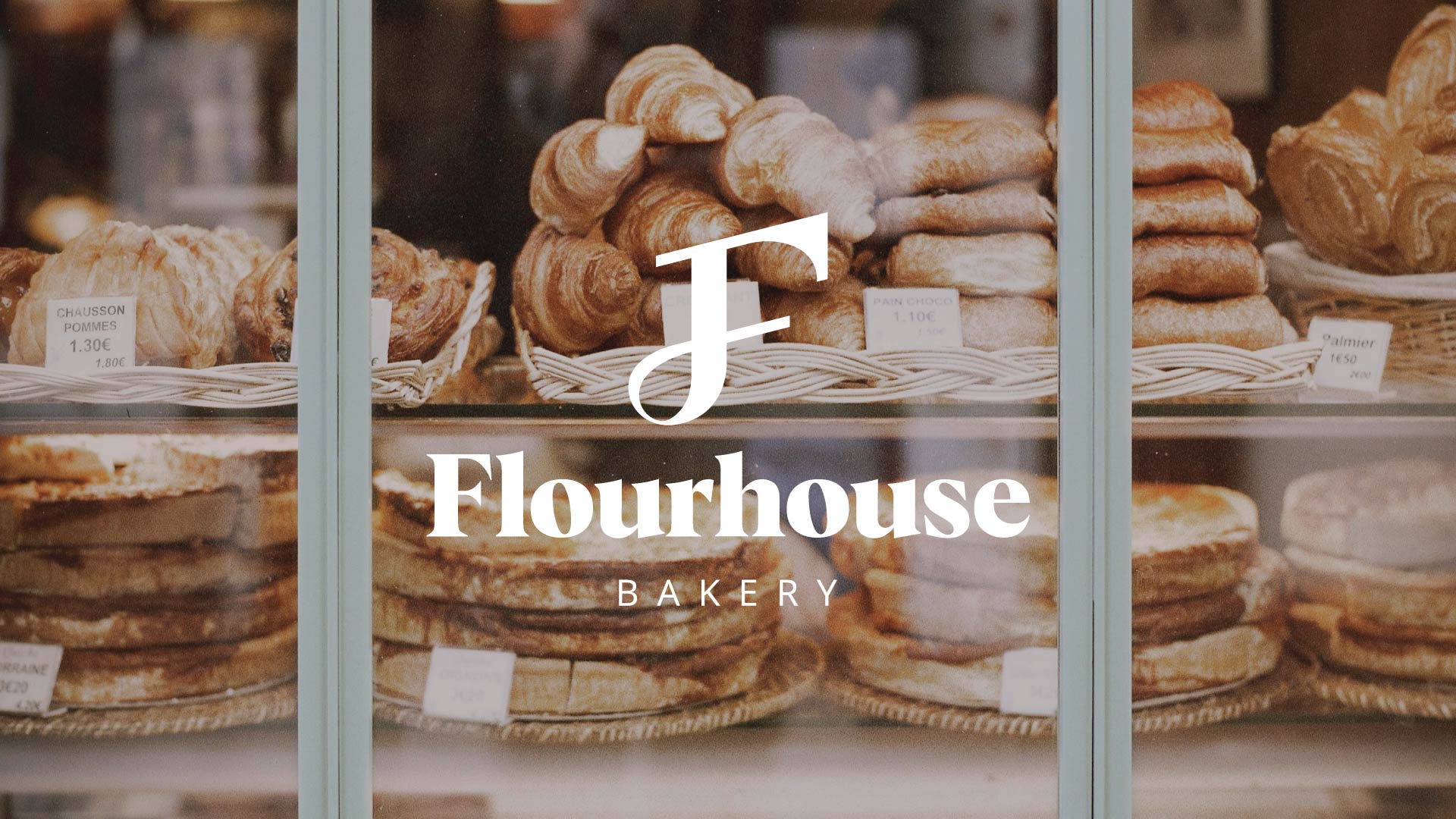
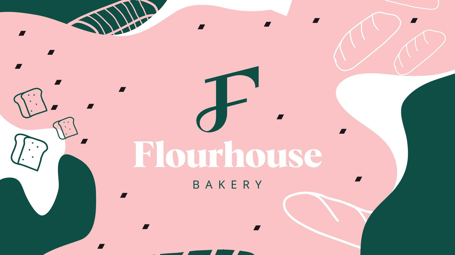
Since our target audience are millennials, the branding has been hand tailored according to the project brief. The solution we provided was making a fun, warm and welcoming design that attracts our targeted audience. When it comes to our logo design, we went with simple and modern F logo icon. For the color palette, we went with option that’s very high in contrast so all of our details are readable. Furthermore, for the pattern design, abstract shapes, bread crumbs, bread and pastries have been designed to uplift our identity.
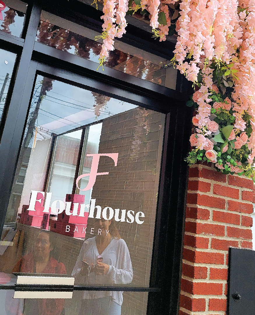
Branding for Flourhouse looks very friendly, warm, modern, inviting, clean, creative yet professional. Bunch of baking related icons have been designed that can be used across different occasions. When it comes to the presentation, we focused mainly on how to showcase our brand in an attractive way on print. With this look as a result, our bakery will definitely stand out from the competition.