

Thrive – Protein Gummy
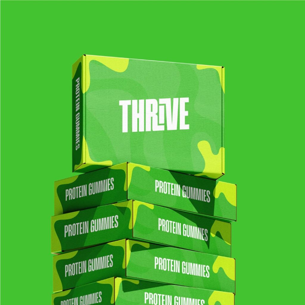
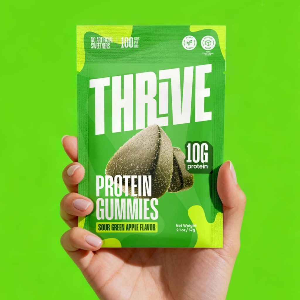
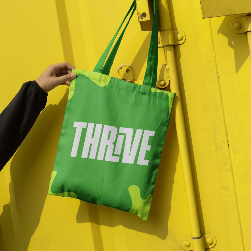
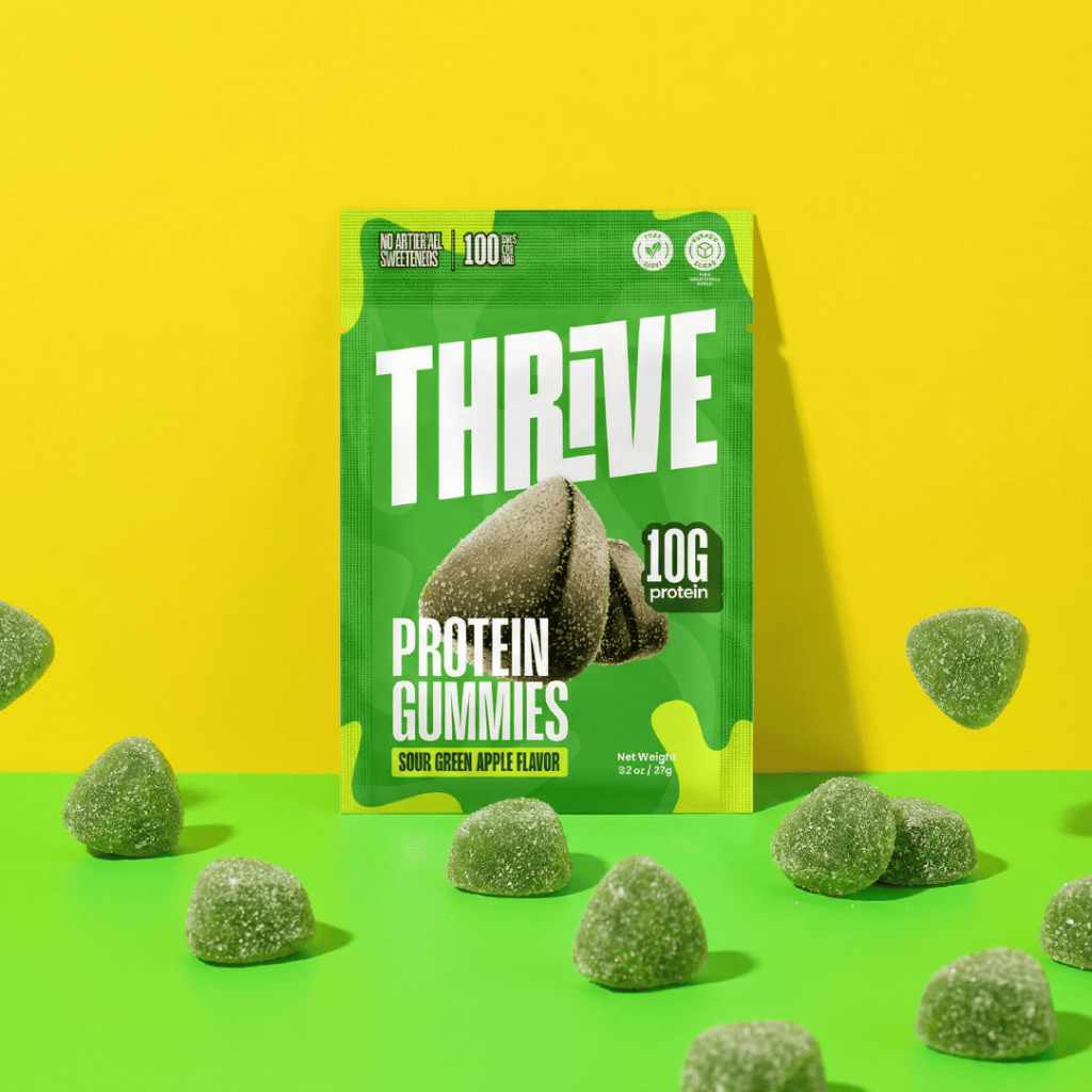
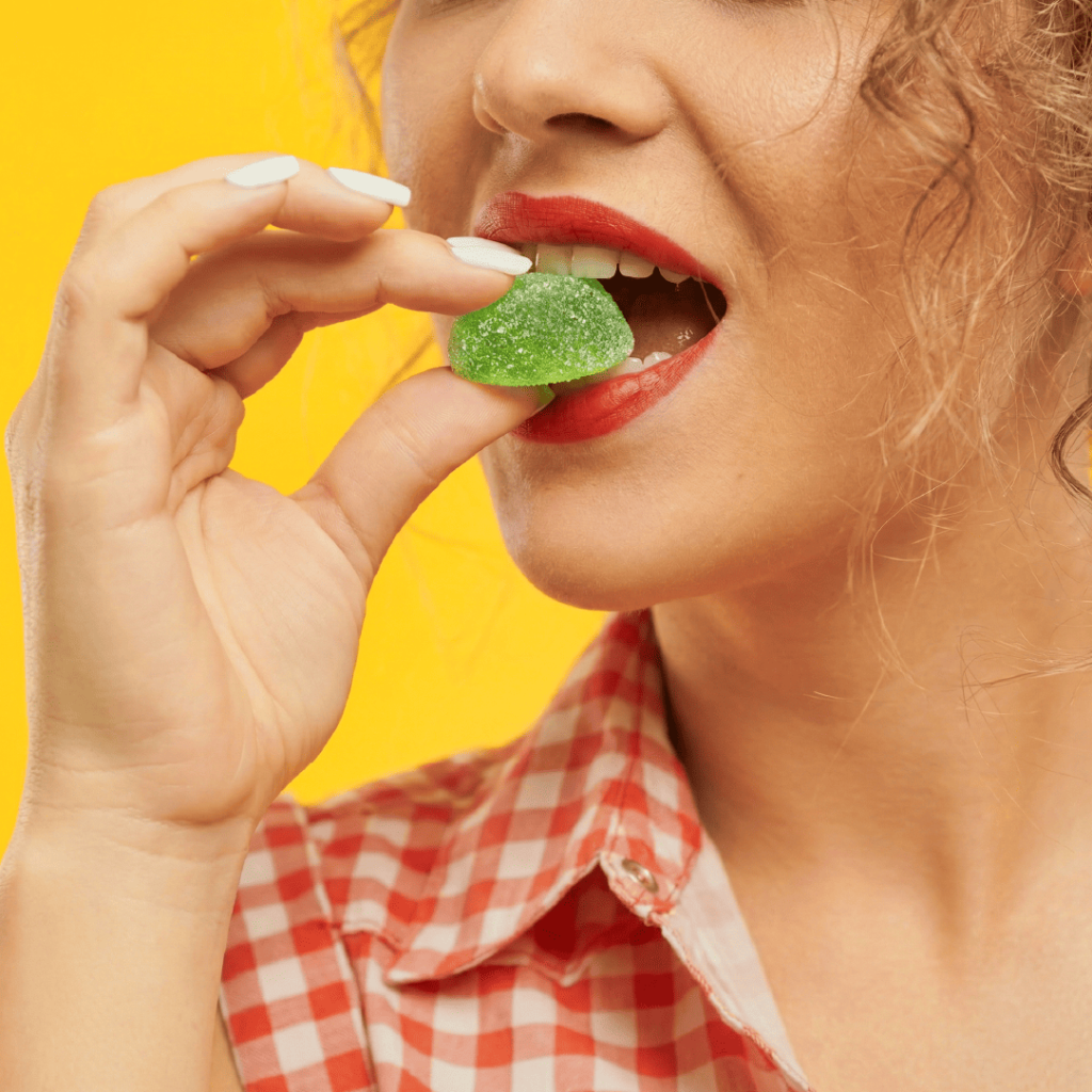
Thrive is a protein gummy brand in the wellness and sports nutrition category that needed a distinctive brand identity and packaging system to stand out among traditional protein snacks and supplements. In a market dominated by powders and bars that often look similar and technical, the goal was to create a fresh, vibrant, and engaging visual identity that feels modern and consumer-friendly — especially appealing to those who want functional nutrition in an enjoyable format. The design had to clearly communicate the product’s benefits while being flexible enough for future line extensions and optimized for retail and digital presentation where visual impact drives choice.
Task
We developed a bold, expressive brand identity and packaging design that reimagines how protein products look and feel in a gummy format. The visual system uses energetic color, approachable typography, and distinct graphic elements that make Thrive instantly recognizable in a crowded category, helping it break away from the generic supplement aesthetic. Packaging was crafted to clearly communicate key benefits and differentiate flavor variants while maintaining a cohesive family look that performs strongly on shelves and in online product grids. The result is a unified brand presence that feels vibrant, memorable, and consumer-focused — designed to attract wellness seekers who want performance nutrition with personality and clarity.


")

")
")
